
Spectre logo and teaser poster
Contributed by Stephen Coles on Mar 17th, 2015. Artwork published in
March 2015
.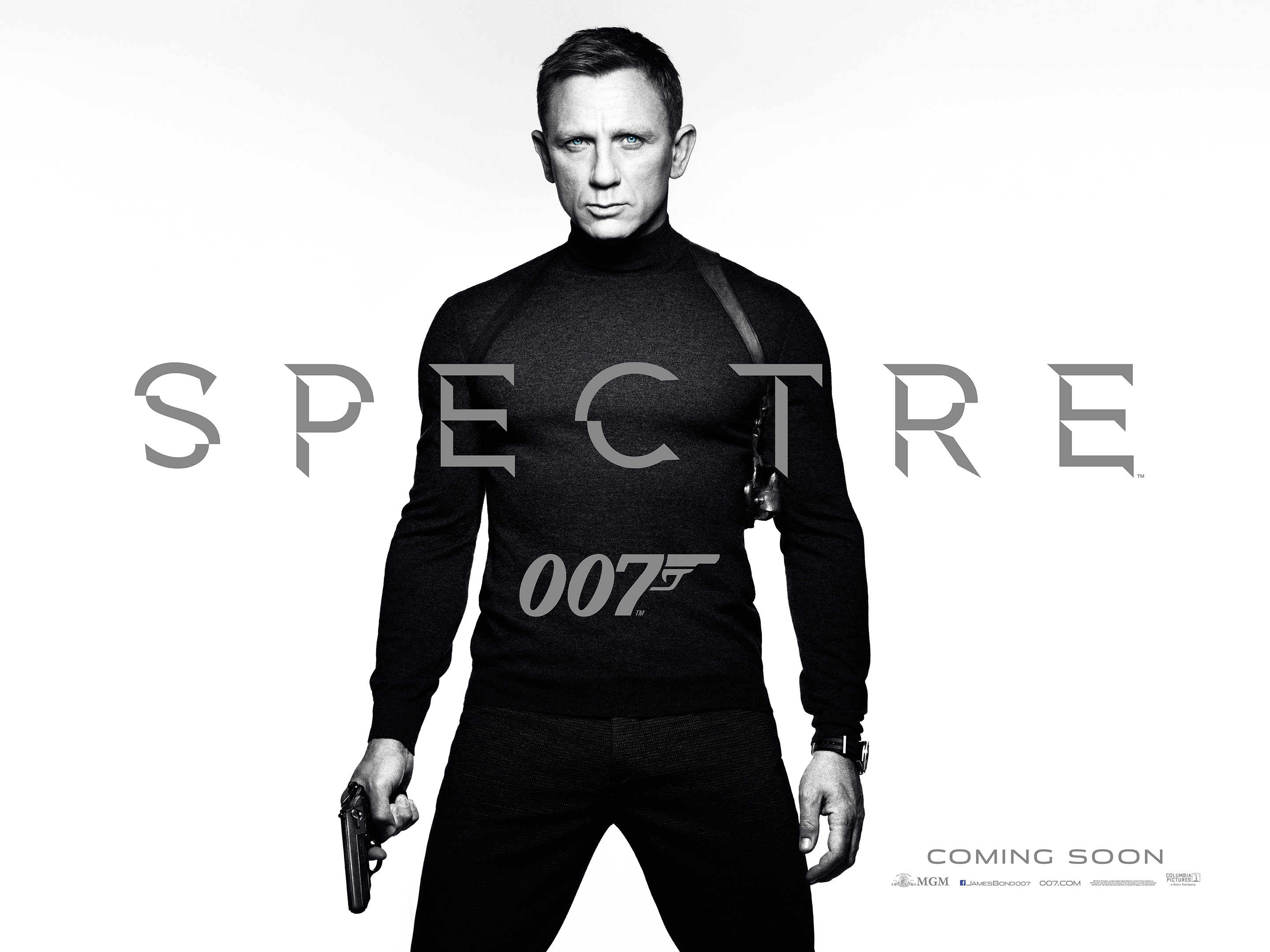
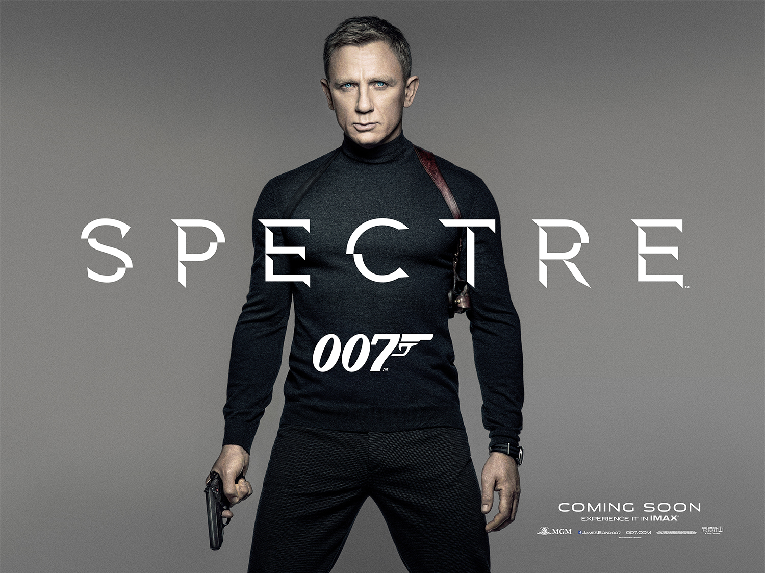
A faceted modification of Gotham along with Stainless Extended teases the next installment of the James Bond film franchise. Spectre opens November 6, 2015.
© 2015 Metro-Goldwyn-Mayer Studios Inc. License: All Rights Reserved.
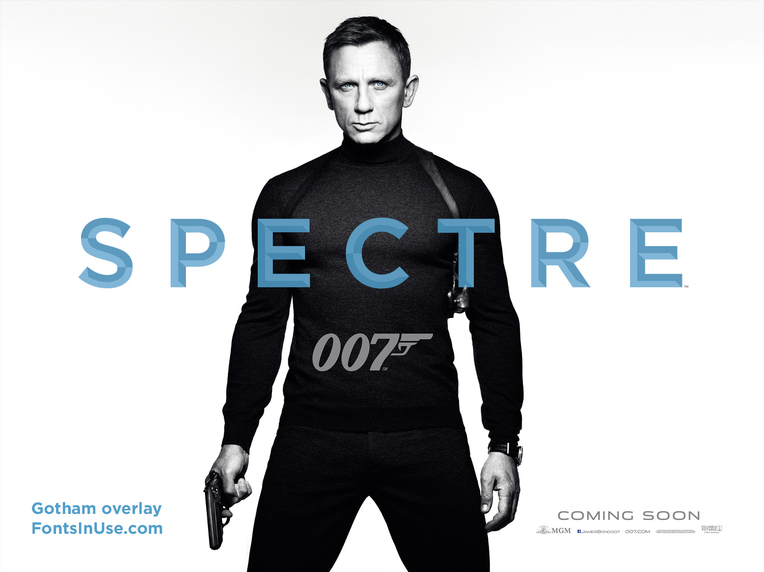
Gotham Bold overlaid on the Spectre logo to show that the letterforms match.
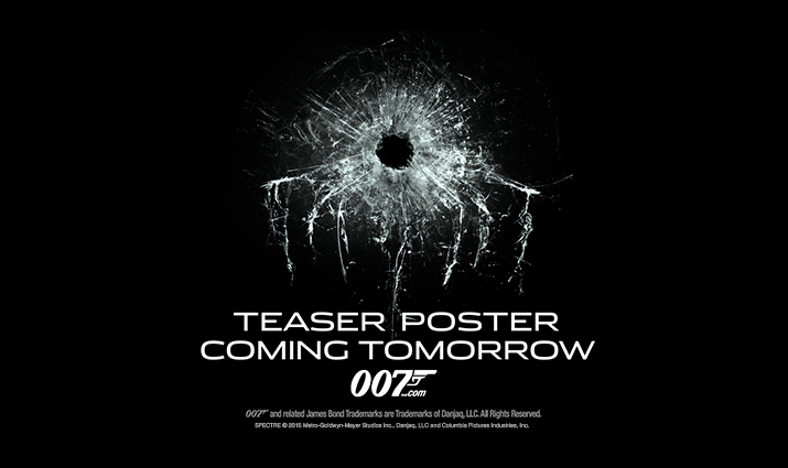
Teaser poster teaser, set in Stainless Extended.


19 Comments on “Spectre logo and teaser poster”
Beside its angle of light incidence, the idea for that custom Gotham is visible in Playtypes’s Faux as well.
Too bad they ditched Neutraface 2 for this …
Really? I find that use of Neutraface to be less interesting, and especially hamfisted with the tight spacing and tacked-on ‘Q’ tail.
That’s true of course, execution could have been way better in the past. Nonetheless I think the choice of Neutraface 2 is more suitable for a classy but tough British secret agent than the ubiquitous Gotham.
I might have picked the wrong example though.
Wonderful to see this on this blog. I designed the Spectre logo as part of my role as a senior at Empire Design. We have worked on the last 4 Bond movies.
On the question of the ubiquity of “Gotham” as a typeface, I totally understand this argument, but the decision was practical as much as it was aesthetic. We’ve just finished adapting the title style for use in something like 20 different languages. The letterforms of Gotham lend themselves perfectly to adaptation for an audience of this size.
The general public don’t see yet-another-instance-of-gotham, they see an ominous word picked ominously out of darkness with a 007 logo beneath as a confident, knowing sign off.
I can’t wait to actually see it incorporated into the title sequence.
T
Thanks for chiming in, Tom. I’ve added the design credits.
Hey Tom,
when I saw the teaser poster for the first time, I thought “That‘s cool, a reversed gun barrel sequence for spectre!”. Did you try to do that, or is it just me overthinking the design?
How I can get this font?
Gotham is available from Hoefler & Co. The faceted variation is custom, though, and not available as a font. For alternatives, see Faux as mentioned above by Jakob, or PLINC’s Henrion BA.
I have Faux but it isn’t the same. It’s more ugly. The change of color in letters there isn’t in the middle of the letter. Somebody know how to do this beleved effect with Gotham Bold? Regards.
Hello Tom. Amazing job you did with that logo. It captured my attention from the very first moment I saw the poster in the theater some months ago. How did you achieve that perfect bevel with Gotham? I’ve tried with the bisel effect in Illustrator, but the results are far from perfect.
There is also Diamond by Rafael Dinner (1995).
Except for the direction of the light :)
Hi Tom – Great work! The Spectre logo is superb!
I’d like to know what the typeface is in the text of the opening credits of the film. I’m not sure how to find out. Given your involvement and your font interest I wondered if you might know? Please can you help?
Thank you,
Sara
Tom, I love what you have done with Gotham. Great work of a great Font.
What font was used in the movie to the locations (like Mexico City, Rome etc.) Do you know? Thanks, Pavel
Pavel, do you happen to have images?
Just watched the film, Pavel. Looks like Courier to me.
What is the lower-case font used in Spectre for subtitles, captioning, etc?