Cannery Row by John Steinbeck, first editions
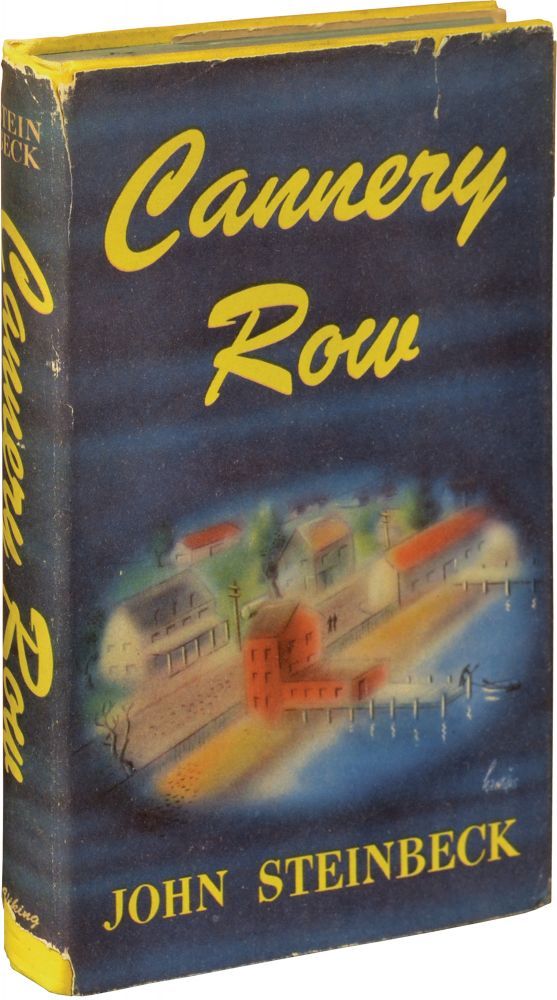
When John Steinbeck’s famous novel was published in January 1945, ATF’s Brush (1942) wasn’t brand-new anymore, but it still was fresh and certainly far away from being the overused stereotype of informal script typefaces that it became in later years. In fact, the jacket design by Arthur Hawkins, Jr. may have been among its first uses of note.
The book and the typeface are strongly linked: “Cannery Row” in Brush can be seen on the dust jacket and the cover — front and spine — as well as on the title page of the first US edition by The Viking Press. Brush also adorns the jacket and the cover of the first UK edition by William Heinemann. It even appears in print ads accompanying the book release — it’s not just a one-off cover face, but acquires logo-like qualities. Unsurprisingly, this strong visual identity is maintained in later editions, see e.g. this Viking Compass Book from 1969.
In American Metal Typefaces of the Twentieth Century, Mac McGrew notes that Robert E. Smith’s design “has a handlettered, freely-drawn appearance, with the letters joined skillfully so the connections are not obvious.” Off-the-shelf, its connections weren’t considered good enough, though. If you look closely, you’ll see that the exit stroke of the second ‘n’ is flatter than of the first one, allowing it to flow more smoothly into the loop of ‘e’. Furthermore, the ‘ow’ pair is joined at the top. To my knowledge, Brush didn’t come with such alternates or ligatures — the title must have been fine-tuned by hand. With these modifications, the “Cannery Row” wordmark essentially isn’t type, but lettering — closely modeled after a typeface that in turn emulates lettering.
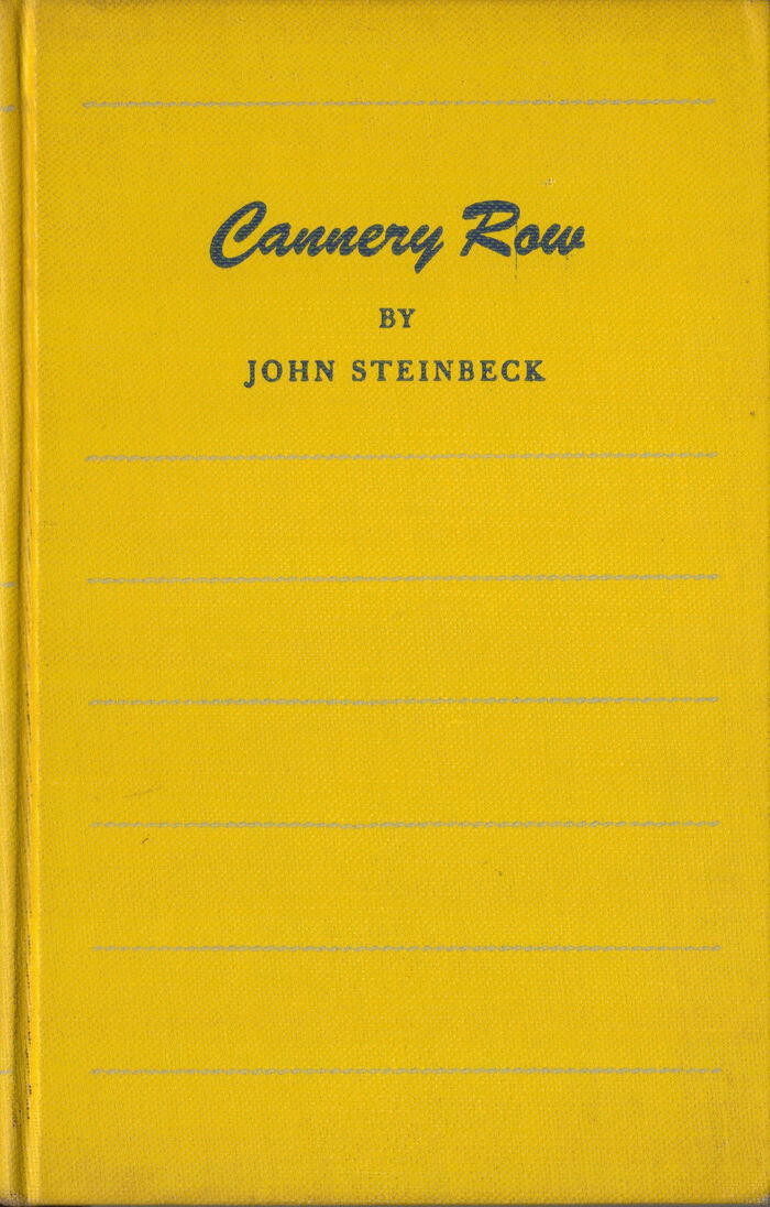
First Edition Third Printing (January 1945). Printed in U.S.A. by the Haddon Craftsmen.
Like the title on the jacket, the cloth binding now is in bright canary yellow as well — too good a pun to miss. There was also a Wartime Edition in blue boards.
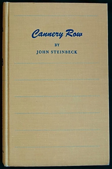
“First Edition First Printing (January 1945) in the First State buff-colored cloth binding, one of only 2500.” — Fine Editions
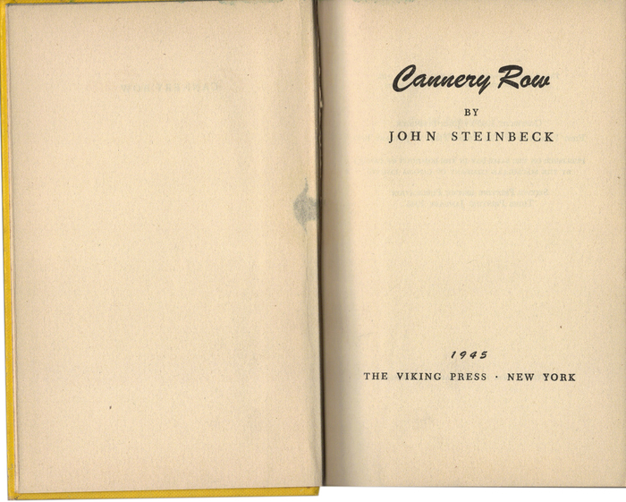
Title page
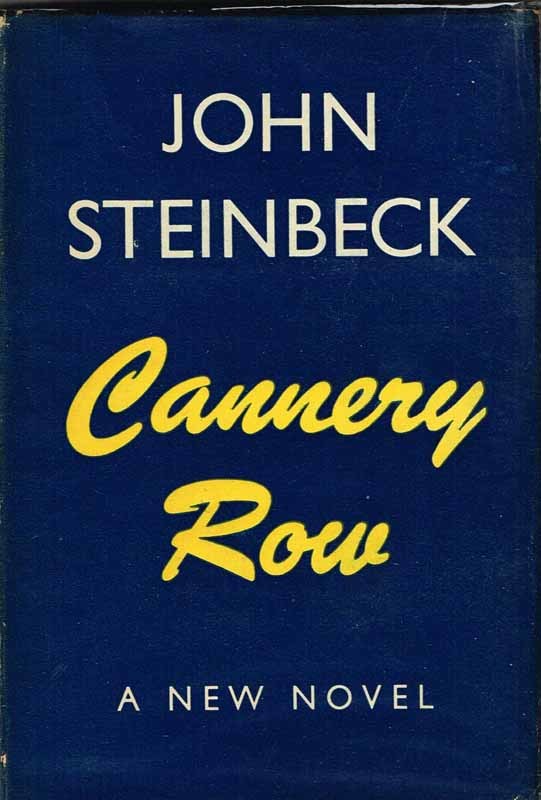
Dust jacket of the first edition by William Heinemann, London/Toronto, 1945.
Printed in Great Britain, Windmill Press

Cover (William Heinemann, London/Toronto, 1945)

Title page (William Heinemann, London/Toronto, 1945)
Typefaces
Formats
- Books (4011)
Topics
- Literature (1920)
Designers/Agencies
Tagged with
- 1940s (73)
- John Steinbeck (4)
- The Viking Press (20)
- book jackets (524)
- yellow (311)
- book covers (3501)
- book spines (727)
- title pages (525)
- William Heinemann (3)
- lettering derived from typeface (483)
Artwork location
- United Kingdom (2146)
- United States (6406)
- London (1205)
- New York City (1708)

















3 Comments on “Cannery Row by John Steinbeck, first editions”
From top to bottom:
1. ATF Brush (ATF Collection’s digital version, 2015)
2. US jacket: ‘C’ stops short of connecting to ‘a’, exit stroke of ‘n’ is flatter, ‘ow’ is joined at the top.
3. US title page: this apparently is typeset.
4. UK jacket: identical to 2. The slightly heavier appearance is likely due to the reproduction.
5. UK cover (front): pretty close to the typographic version. Some proportions and angles are off, though. Note the top of ‘r’.
6. UK cover (spine): interestingly, this rendering is again different. The ‘ow’ pair is joined at the top, like on the cover, but other details (a, r, y and, in particular, R) suggest that this is an independent piece of lettering.
The jacket design for Of Mice And Men (1937) is another, more obvious example of lettering derived from a typeface. With the production methods of that time, sticking to type simply offered no real advantage, on the contrary.
In this technological regard, the letterforms on the dust jackets for Steinbeck’s The Pearl (1947) and A Russian Journal (1948) are a peculiar case, too: They are likewise lettered and derivative. The model here is not typeface, but rather a historic piece of lettering, namely an alphabet drawn by Eric Gill for W H Smith & Sons. Only in 1996 did Colin Banks turn these shapes into a typeface named Gill Facia.
Here’s the 1969 paperback edition by Viking Press mentioned above. It features yet another rendition of the title. Now in two lines, the wordmark is distinguished by a wide and fat e.