

Hungryroot Branding

Like the dishes themselves, the brand name balances appetite and health, exploration and convenience.
Hungry: craveable, delightful, curious, progressive. This half speaks to the “explorer” persona interested in new experiences and products, escaping boredom through fulfilling journeys.
Root: down-to-earth, honest, nurturing. This half speaks to the “everyman” persona attracted by authenticity, convenience, and functionality.
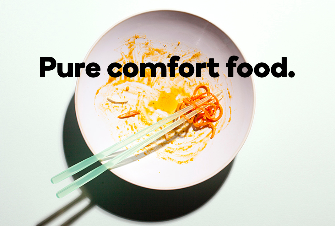
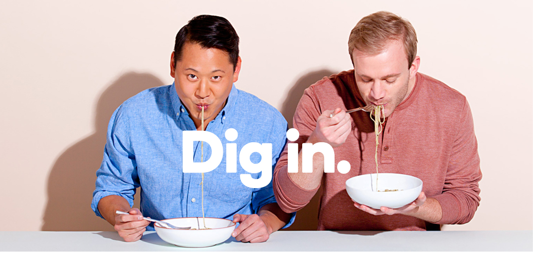
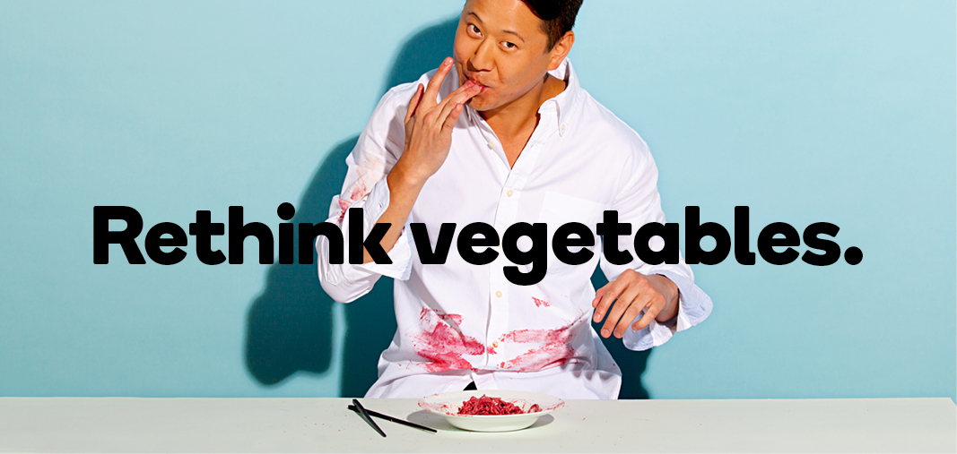
For a web-based fresh food brand, photography has to get the customer as close to the experience of eating as possible. From close-up bites to empty plates, art direction uses color and attitude to capture adventure in eating, bowl after delicious bowl.
Hungryroot typography is a strong contrast of hearty and light. The two families, Brown and Boing, are each drawn with the curls and curves of the noodle, in a single width—no thicks and thins. The round letters in both fonts–particularly the “o”—connect visually to the brand name.

The simple sleeve acts as a billboard for the six flavor profiles. In addition to creating a preview of what's inside.
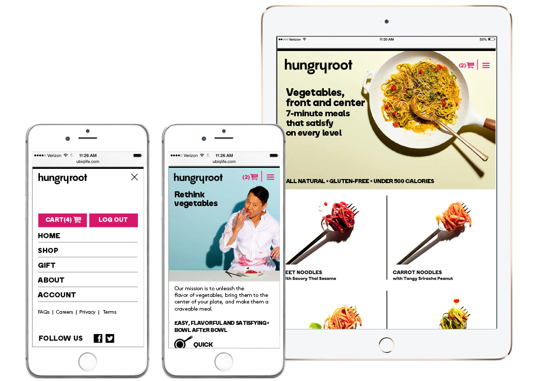
A streamlined ecommerce site allows customers to get Hungryroot delivered, as quickly and easily as they can make it at home.


")


")

 film credits and promotional material")


")


