
Domaine des Claires: Cuvée Presqu’île 2014
Photo(s) by Étienne Pouvreau. Imported from Flickr on Jul 22, 2015.
Source: www.flickr.com Uploaded to Flickr by Étienne Pouvreau and tagged with “line”. License: All Rights Reserved.
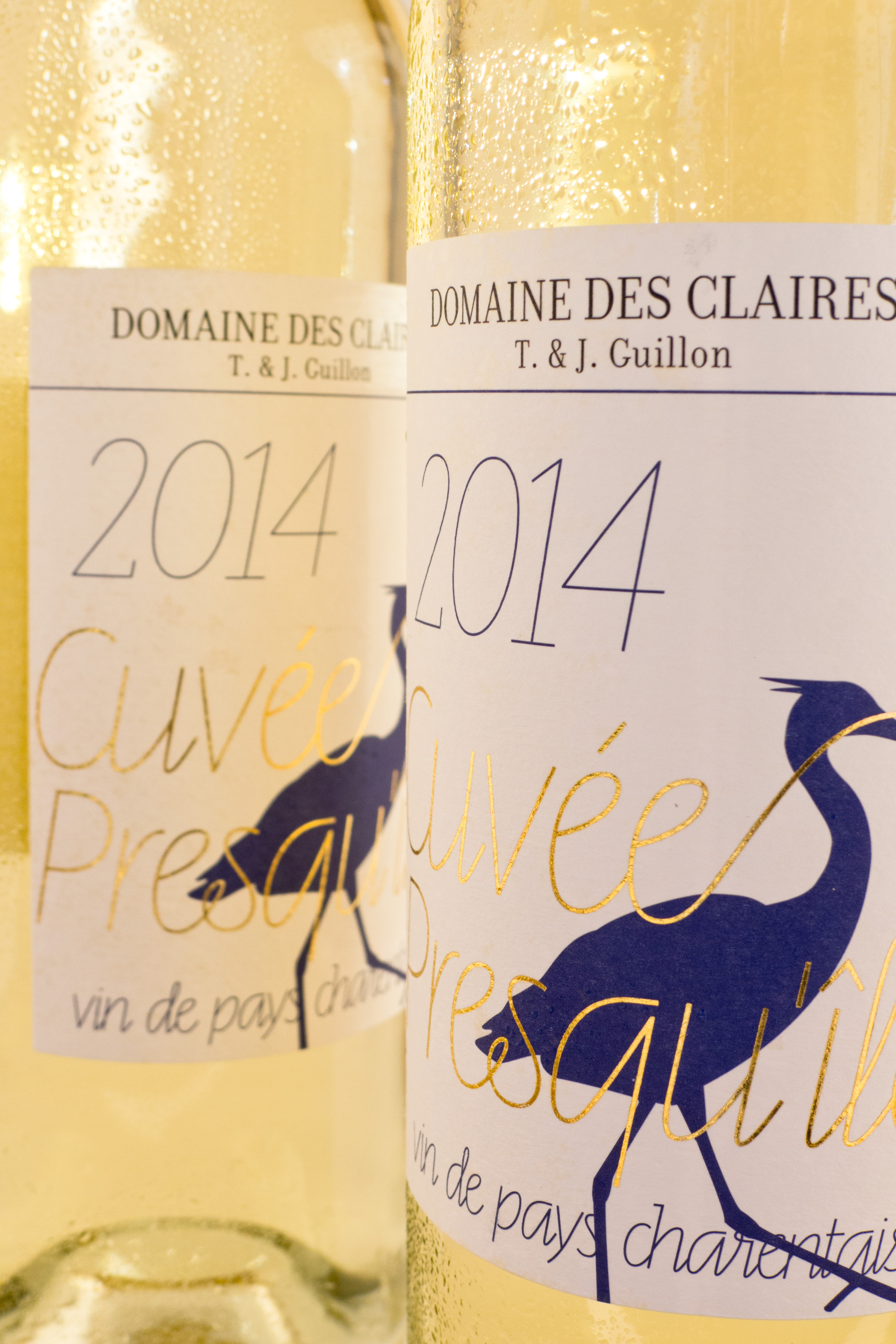
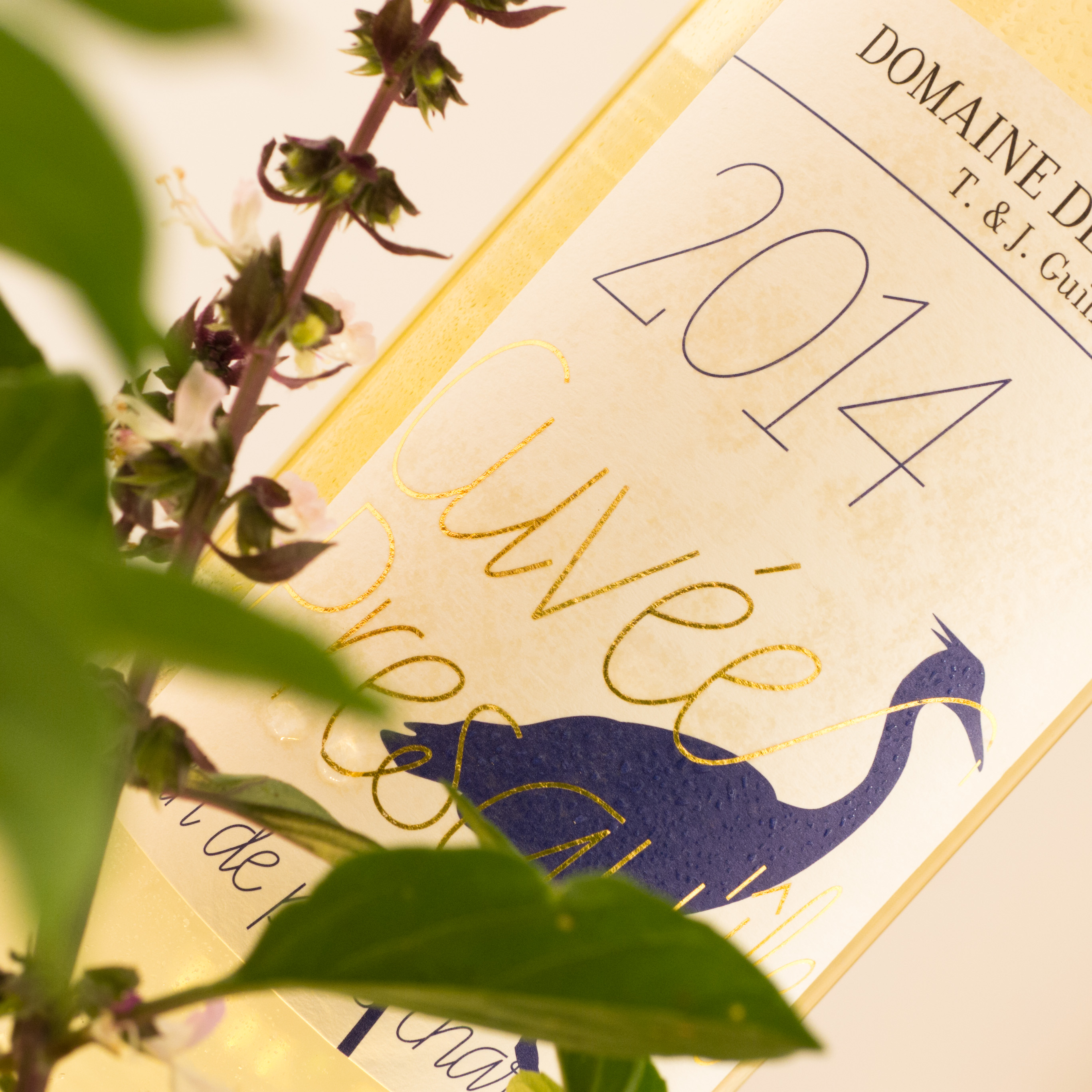
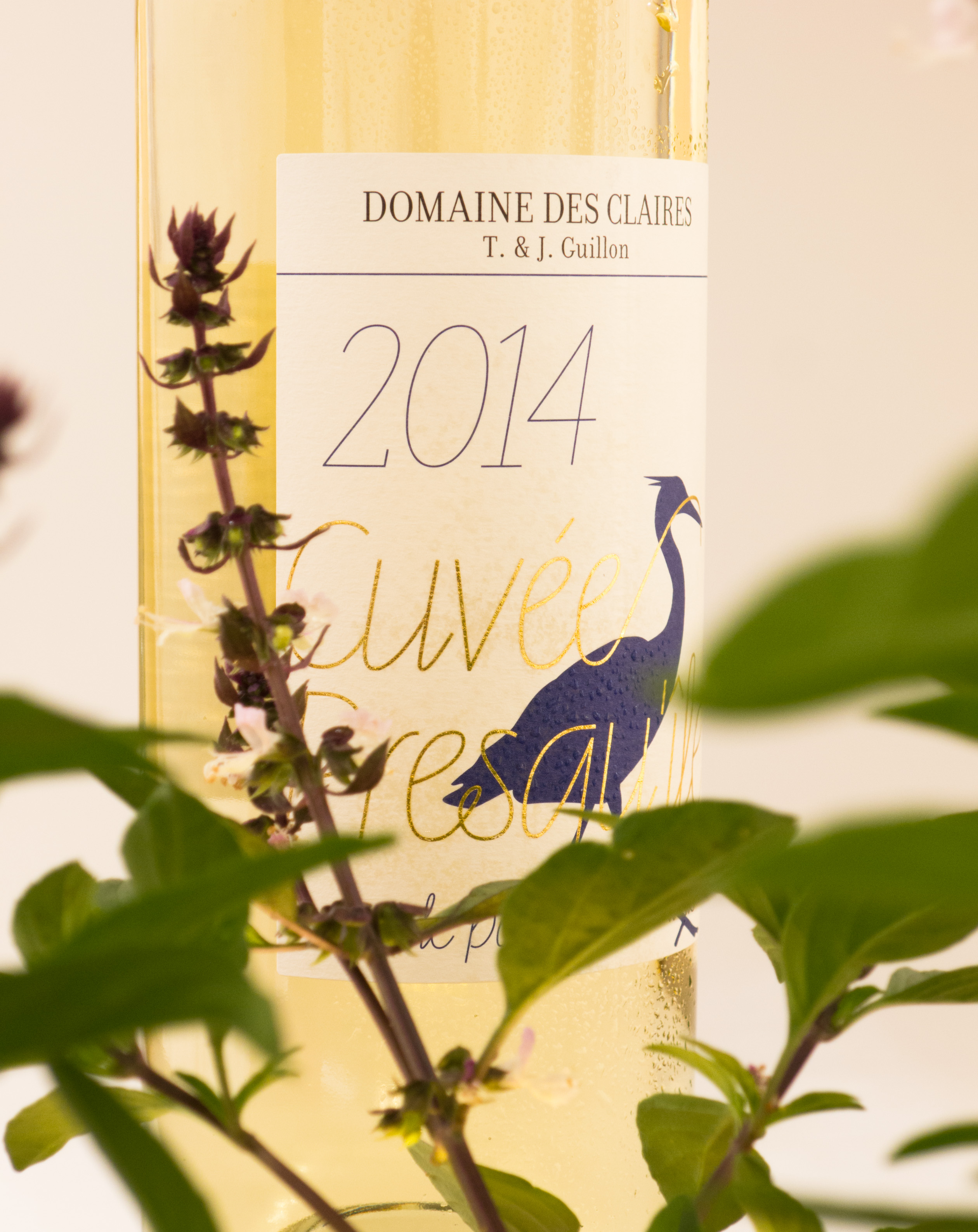
This label design was created for the new range of wines from Domaine des Claires. It is refined and feminine but still sober, for an elegant wine that has aged in oak barrels. Fedrigoni Merida paper has been combined with golden hot foil-stamping and a delicate Swedish typeface … et voila!
Source: www.flickr.com Uploaded to Flickr by Étienne Pouvreau and tagged with “line”. License: All Rights Reserved.
Source: www.flickr.com Uploaded to Flickr by Étienne Pouvreau and tagged with “line”. License: All Rights Reserved.


")


")


 – <cite>Okay Wow</cite> album art")


2 Comments on “Domaine des Claires: Cuvée Presqu’île 2014”
The delicate rational serif looks like Donatora.
Good eye! I thought it was Filosofia, but you are right – Donatora is also used on the winemaker’s website.