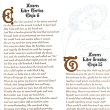
Tudoresque was introduced by Figgins in 1847.
Shown in a single Two-line double pica (≈44pt) size [Gray
1976].
Bruce showed a
single Double small-pica (≈22pt) size as Medieval
[1869
Bruce specimen] which is different from Figgins’s ≈44pt in the
details and the amount of ornamentation.
MacKellar,
Smiths & Jordan showed Medieval in three sizes;
Two-line pica (≈24pt), Two-line English (≈28pt), and Four-line
small pica (≈44pt); with considerable differences across them
[1878
specimen]. While the largest size appears to match Figgins’s
cut, the smallest appears to match Bruce’s. Continued by ATF as Mediæval
No. 10 [c.1897
specimen]. Also cast by MacKellar,
Smiths & Jordan as Medieval No. 40 and by
Enschedé as
Renaissance Schrift Serie 2 [Reichardt
2011]. Reichardt also mentions Schiller Series by
Barnhart
Brothers & Spindler, but that’s a version of Tudor
Text.
Saxe shows a 28pt size as “Medieval [Figgins] recut by
Ihlenburg” [Saxe].
Note that the credit might be in error – Ihlenburg cut
Medieval
Text (1870), an unrelated design for MacKellar,
Smiths & Jordan.
Solotype had a phototype adapatation of the ≈44pt
size More…
Tudoresque was introduced by Figgins in 1847. Shown in a single Two-line double pica (≈44pt) size [Gray 1976].
Bruce showed a single Double small-pica (≈22pt) size as Medieval [1869 Bruce specimen] which is different from Figgins’s ≈44pt in the details and the amount of ornamentation.
MacKellar, Smiths & Jordan showed Medieval in three sizes; Two-line pica (≈24pt), Two-line English (≈28pt), and Four-line small pica (≈44pt); with considerable differences across them [1878 specimen]. While the largest size appears to match Figgins’s cut, the smallest appears to match Bruce’s. Continued by ATF as Mediæval No. 10 [c.1897 specimen]. Also cast by MacKellar, Smiths & Jordan as Medieval No. 40 and by Enschedé as Renaissance Schrift Serie 2 [Reichardt 2011]. Reichardt also mentions Schiller Series by Barnhart Brothers & Spindler, but that’s a version of Tudor Text.
Saxe shows a 28pt size as “Medieval [Figgins] recut by Ihlenburg” [Saxe]. Note that the credit might be in error – Ihlenburg cut Medieval Text (1870), an unrelated design for MacKellar, Smiths & Jordan.
Solotype had a phototype adapatation of the ≈44pt size as Medieval, with the lowercase borrowed from the similar Memorial(?) [Gothic and Old English Alphabets, 1984]. Later shown with the correct lowercase [Solo 1992].
MFC Hills Medieval is a digital interpretation of the ≈44pt size as shown in the 1882 edition of Hill’s Manual of Social and Business Forms, and is used for the sample.
Not to be confused with Tudoresque, a name used in the United States for an unrelated blackletter design, see Ecclesiastic.


