
Bruce Springsteen – Born to Run (album and 40th anniversary poster)

“For the record, the typeface I used was Lightline Gothic. I wanted a typeface I could use large but which would not impose itself on the photo.” — John Berg, Backstreets News
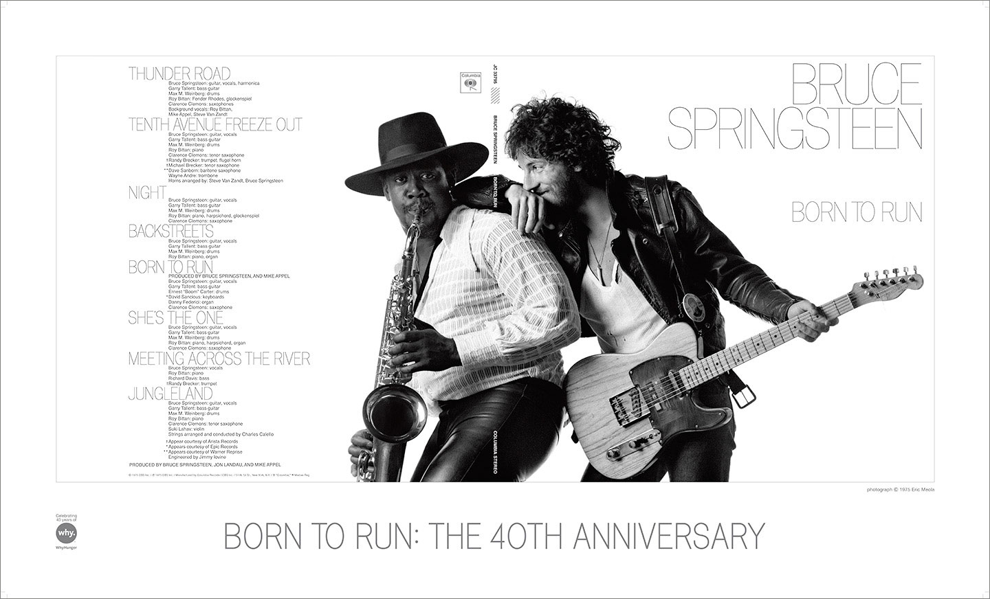
40th anniversary poster by Dave Bett.
“The gatefold album cover was originally designed by legendary art director John Berg, who was at Columbia Records from 1961 to 1985. For the new remastered edition, Bett had the challenge of recreating a classic: ‘When we were reworking the cover art and packaging, there was no exact match for that typeface anymore, which originally had been done in the days of going to a typesetter, pre-Mac. We worked with a typographer to recreate the alphabet from scratch, paying special care to match the letterforms and kerning.’” — Backstreet Records

John Berg with the 40th anniversary poster.


