Konst & Teknik (2015)
The Stockholm studio reaches a new maturity with a portfolio site as thoughtful and attractive as their work.
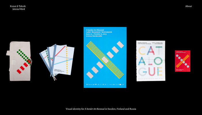
Konst & Teknik’s latest site is exactly how I like to see a design portfolio presented online: straightforward navigation. No hocus-pocus. Let the work do the talking.
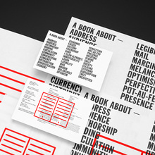
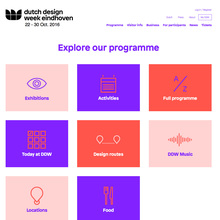
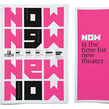
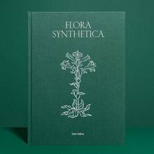
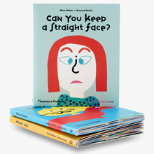
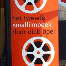
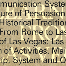
The simple framework is deceptive, however. Each item’s photography and presentation is carefully considered, with no uniform treatment, and an image grid (if there is one) flexible enough to show each work in its best light. See the interior spread of a book with a cover shot overlaid on top, a website shown via a quadrant of views, or a shop logo side-by-side with a photo of the retail space. I only bemoan the lack of individual URLs so I can link to each of the projects.
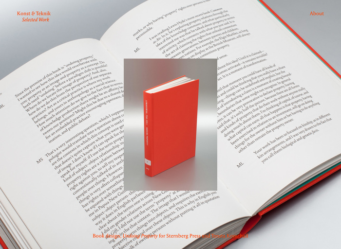
Nice way to show a book, inside and out. The red caption is a little rough to decipher, though.
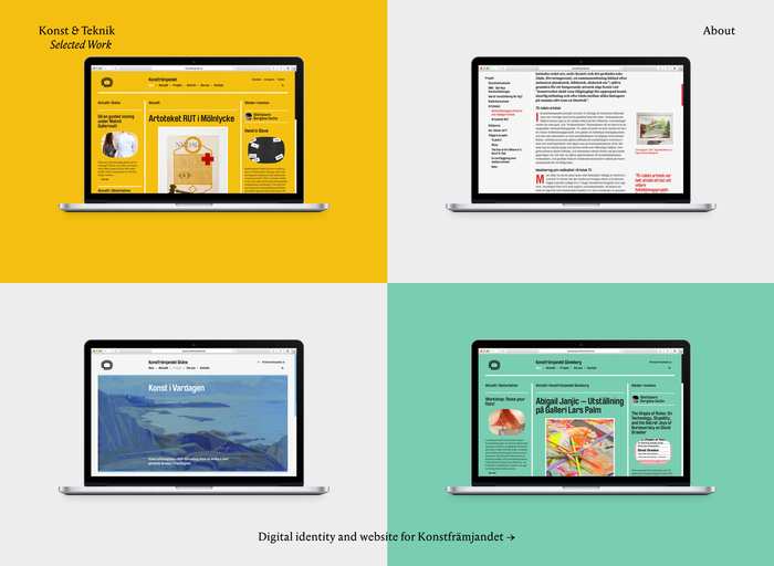
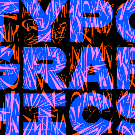
Some projects get a single image, while others require a set. The variability dispels any notion that the site is powered by automatic template.


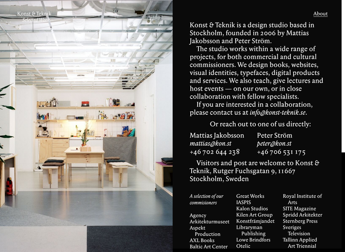
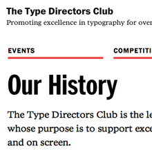
The typeface is Anselm Serif, a typeface meant for text, but that is so peculiar most designers probably shy away. This is a shame, because it is such rational, reader-friendly choice compared to recent artschool types that are weird just for the sake of being weird. And, despite its eccentricities, Anselm is so readable here — even at 14–18px. It helps that Konst & Teknik wisely chose a family with optical sizes; Anselm Ten has the heft and spacing to withstand this diminutive setting on screen, yet it loses none of its curious flavor.
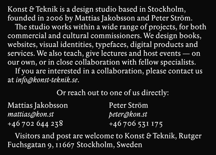
We’ve featured plenty of Konst & Teknik stuff at Fonts In Use over the years. In all, their new site personifies the firm well. It’s a mature design studio with a diverse array of professional work. It’s also a group of designers that isn’t afraid to be a little odd and have some fun — not as inside jokes, but in the service of content and audience.
Typefaces
Formats
- Web (3346)
Topics
- Graphic Design (2193)
Designers/Agencies
- Konst & Teknik (11)
Tagged with
- portfolios (437)
- alternate glyphs (771)
- one typeface (1349)





















3 Comments on “Konst & Teknik (2015)”
I thought I could click into some more details of each item, but clearly no? The little hand cursor is a bit confusing, because it’s not diving into the item, but going to the next one.
Peiran, once you zoom, you can cycle between all the full-size images in this post. The hand cursor that appears after zooming an image is a little confusing, perhaps, but I’m not sure what you mean by “click into some more details of each item” — all the details on this Use are found here on this page.
@Stephen Coles:
Oh, I am not referring to fontsinuse, but the Konst & Teknik website. Normally I would expect a separate page with more detail / process after I click on the full-screen image of each portfolio piece, but after quite a while I finally understood that there was no detail page, but only a full-screen image gallery. The cursor-hand implies hyperlink that should take the user to another page, but clearly not so.
If I were to improve it, I would change the cursor shape into right and left arrows to avoid confusion—it very much seems like there’re two giant, transparent divs taking 50% width of the viewport.