
Line & Jo
Contributed by Gareth Hague on Jan 6th, 2016. Artwork published in
.
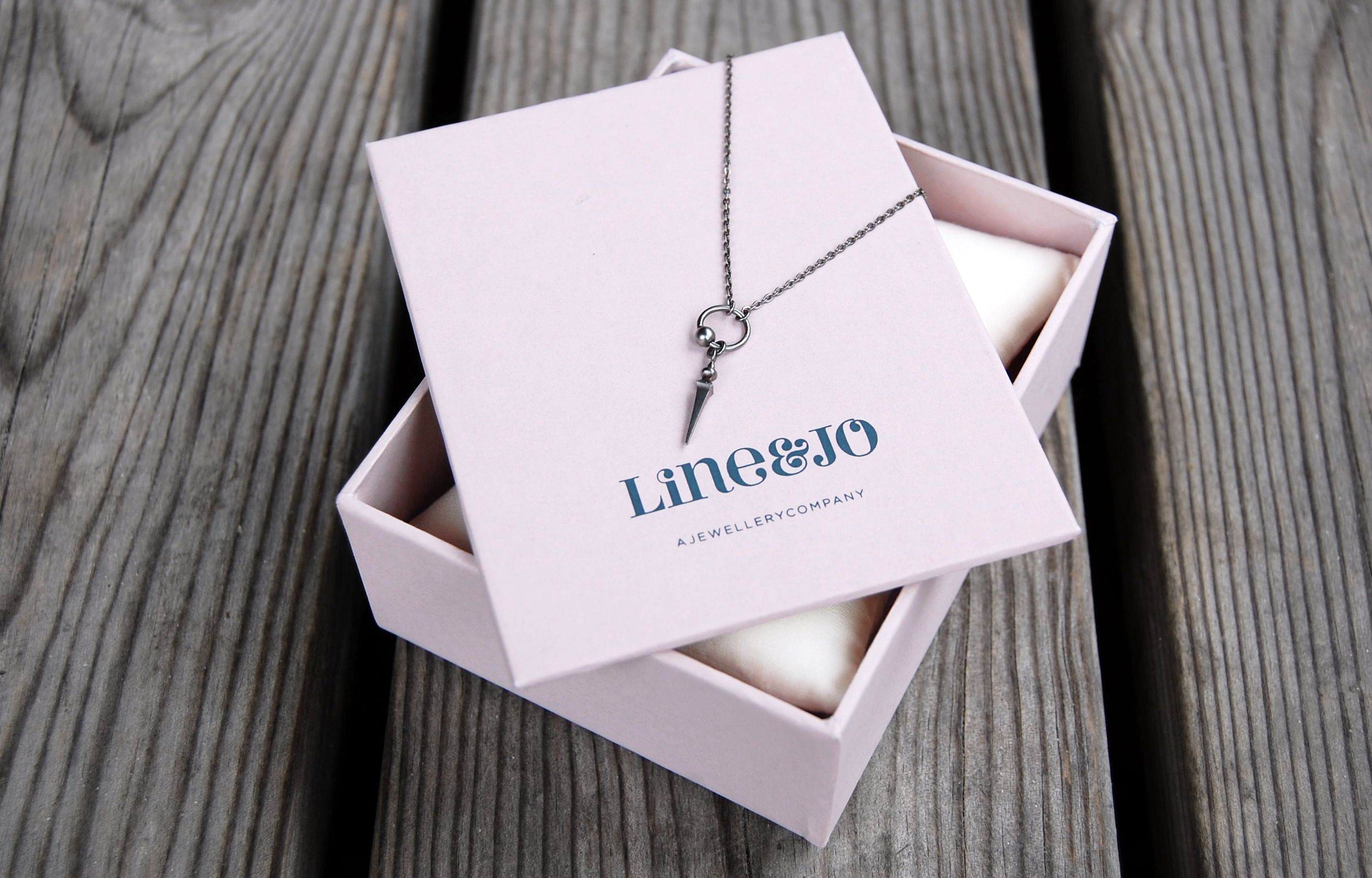
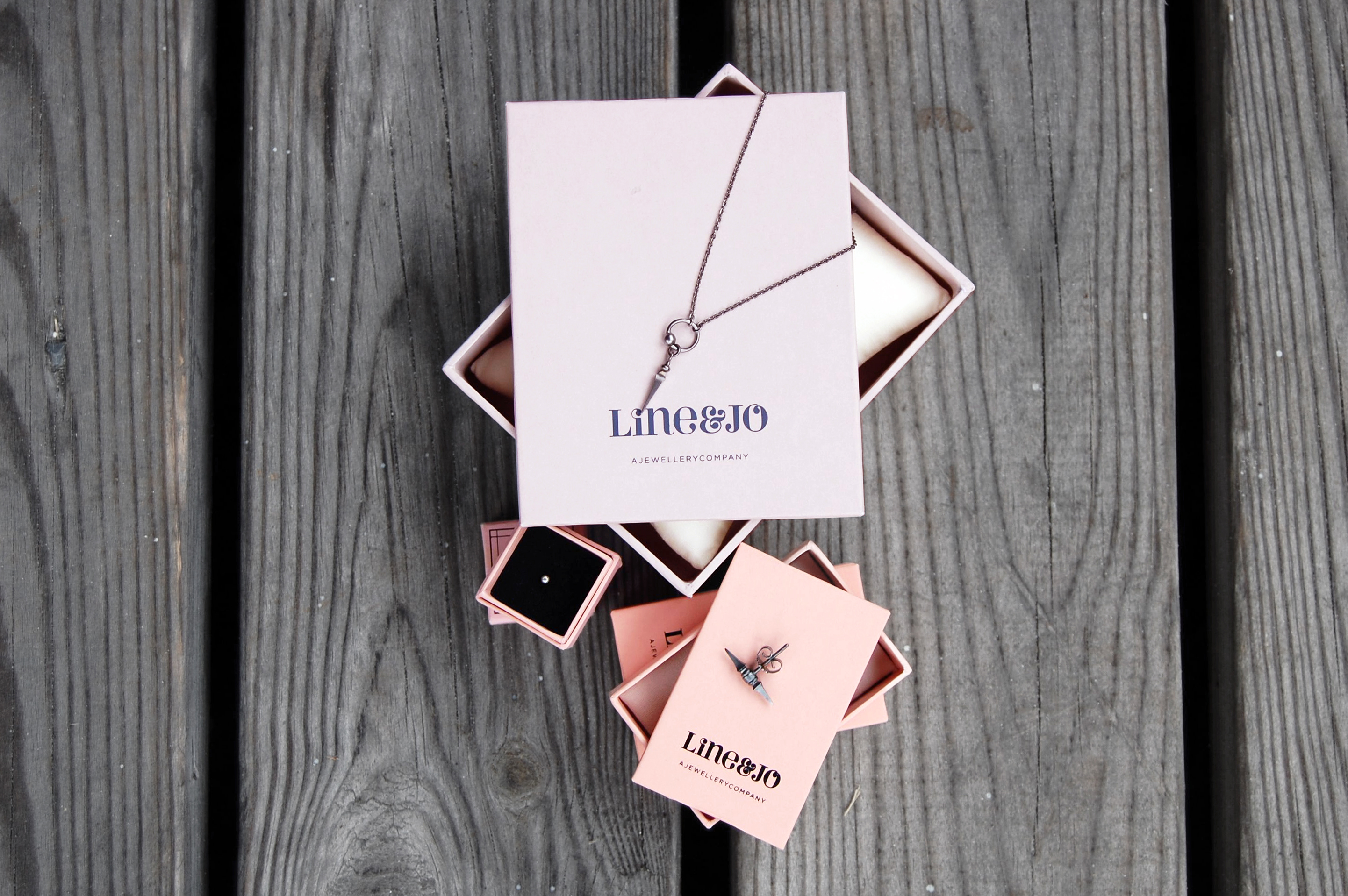
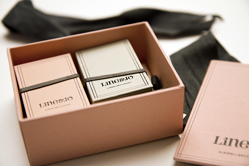
Line & Jo are a jewellery company based in Denmark. it is a brand –
that unites cool sharpness with beautiful elegance.
Perla is used for the logotype. The use of decorative alternate characters such as the i and o (flipped vertically) is balanced by the simpler L, N and J, and the minimal layout and elegant use of colour.

Line & Jo. License: All Rights Reserved.

")


 brand")


