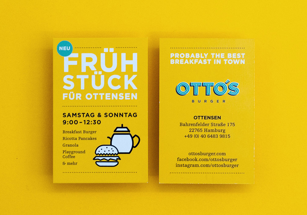
An independent archive of typography.
to participate.
Topics
Formats
Typefaces

Otto’s Burger

Contributed by Lecter Johnson on Mar 23rd, 2016. Artwork published in
circa 2015
.
    Otto’s Burger 1
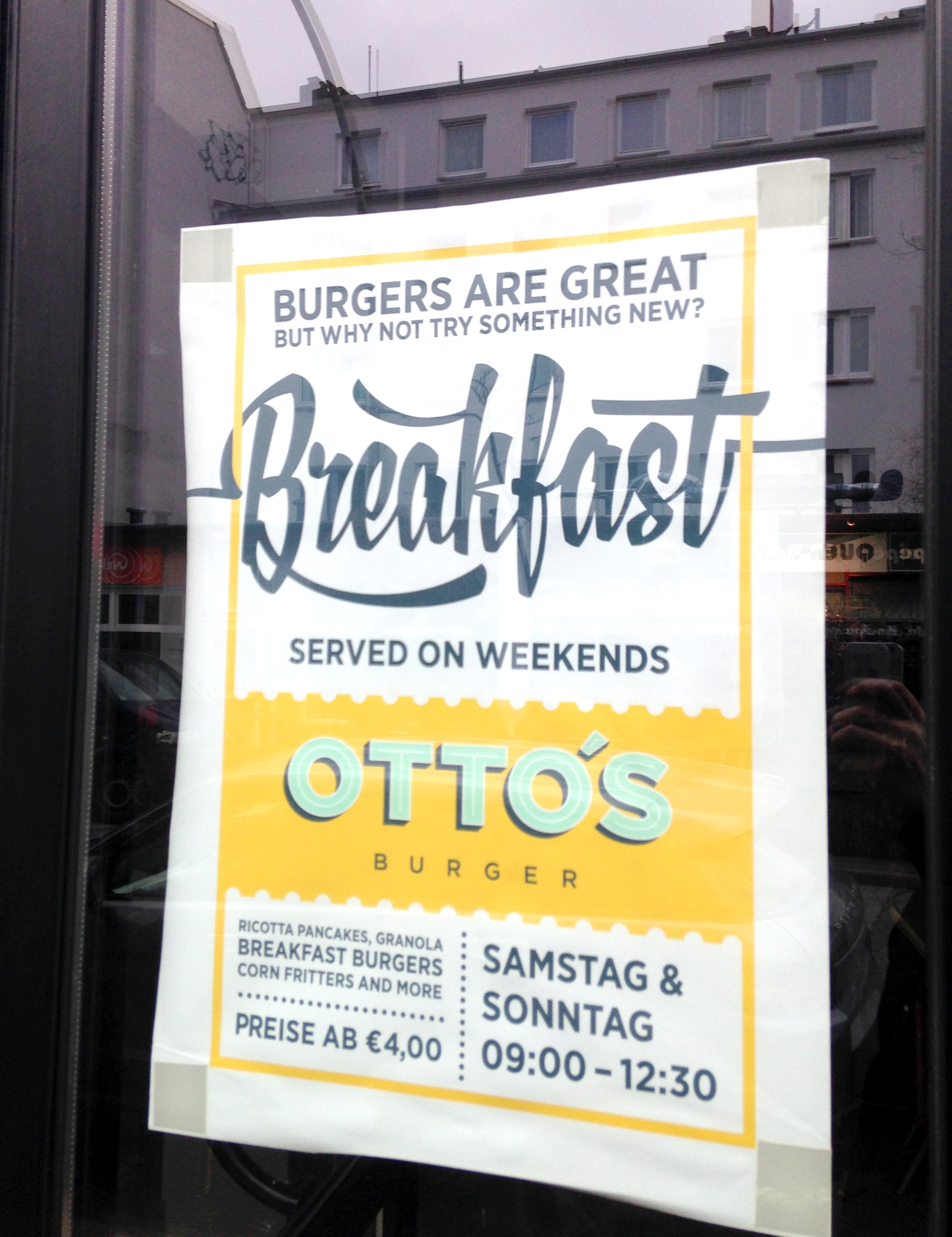
    Photo: Lecter Johnson. License: All Rights Reserved.

    Poster, menu and business cards for the new breakfast offer from Otto’s Burger. See more images on the Hochgestalten website.

    Otto’s Burger 2
    Source: www.hochgestalten.de Hochgestalten. License: All Rights Reserved.
    Egyptienne F doesn’t have the desired oldstyle figures, so the designers simply used the numerals from Chaparral. That’s unconventional, but as the two faces harmonize in overall style and weight, it is a clever compromise.
    Source: www.hochgestalten.de Hochgestalten. License: All Rights Reserved.

    Egyptienne F doesn’t have the desired oldstyle figures, so the designers simply used the numerals from Chaparral. That’s unconventional, but as the two faces harmonize in overall style and weight, it is a clever compromise.

    Gotham doesn’t offer compact umlauts, so the ‘R’ had to pull in its leg.
    Source: www.hochgestalten.de Hochgestalten (cropped). License: All Rights Reserved.

    Gotham doesn’t offer compact umlauts, so the ‘R’ had to pull in its leg.

    Typefaces

    • XXII YeahScript
    • Gotham
    • Egyptienne F
    • Chaparral

    Formats

    Topics

    Designers/Agencies

    Artwork location

    Post a comment