
Freak Festival
Contributed by Ignacio Pazzaglia on Apr 2nd, 2016. Artwork published in
circa December 2012
.
Source: www.gonni.com.ar Photo: Ignacio Pazzaglia. License: All Rights Reserved. Artwork by Ignacio Pazzaglia.
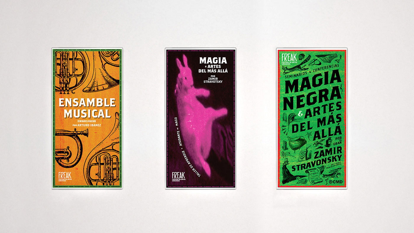
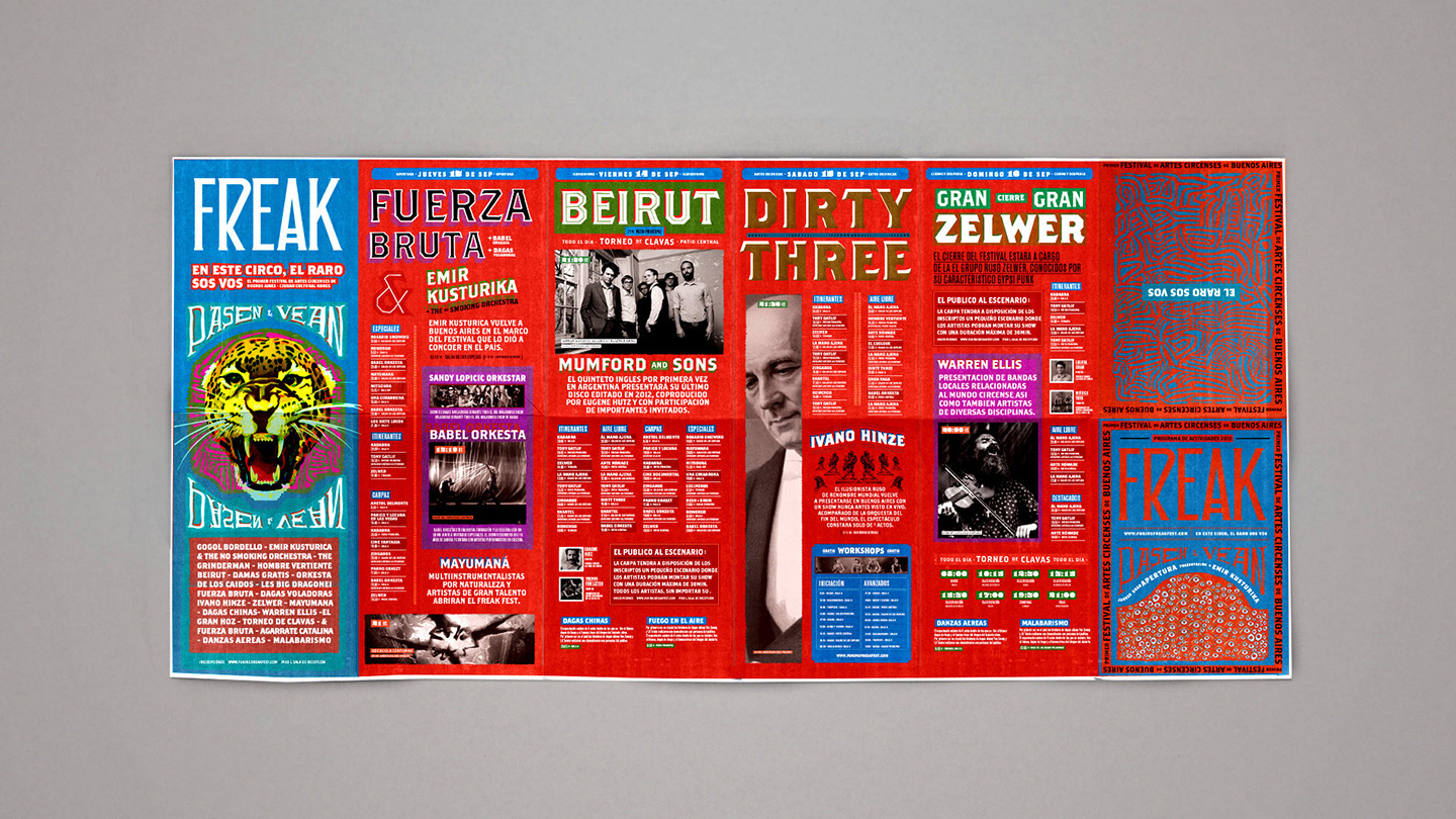
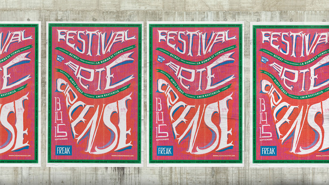
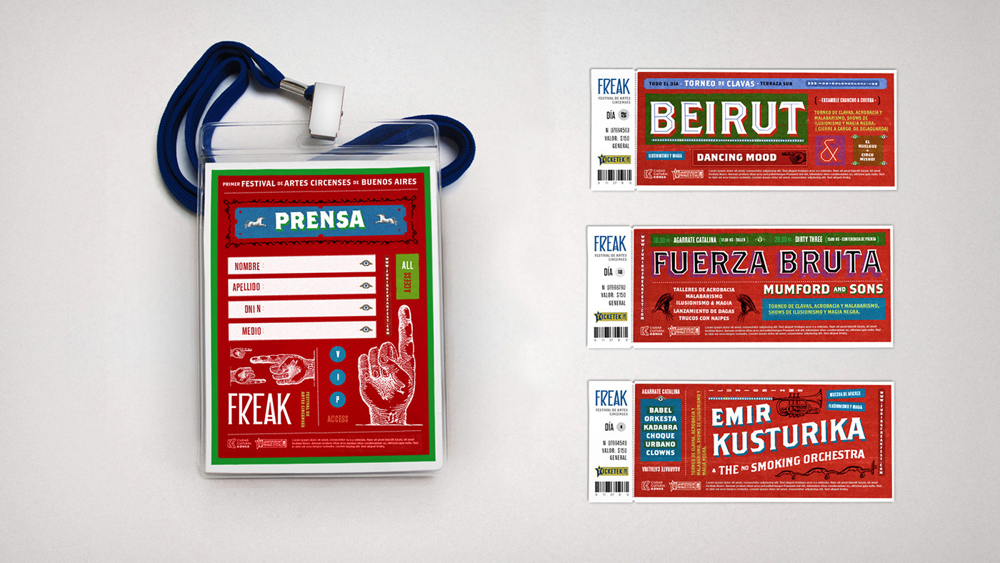
Freak is a three days festival born from the mix of balkan music, old circus arts and live performances. The result is a mix of vintage circus posters, psychedelic colors and type combinations.
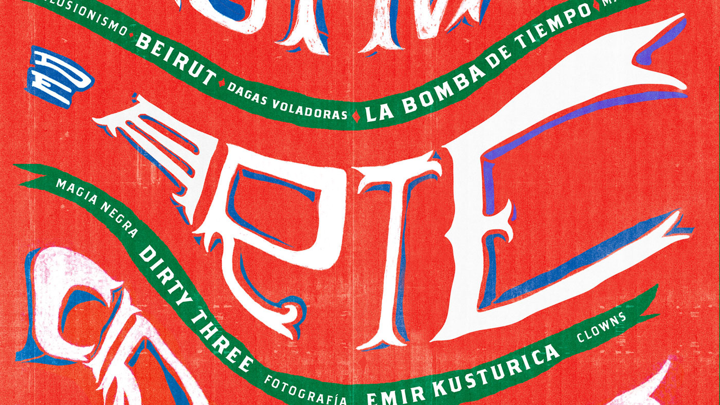
The name of the festival is a reference to the old circus where “shows phenomena” were part of the show. In this case the anomaly / alteration in the letter “A” is a nod to the old show. This concept is accomplished by a particular and deformed typographical set that give the event its own identity.
Source: www.gonni.com.ar Photo: Ignacio Pazzaglia. License: All Rights Reserved. Artwork by Ignacio Pazzaglia.
Source: www.gonni.com.ar Photo: Ignacio Pazzaglia. License: All Rights Reserved. Artwork by Ignacio Pazzaglia.
Source: www.gonni.com.ar Photo: Ignacio Pazzaglia. License: All Rights Reserved. Artwork by Ignacio Pazzaglia.
Source: www.gonni.com.ar Photo: Ignacio Pazzaglia. License: All Rights Reserved. Artwork by Ignacio Pazzaglia.
Source: www.gonni.com.ar Photo: Ignacio Pazzaglia. License: All Rights Reserved. Artwork by Ignacio Pazzaglia.
Source: www.gonni.com.ar Photo: Ignacio Pazzaglia. License: All Rights Reserved. Artwork by Ignacio Pazzaglia.

Source: www.gonni.com.ar Photo: Ignacio Pazzaglia. License: All Rights Reserved. Artwork by Ignacio Pazzaglia.

Source: www.gonni.com.ar Photo: Ignacio Pazzaglia. License: All Rights Reserved. Artwork by Ignacio Pazzaglia.

Source: www.gonni.com.ar Photo: Ignacio Pazzaglia. License: All Rights Reserved. Artwork by Ignacio Pazzaglia.


")
")


")
1 Comment on “Freak Festival”
The logo appears to be based on Carouselambra, Ray Larabie’s “tribute to the lettering on Led Zeppelin’s Houses of the Holy album sleeve” [Typodermic] (1973, designed by Hipgnosis), which in turn references the work of Charles Rennie Mackintosh.