
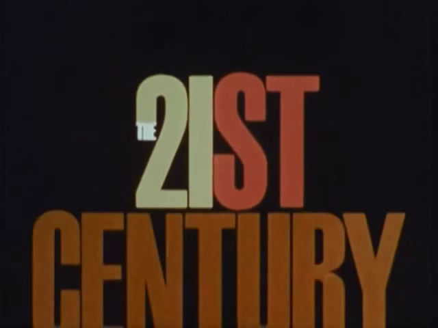
The 21st Century titles
Contributed by Stephen Coles on Apr 13th, 2016. Artwork published in
.
© CBS Television. License: All Rights Reserved.
The Twenty-First Century was a CBS documentary series hosted by Walter Cronkite that aired 1967–70. Focusing on modern technology, science, and predictions about the future, the show was a sequel to The Twentieth Century which covered historical events.
The logo and opening titles are set in animated Schmalfette Grotesk, while end credits used a mix (see two shapes of ‘R’) of unidentified compressed grots.
Thanks to Jessica Svendsen for the tip!


End credits from Surviving in Space, a 1968 episode.
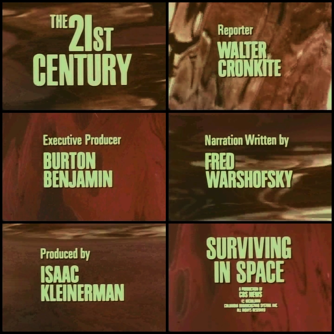
Why does Walter get his own ‘R’?


")


 TV series titles")


")


4 Comments on “The 21st Century titles”
I loved this show when I was a kid. Don’t really recall these titles so much as the “music” though.
I believe the sequence was designed by Lou Dorfsman. It is included as one of the on-air promotions in his monograph “Dorfsman & CBS.”
See image 5: nyti.ms/1qJYZxq
Thank you, Jessica! Added.
Thanks Jessica! Saved me a google search.