
The Sonnets of William Shakespeare, Cassell & Company Ltd
Contributed by Florian Hardwig on Apr 23rd, 2016. Artwork published in
.
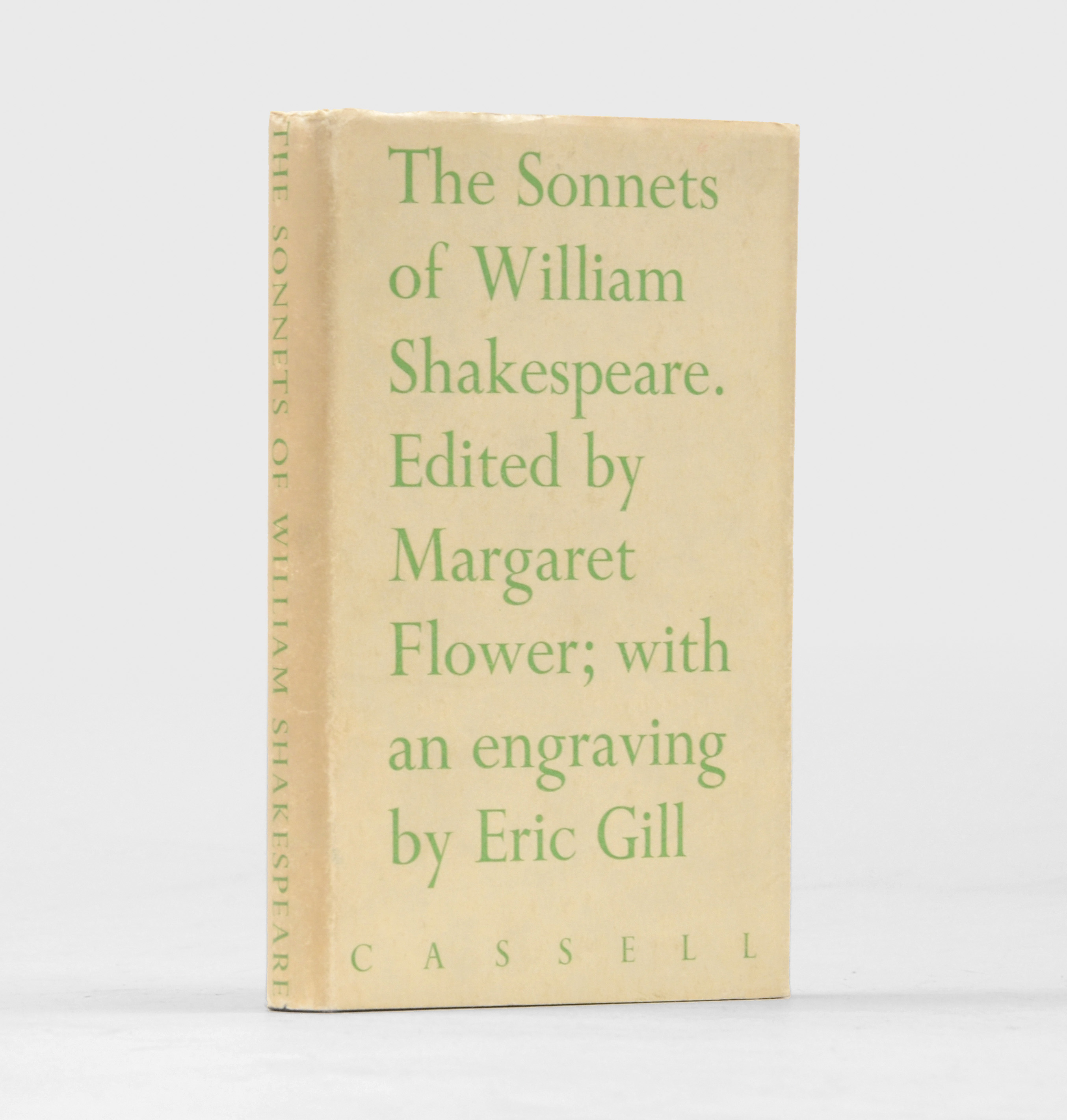
The Sonnets of William Shakespeare. Edited by Margaret Flower; with an engraving by Eric Gill. London: Cassell & Company Ltd, 1933.
First edition thus, first impression. One of a limited edition of 500 copies. This copy from the library of Eric Gill’s brother Evan, with his bookplate to the front pastedown. A lovely copy of this beautifully-produced edition of the sonnets. Scarce in the jacket.
It’s not clear whether Eric Gill is responsible for the book design and the jacket, too.


")


 movie poster")


")


3 Comments on “The Sonnets of William Shakespeare, Cassell & Company Ltd”
Really beautiful use of an almost upright italic that I don’t recognise on the title page, too. Whatever it is, it looks lovely, and I like how the handwriting feel of the lower-case complements the upright capitals in alternating lines.
(As for identification, it has a single-storey 'a’ and a non-descending 'f’, which is an unusual mix of choices. With a single-storey 'g’ too, it doesn’t seem to be Bembo Condensed Italic or Blado or Centaur Italic or Lutetia, unless there was some weird custom version of them floating around.)
Joanna Italic (with caps from the Roman*) would bring you close. It has the single-storey ‘a’ and the non-descending ‘f’. Joanna’s release date is typically given as 1937, but that refers to the Monotype version, series 478, which is a recut of the earlier private version produced for Hague & Gill by H.W. Caslon & Co. Ltd.
Monotype Recorder Vol. 41 No. 3 from autumn 1958** mentions that Gill began the design of Joanna Italic as early as in 1930. The Caslon version was cut in 1931 and could have very well be used in a book designed by Gill in 1933. While “the roman was cut at Salfords directly from Caslon’s punches”, Monotype’s Italic was redesigned by Gill. This might explain minor differences.
*) Both an early showing of Joanna Italic from September 1930 in the Recorder issue as well as the Monotype specimen from 1937 show italic text with roman caps.
**) This number constitutes the first showing of series 478, after the exclusivity expired. The Monotype version initially was exclusive to J.M. Dent & Sons, who had acquired Hague & Gill, along with the rights to Joanna. [Fonts.com]
Wow, good thinking! I hadn’t considered that possibility as the date seemed to be too early for Joanna being used outside Hague and Gill. But on WorldCat it says that this book was actually printed by Hague & Gill and issued by Cassell, and all the letterforms match up perfectly.
No, Gill didn’t originally design italic capitals for Joanna – (“in accordance with notable precendents”, i.e. the first italics, says Harling, though that may be rationalising it) – they were added by Monotype later.