Stewart & Holmes Drug Co.
Norman McKnight of Philoxenia Press in Berkeley, California writes:
“While visiting the Portland, Oregon paper show a few years ago I located a small trove of printer’s samples or unused pharmacy stock for a local druggist in Walla Walla, Washington. … I later found this long, thin envelope measuring 2.25 x 9 inches. Its use is unknown, but it would have been restricted by its measurement; perhaps to package a thermometer. … The additional traits de plume above & below the text unit are a nice touch showing how much the printer cared to enhance his work. This is job printing at its finest. The printing is raised, i.e. the ink was dusted with a powder which, when placed in a small oven for the purpose, caused the ink to rise slightly. This was the economical answer the the tactile way in which copperplate engraving imparted elegance.” — Ephimeros
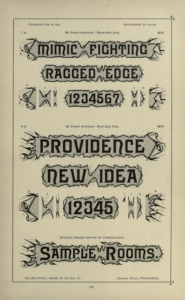
The lettering, background, and torn paper effect are all produced by an unusually elaborate typeface called Stipple by the most prolific 19th-century designer of ornamental type, Herman Ihlenberg. He patented it in 1890, and Mackellar, Smiths & Jordan showed in their 1892 catalog, below.
Ihlenberg produced nearly 100 decorative typefaces from the 1860s to around 1905. Many of them are impressively detailed, but Stipple is as clever as it is ornate. The genious of the design is not in its variety of spacing material or left/right endcaps (just one option for each character in each size), or even in the way each character’s border organically aligns; the best trick is the busy background pattern that appears random and masks the seams where each piece begins and ends. Once the font is set properly, it isn’t immediately obvious to the reader that letter, background, and border are all part of each metal block. Only repeating characters give the structure away.
Formats
- Packaging (1399)
- Branding/Identity (4746)
Topics
- Retail/Shopping (673)
Tagged with
- drug stores (3)
- ephemera (32)
- logos (2686)
- envelopes (120)
- raised ink (1)
- artistic printing (6)
- 19th century (4)
- Victorian (23)
- job work (177)
Artwork location
- United States (6359)
- Washington (14)
- Walla Walla (1)





















6 Comments on “Stewart & Holmes Drug Co.”
This is from my family! Wow!
These were used for pens given to very special customers at Christmas time. I have many of the calendars they had made as well dating from 1885 to 1900.
What a fabulous find!
Great to know about the history of the font as I am a high school art teacher. I teach both Design and Computer graphics and am always interested in this type of information!
Thanks for your comment, Bretta! Please send us images of the pens and calendars if you can.
Ace revival developer Alan Prescott is nearly finished with a full-featured Stipple font complete with related ornaments and finials. It will soon be available for purchase:
forums.typeheritage.com/top…
Wonderful, thank you, Anna! I’ve added this info to our typeface page for Stipple. Is there a website where Alan’s fonts are made available for licensing?
The Stipple revival is finished!
forums.typeheritage.com/top…
It will soon be available for download at the related eCommerce site, bazaar.typeheritage.com (under construction). The target deadline is 12–31–18.
Thanks, Anna, and congrats, Alan! Good luck with the Bazaar!