
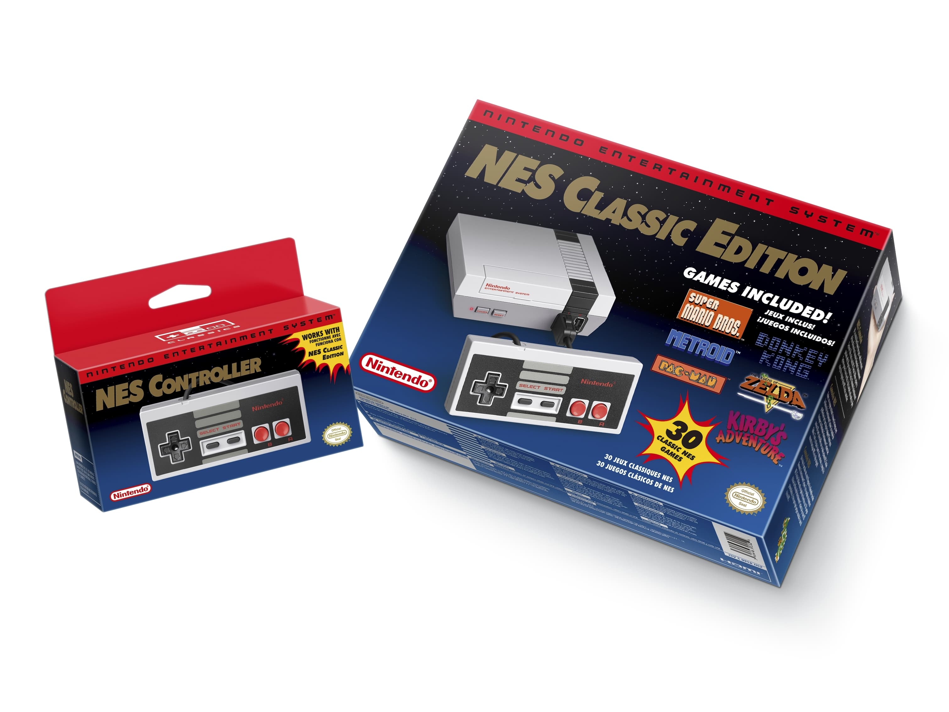
Nintendo Entertainment System NES Classic Edition packaging
Contributed by Choo Kwang Zhee on Aug 5th, 2016. Artwork published in
.

Nintendo. License: All Rights Reserved.
“A retro blast from the past” — faux small caps, every typographer’s nightmare! Can’t really complain about the price and the games though …


")


")


")

1 Comment on “Nintendo Entertainment System NES Classic Edition packaging”
As a sidenote, when I was making the digital Corporatus I had visited Nintendo’s NES Classic Mini website to see if there were any press or marketing materials available for public download and found that the vectors in use for the SVG versions of the logos (especially the logotyped “NINTENDO ENTERTAINMENT SYSTEM” and “CLASSICS” product line branding) on the site were…interestingly drawn.
I had back then reached the conclusion that they did not have access to or knowledge of a proper digital version of the font at the time, either AVPerth/Patrick Concannon’s or my own version (a third by Lyric Fonts on DeviantArt was made available the same weekend I originally submitted to MyFonts). I had also concluded that the Corporate typeface they used for the NES Remix game series was just really good tracing of a subset of the face that wasn’t originally digital (most likely scans of some of their older materials or something).