
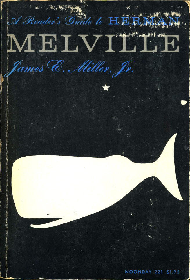
A Reader’s Guide to Herman Melville, First Edition
Contributed by Stephen Coles on Jul 25th, 2016. Artwork published in
.
Source: blog.typekit.com From the collection of Dr. Shelley Gruendler. License: All Rights Reserved.
While the cover designer for this paperback is unclear, the interior states “designed by Robin Fox”. The cover shows similarities to the work of Alvin Lustig. Perhaps Lustig’s work for Noonday in the 1950s set the tone for the publisher which was followed by this designer.
Source: articulo.mercadolibre.com.ve License: All Rights Reserved.
Source: articulo.mercadolibre.com.ve License: All Rights Reserved.

Source: articulo.mercadolibre.com.ve License: All Rights Reserved.


")


")


")


3 Comments on “A Reader’s Guide to Herman Melville, First Edition”
See Volta + herring. Also, I wonder what came first, the logo of Farrar, Straus and Cudahy (later Giroux), or the one for Fischer Bücherei (Wolf D. Zimmermann, 1952).
The Tales Behind the Branding 32 Storied Book Publishers
Thank you very much, Benjamin! That article is a treasure trove.