

The Garamond Types Considered in The Fleuron No. 5
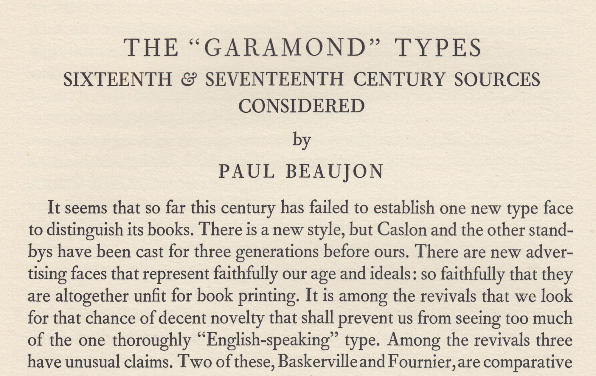
One of the most famous articles on the history of printing ever published is Beatrice Warde’s 1926 article in the Fleuron. Written under the pseudonym of “Paul Beaujon”, it proved that the “Garamond” Latin-alphabet typefaces in the collection of the Royal Printing office of Paris were not cut by Claude Garamond but by Jean Jannon, working more than fifty years later. Warde is critical of Jannon’s work, especially its eccentric italic in which the capitals have different slant angles.
The article was recently digitised by the French government, as part of its website on the history of Garamond and his work, and is still worth reading despite later research by Carter, Vervliet, and others proving some of its conclusions to be incorrect.
The font used is Barbou, Monotype’s more obscure attempt at digitising the eighteenth-century work of Pierre-Simon Fournier. It was not put into mass production, unlike their other “Fournier”, which became a common-ish book typeface in Britain around the 30s and 40s, and it hasn’t been digitised, although Stanley Morison preferred it – hence its appearance in his magazine. Monotype manuals distinguish it from their other try by its four-terminal lower-case ‘w’ and a slightly splayed 'M’. (Fournier itself seems to have rather dropped off the map in recent publishing, maybe because it doesn’t have a bold – if you wanted something like it but with one Berthold’s Bodoni Old Face is actually quite similar.)
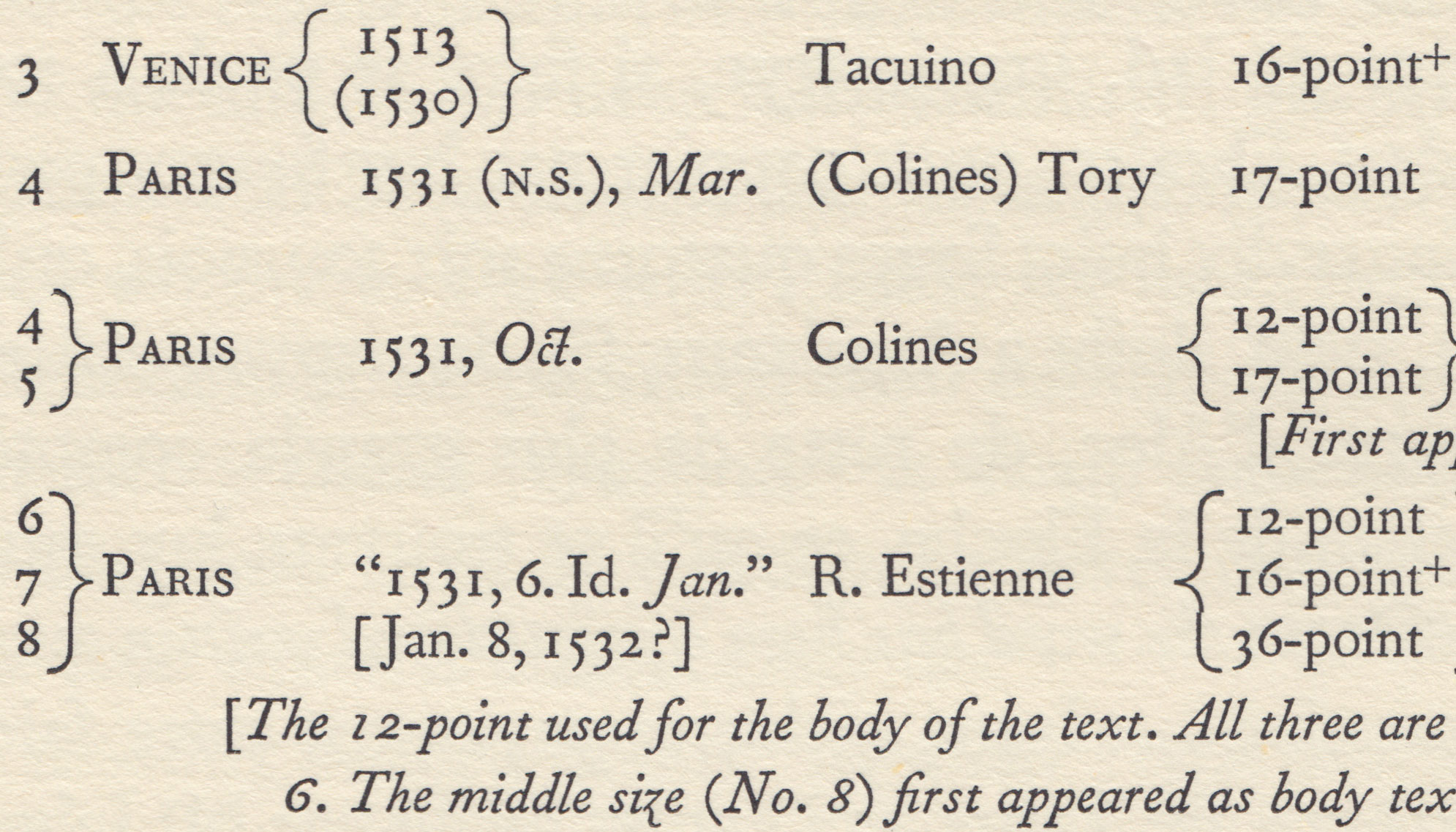
Besides a history of printing in France, Warde’s essay gives an assessment and specimen of many (all?) of the Garamond revivals then in existence. Based on Jannon comes that of her past employer American Type Founders (her colleague there, Henry Bullen, told her of his suspicions about this “Garamond”, saying that he had never seen it in a book from the right period), Monotype’s in America (Goudy’s “Garamont”) and in Britain (the one installed, in a horribly scrawny digitisation that emphasises all its most eccentric features, with Office). Based on Garamond’s work (or his contemporaries) come Linotype Granjon (her favourite), the Fonderie Ollière in Paris (never digitised?) and Stempel Garamond (she wished that they could recut its descenders longer than common line permitted).
Speaking 30 years later to the BBC, Warde commented: “I wanted a pen name. I wasn’t quite sure at that time (which is a long time ago) that women would be taken quite as respectfully. I thought that if I was going to have a pen name, I might as well have a man, and I took a Frenchman’s at that, to make it a little more mysterious.
And they all thought this learned Frenchman wrote English remarkably well. They were particularly interested that he was quoting Lewis Carroll, they didn’t think that many elderly Frenchmen knew how to quote from The Hunting of the Snark.”
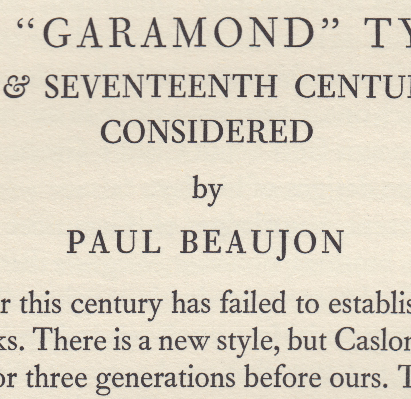
A closer look at that first page. Note that lovely four-terminal ‘w’. “GARAMOND” is set in Fournier, as Barbou was only cut in sizes up to 12pt.

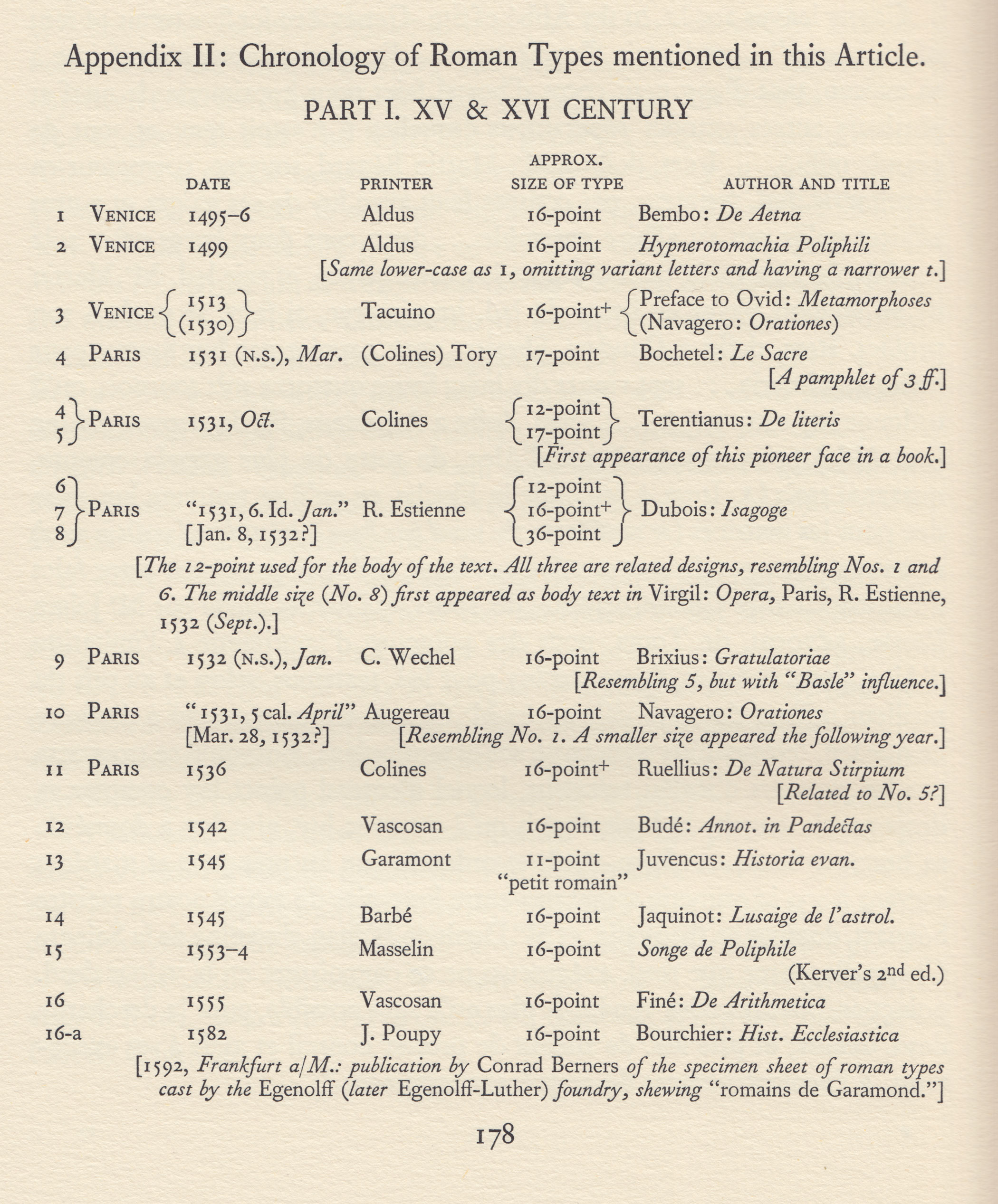
10pt Barbou is used for this table. The main text is set in 12pt.
10pt Barbou in detail. Note stressless zero (at top) and Fournier’s trademark italic ‘z’.
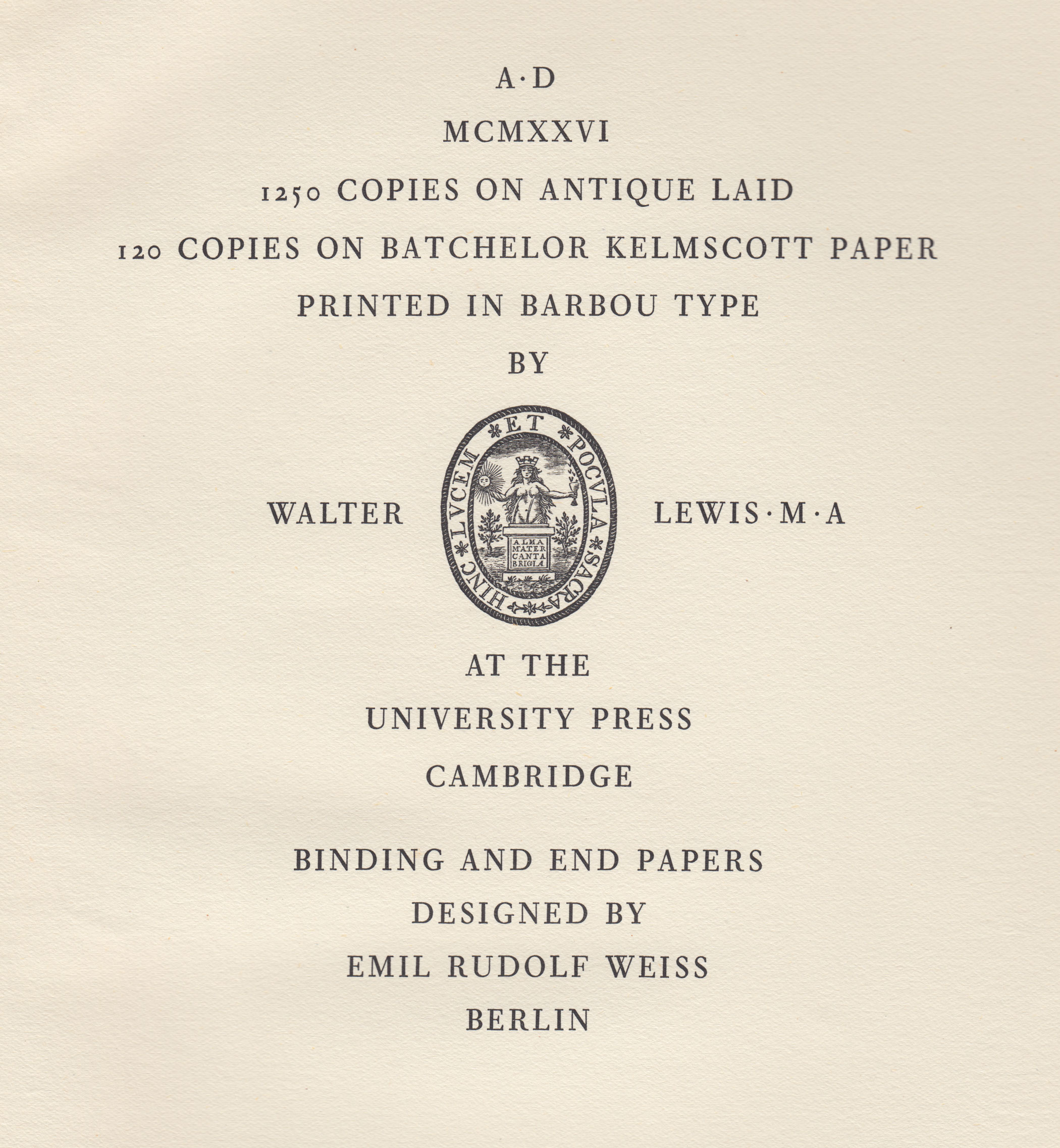
Colophon page from the end of this issue of The Fleuron.


")


")


2 Comments on “The Garamond Types Considered in The Fleuron No. 5”
Thanks for the images. The French government’s scan is a great service, but it’s beautiful to see the quality of the print in scans this good. And this was a rush-released addition to the magazine!
For anyone interested in getting a great view of Garamond’s actual work (and that of his contemporaries) in the best possible samples, The Palaeotypography of the French Renaissance by Hendrik Vervliet is as I understand it the state of the art. It’s particularly fascinating to see Robert Estienne’s very low x-height titling face (the balance of lower-case to the capitals in particular), quite unlike most “Garamond” display revivals.
I started getting interested in this when making a stab at rewriting the Wikipedia article on “Garamond”, but what rapidly became clear to me on reading academic histories on the topic is the extent to which Garamond/t was just one figure among many at period of rapid development in the art of printing. It’s only a few accidents of history, I think, that mean that we now call modern fonts in this style “Garamond” and not “Estienne”, “Constantin”, "Augereau" or “Hautin”.
This is food for my eyes.