An independent archive of typography.
to participate.
Topics
Formats
Typefaces

huna/k

Contributed by Judith Anna Rüther on Aug 24th, 2016. Artwork published in .
    huna/k 1
    Source: www.jac-gestaltung.de Photo: Judith Anna Rüther. Judith Anna Rüther, Hannes Woidich. License: All Rights Reserved. Artwork by Judith Anna Rüther.

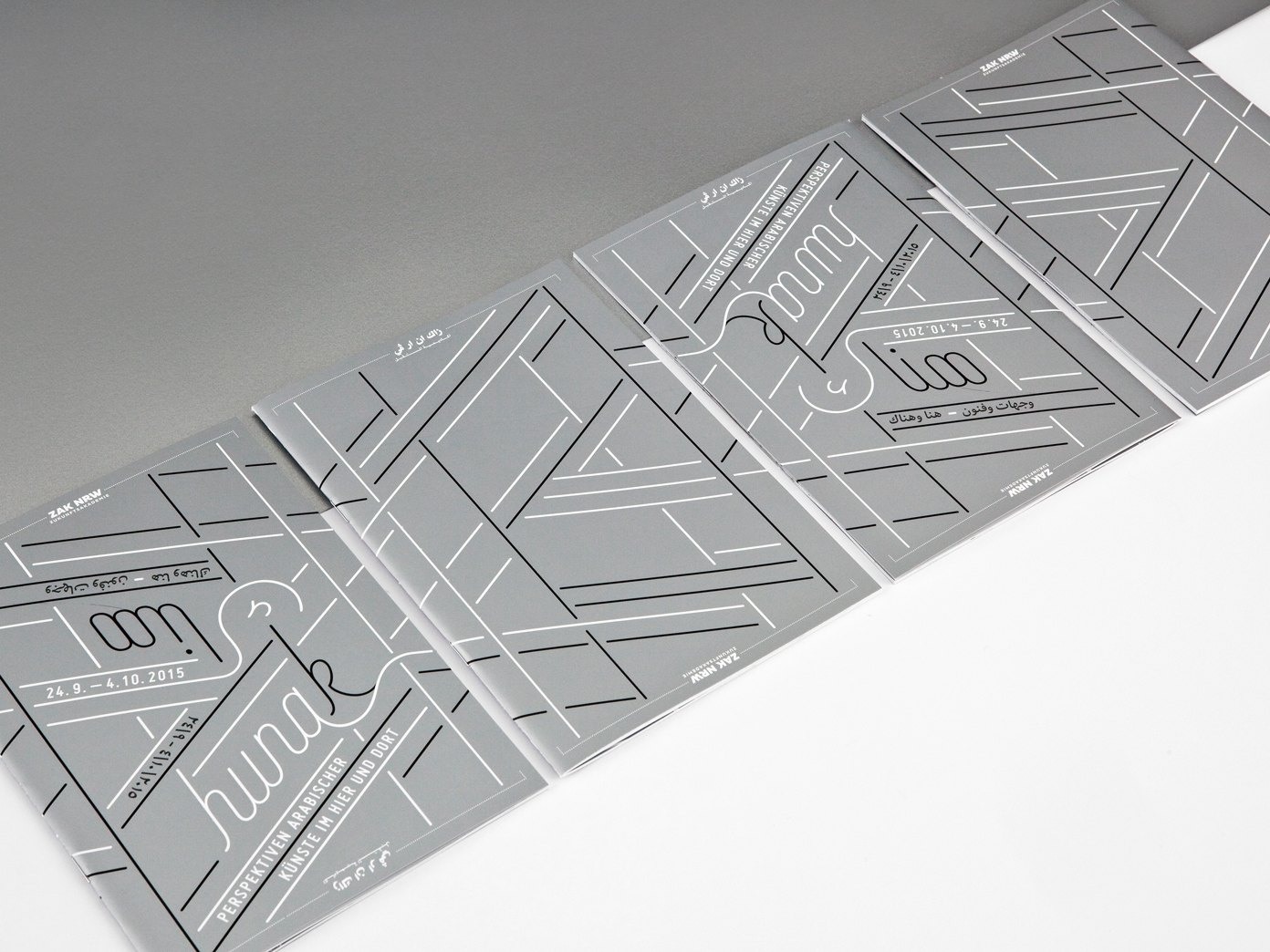
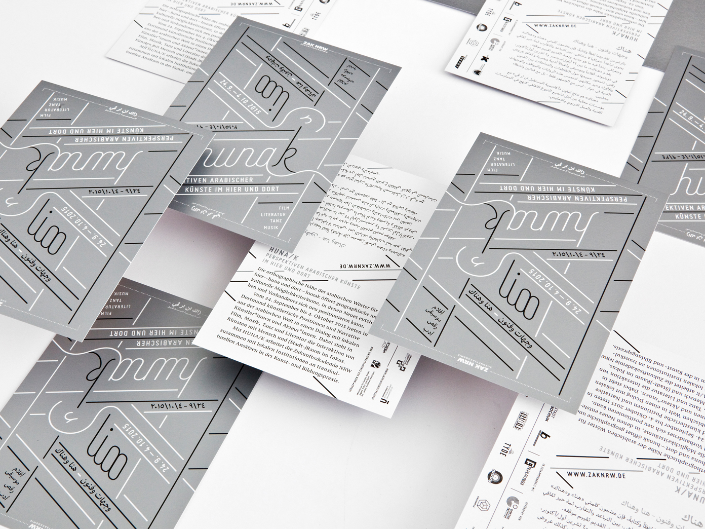
    In Arabic, the letter kaf (ك) is the only difference between here (huna) and there (hunak). The Arabic Culture Festival huna/k defines itself — quite literally — as a bridge between the Arab “there” and the “here” of the Western world. This transgression is visualized in the editorial design: the flyers, programs and posters are interlinked, once you put them side by side. The principle of merging “here” and “there” is also reflected in the mirror symmetry of the design, which always provides bilingual information: When turned upside down, the program can be read in the other language, and the pages browsed in the usual direction; from right to left in Arabic, or from left to right in German. Printed with silver spot color. Made in cooperation with Fadi Abdelnour.

    huna/k 2
    Source: www.jac-gestaltung.de Photo: Judith Anna Rüther. Judith Anna Rüther, Hannes Woidich. License: All Rights Reserved. Artwork by Judith Anna Rüther.
    huna/k 3
    Source: www.jac-gestaltung.de Photo: Judith Anna Rüther. Judith Anna Rüther, Hannes Woidich. License: All Rights Reserved. Artwork by Judith Anna Rüther.
    huna/k 4
    Source: www.jac-gestaltung.de Photo: Judith Anna Rüther. Judith Anna Rüther, Hannes Woidich. License: All Rights Reserved. Artwork by Judith Anna Rüther.
    huna/k 5
    Source: www.jac-gestaltung.de Photo: Judith Anna Rüther. Judith Anna Rüther, Hannes Woidich. License: All Rights Reserved. Artwork by Judith Anna Rüther.

    Typefaces

    • Nassim
    • Eskorte
    • Miso

    Formats

    Topics

    Designers/Agencies

    Artwork location

    Post a comment