
The Right to Fly, Pushkin Press/The London Library
A curiosity both for its content on theories of flight and its author, an important pioneer of French photography and skilled self-publicist, The Right to Fly indicates the interest taken by many at the time in the possibilities of human flight – and the Victorian passion for discoveries and invention.
The Right to Fly is part of ‘Found on the Shelves’, published with The London Library. The books in this series have been chosen to give a fascinating insight into the treasures that can be found while browsing in The London Library.
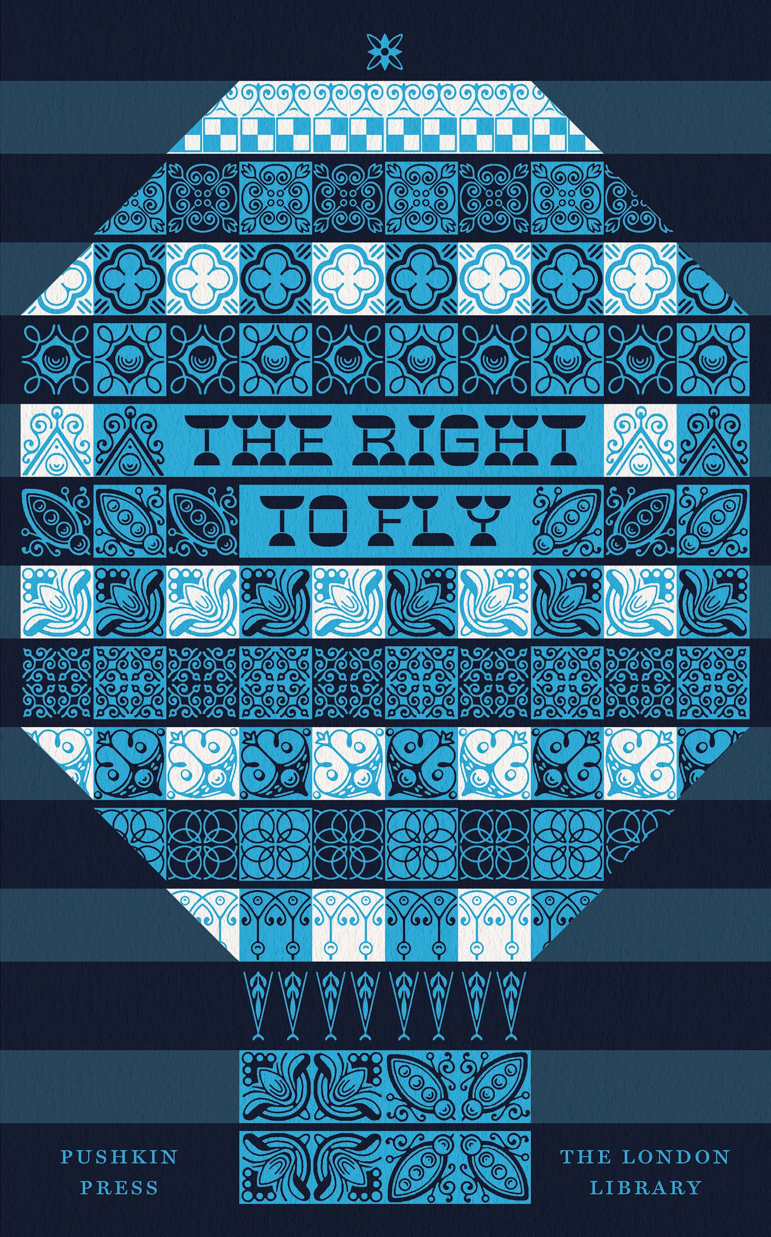
“For once I’m letting the image take the lead”, says David Pearson of his designs for this series. The typographic condiment here is Mortar, an extreme variation on the theme of French Clarendons or Italiennes. It was the third release in The Pyte Foundry’s ongoing weekly series of reimagined Victorian display typefaces. Although Ellmer Stefan’s freebies are limited in character set (caps, numerals, and a basic set of punctuation “only”, adding up to about 90 unique glyphs per font, which is impressive anyway, given the character of the project), they do contain kerning pairs. Kerning has been deactivated here (see ‘LY’), probably in order to be more authentic in regard to what was common with physical type in Victorian times.
See also On Corpulence: Feeding the Body and Feeding the Mind.


 Belvédère(s)")


