
Life in the Middle Ages by G.G. Coulton
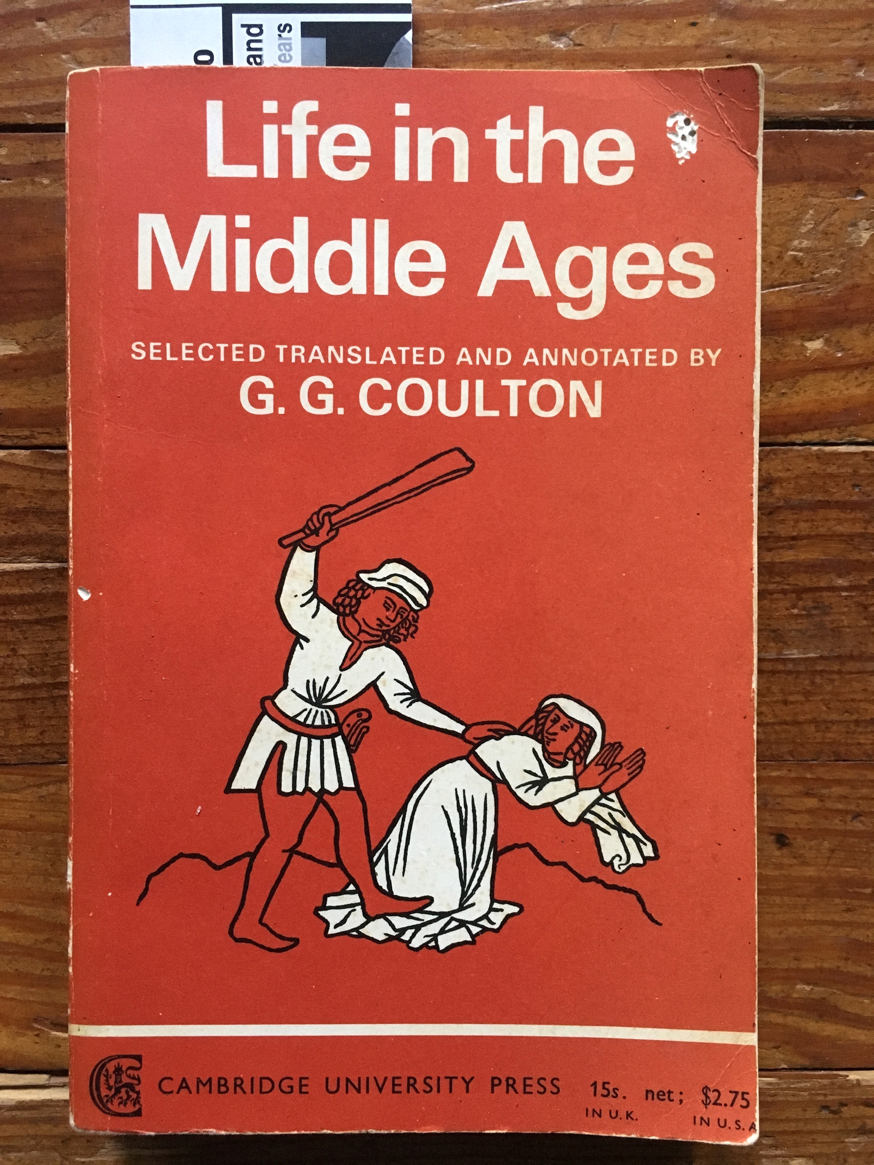
Univers was still a relatively recent addition to the typographic palette in the UK in 1967. This book was first published in a paperback edition during that year; as a text, it is much older … the first hardcover edition was published in 1910. Patrica Davey is credited on the book’s back cover as being the cover’s designer. Presumably, she designed this cover in 1967 for the paperback’s publication.
Interestingly enough, the text on the cover’s bottom portion, below the illustration, is all in Gill Sans. This must have been part of a paperback series in which all such text was set in Gill. Still, one wonders why Davey and CUP even bothered to set the upper text in Univers at all. Wouldn’t an all-Gill cover have been more unified, design-wise? Also, Gill’s personal views of family, life, and religion were all positively medieval. As such Gill Sans seems to be much more appropriate to the subject matter (and alas, the illustration) than Frutiger’s forward-looking Univers typeface.


")


")


1 Comment on “Life in the Middle Ages by G.G. Coulton”
I’ve seen quite a few cases of this kind of “we only had time to make half the cover modern”. Here’s a C.S. Lewis edition from Puffin. The cover is still Puffin’s favourite Monotype Garamond Italic, but Swiss modernism is starting to bleed in at the bottom.