
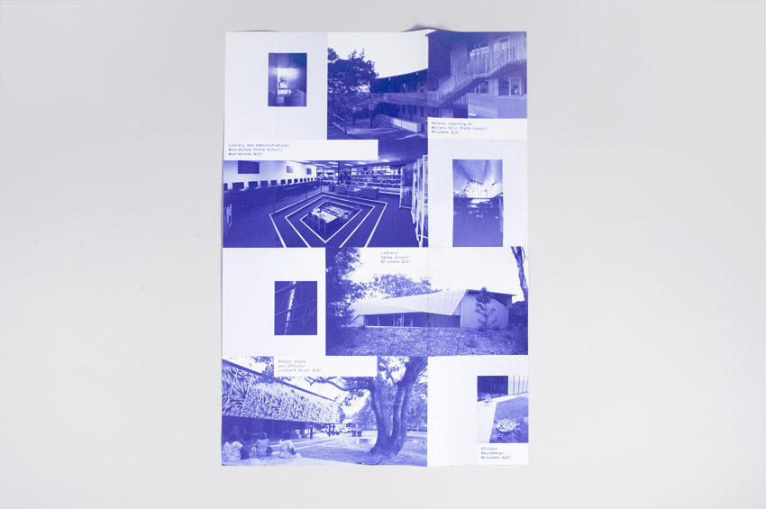
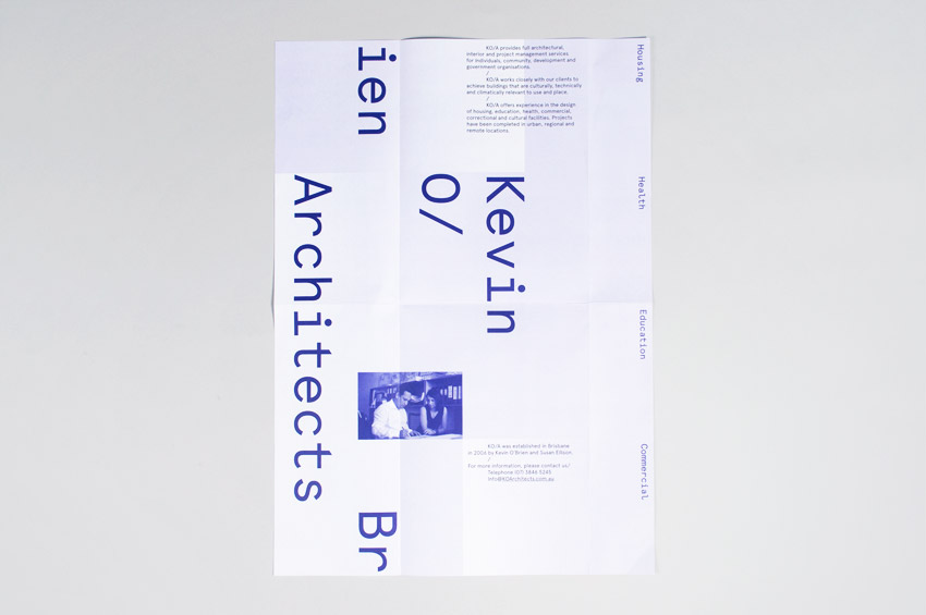
Kevin O’Brien Architects identity
Contributed by TheLetterD_ on Apr 30th, 2012. Artwork published in
.
Source: theletterd.com.au License: CC BY-NC-ND.
Source: theletterd.com.au License: CC BY-NC-ND.

Source: theletterd.com.au License: CC BY-NC-ND.


3 Comments on “Kevin O’Brien Architects identity”
That doesn’t look like Apercu to me. The “i” in apercu isn’t like that one at all.
There’s a mix of Aperçu Mono and Regular.