

Revue magazine
Contributed by Peiran Tan on Feb 6th, 2017. Artwork published in
circa 2017
.
Source: www.revuemagazine.fr License: All Rights Reserved.
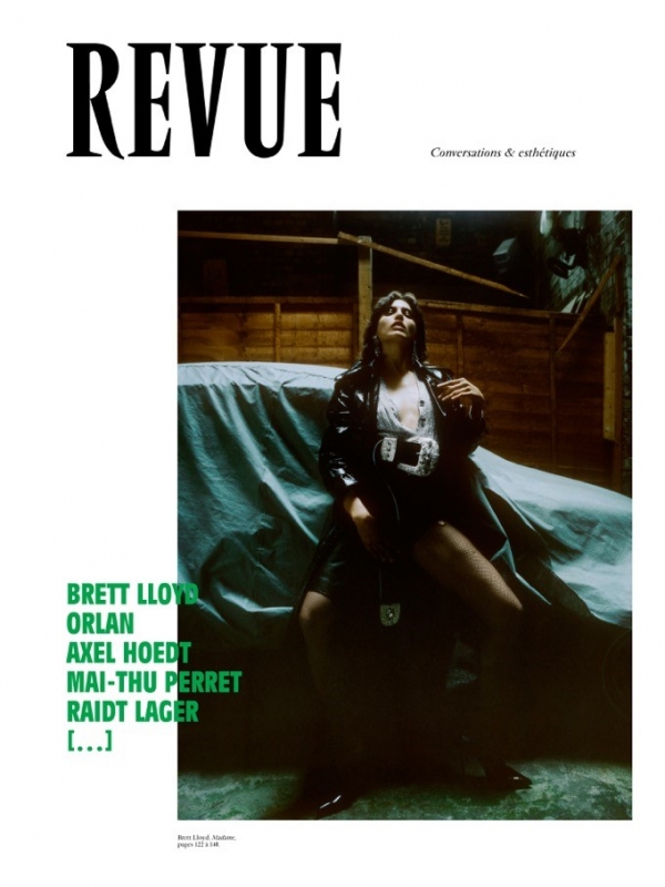
Revue is a French magazine on photography, music, architecture, literature, cinema and other arts. It has published two issues so far.
The typeface choices are of quintessential French taste—both Vendôme and Antique Olive are by the famous French type designer Roger Excoffon.
Source: www.revuemagazine.fr License: All Rights Reserved.
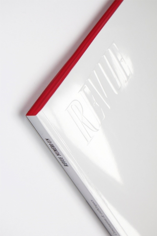
The physical magazine cover features only the blind embossed “REVUE” logo on white. Both issues’ reading edges are colored.

Source: www.revuemagazine.fr License: All Rights Reserved.
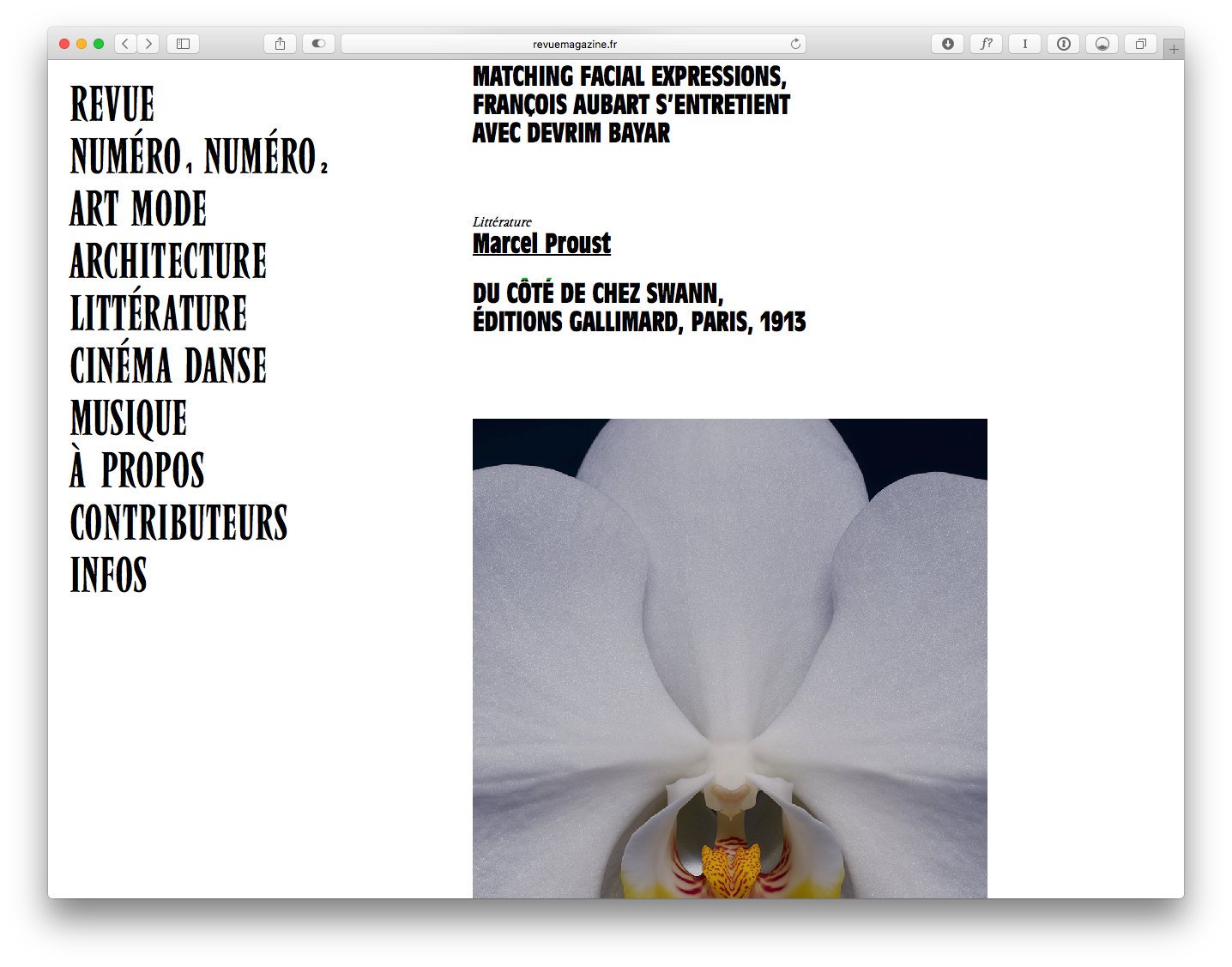
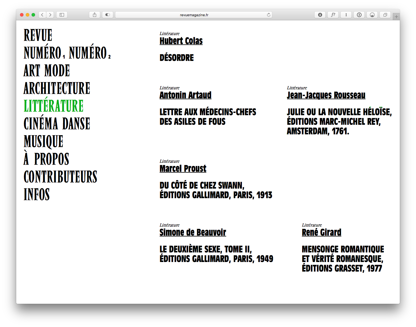
Sample spreads from Issue 1.
Source: www.revuemagazine.fr License: All Rights Reserved.
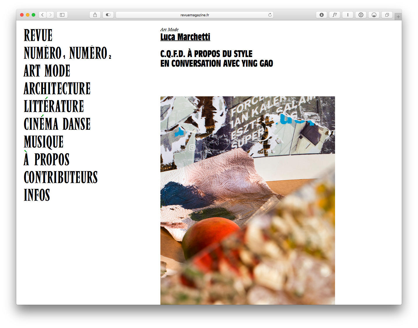
Antique Olive Bold Condensed is paired with Vendome Condensed in all caps.
Source: www.revuemagazine.fr License: All Rights Reserved.

Source: www.revuemagazine.fr License: All Rights Reserved.
Source: www.revuemagazine.fr License: All Rights Reserved.


")


")


1 Comment on “Revue magazine”
Cool find, Peiran! The type choices give the mag an individual appeal, and have a really nice affect from a distance. But do they really expect folks to consume long articles set in 16px Vendome italic? Again, I feel bad for the people who write this stuff and the audience who tries to read it.