
1970–71 Texas Almanac and State Industrial Guide
Contributed by LtCmmdr Bo Towers on Feb 22nd, 2017. Artwork published in
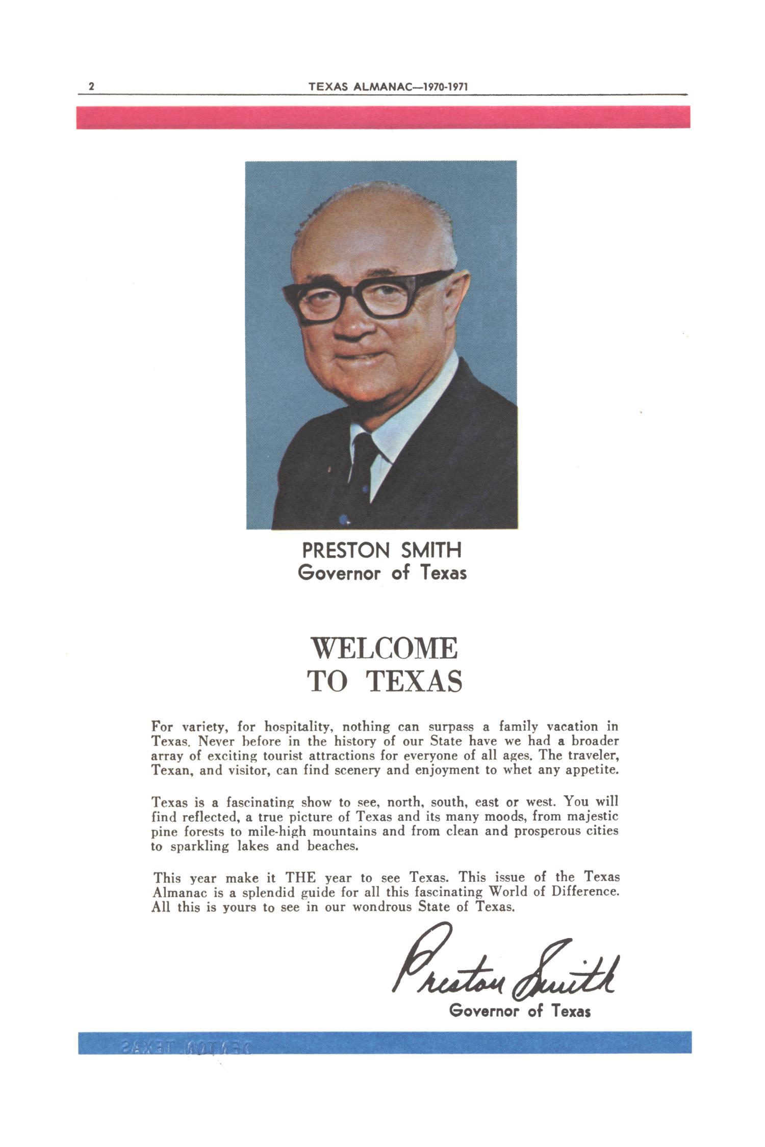
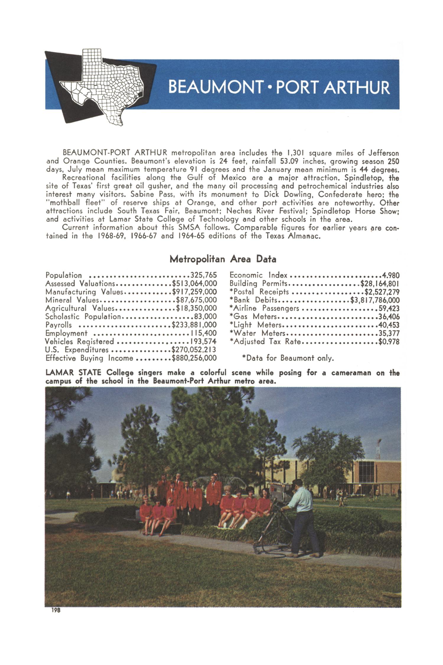
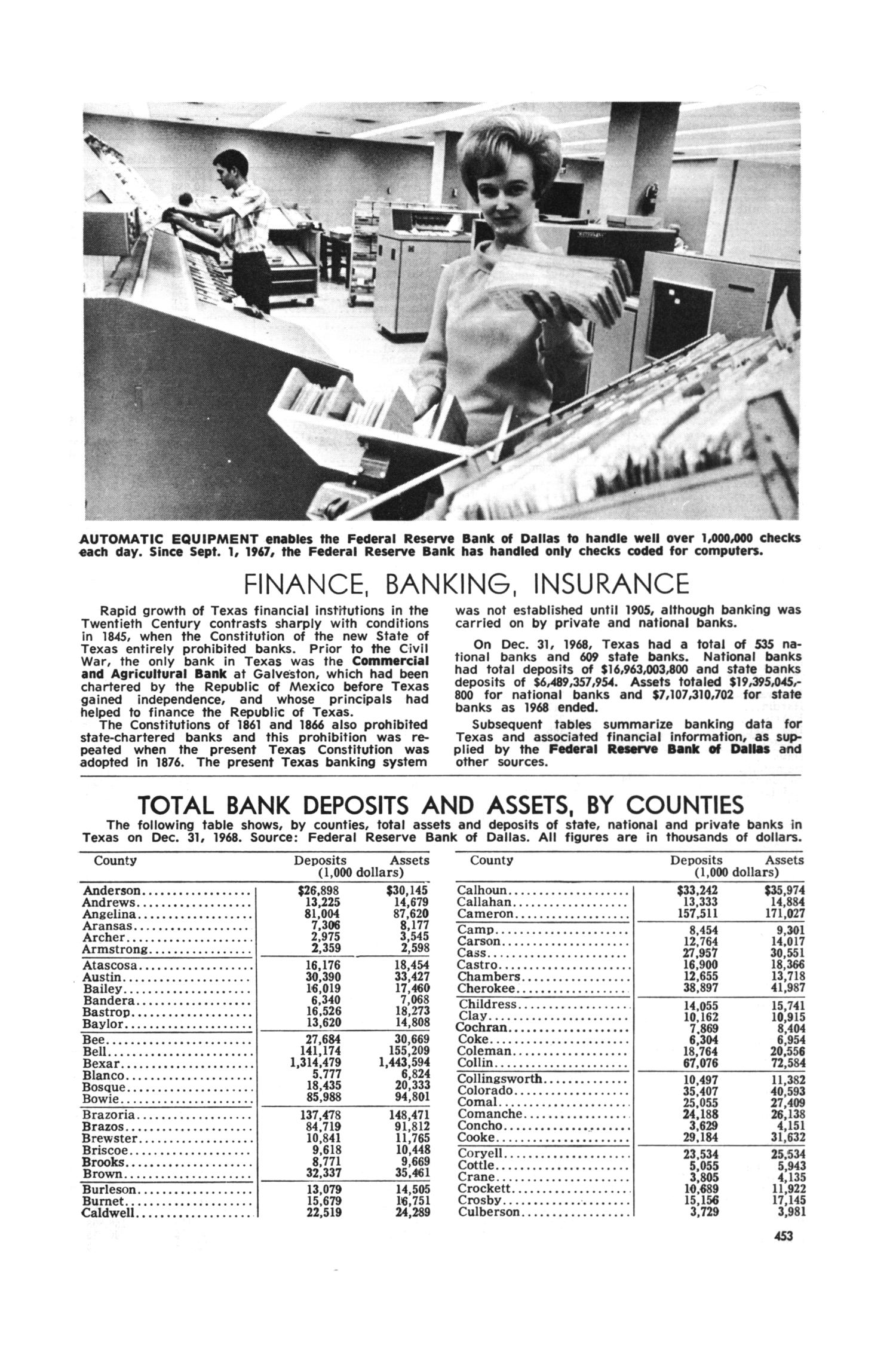
circa 1969
.
Source: texashistory.unt.edu University of North Texas Libraries, Texas State Historical Association. License: All Rights Reserved.
Source: texashistory.unt.edu University of North Texas Libraries, Texas State Historical Association. License: All Rights Reserved.

Source: texashistory.unt.edu University of North Texas Libraries, Texas State Historical Association. License: All Rights Reserved.
Source: texashistory.unt.edu University of North Texas Libraries, Texas State Historical Association. License: All Rights Reserved.
Source: texashistory.unt.edu University of North Texas Libraries, Texas State Historical Association. License: All Rights Reserved.


")


")


")


2 Comments on “1970–71 Texas Almanac and State Industrial Guide”
I might be guessing here, but “Texas Almanac” seems to be set in Filmotype Western, which has a serif on top of the capital A.
That’s totally possible! The date certainly suggests the use of some phototype version of French Antique/Clarendon Extended, like Filmotype Western. I compared it against a glyph set of the original pre-digital face, and it appears to be a match.
The digital version drawn by Charles Gibbons in 2014 is much more extensive, with a large character set including Greek and Cyrillic. It’s also different from the original in a number of details: rounds are generally rounder, b has a bottom serif and c a top serif, v is narrower, J has a vertical instead of a horizontal terminal serif, Z is less wide at the top.