Gruhl, Magdeburg invoices, 1926 and 1927
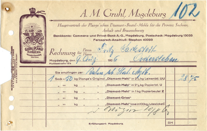
Weekly Invoice №20 brings a double feature from Magdeburg. Gruhl was the “main distributor of Plange’s sacked ‘Diamant’ flours for the province of Saxony, Anhalt and Brunswick”. In 1926, the firm was doing business as A. M. Gruhl. A year later, its name had changed to Gruhl & Co. Both invoices are pages from carbon copy books printed by Max Schlutius Durchschreibbücherfabrik — a local company established in 1820 and still in business today — using the same format and color.
The titling face in the 1926 letterhead is Koch-Antiqua-Kursiv (1923), with the decorative capitals that distinguished this design in all sizes from 12pt upward. In the later version, it has been replaced by another, less tender italic, also with elements of a sloped roman. It’s Bernhard-Kursiv (1912), the companion to Bernhard-Antiqua, starring its fly-fishing ampersand. Koch’s italic, which is digitally available from Spiece Graphics as Eva Antiqua Light Italic, is maintained for “Rechnung”.
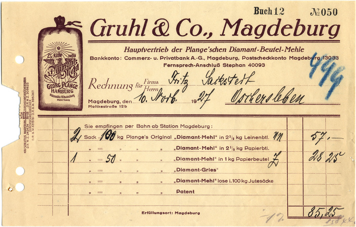
All the smaller type in both documents is Koralle. It is not printed from the same composition, though: There are many small differences, in spacing and arrangement, but also in the text, e.g. “Privat-Bank” → “Privatbank”, “Postscheck” → “Postscheckkonto”, etc. Storing the composed type as “standing type” — the metal type equivalent of a reusable, editable file — wasn’t worth the trouble, especially when it was unclear if the client ever returned with a sufficiently similar order. For such a small job, it was more profitable to simply recompose the whole thing from scratch, in case a reprint was needed.
By 1927, the mode of delivery apparently had been standardized: instead of adding “per train from station Magdeburg” by hand again and again, this piece of information could now be taken as a given and rendered typographically. Also, the newer version was intended to last a little longer: only two (formerly three) leading digits of the year are preprinted now, making the form fit for the 1930s.
Typefaces
Formats
- Branding/Identity (4824)
- Ephemera (798)
Topics
- Product (1010)
- Food/Beverage (1976)
Designers/Agencies
Tagged with
- invoices (42)
- letterheads (258)
- 1920s (78)
- German (language) (1341)
- borders and rules (672)
- one color (223)
- redesign (376)
- flour (11)
- Diamant-Mehl (1)
- metal type (108)
- job work (177)
- Weimar Republic (79)













2 Comments on “Gruhl, Magdeburg invoices, 1926 and 1927”
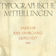
Koch’s œuvre includes several examples where he merges blackletter and roman forms. Jessen-Schrift pairs roman/uncial caps with a textura lowercase. Wallau and Offenbach were both devised with “deutsch” and “unzial” sets of capitals. The decorative caps of Koch-Antiqua-Kursiv have nothing to do with blackletter, though.
Thank you for the interesting reference! In Dutch Type, Jan Middendorp provides a translation for Joos Lambrecht’s text:
Peter van Lancker has compiled a nice overview of Lambrecht’s types (in Dutch).
The current version of Laurent Bourcellier’s Joos, a digital interpretation of the upright italic, doesn’t come with Bastardic titling caps. But who knows, maybe he is open to requests?