
ATAF
Contributed by Florian Runge on Apr 7th, 2017. Artwork published in
.

Photo: Florian Runge. License: All Rights Reserved.
For ATAF, a small Polish distributor of personal medical/healthcare products we developed a corporate identity and website, where the overall minimalistic and austere design is contrasted by the use of two lively and inviting typefaces: Eskorte and Ideal Sans.
While the primary typeface Eskorte conveys a more serious tone in text sizes, it subtly echoes the soft and rounded feel of the logo when used in larger sizes. In contrast, Ideal Sans (used for headlines, captions, highlighted texts etc.) offers a more humanist feeling.
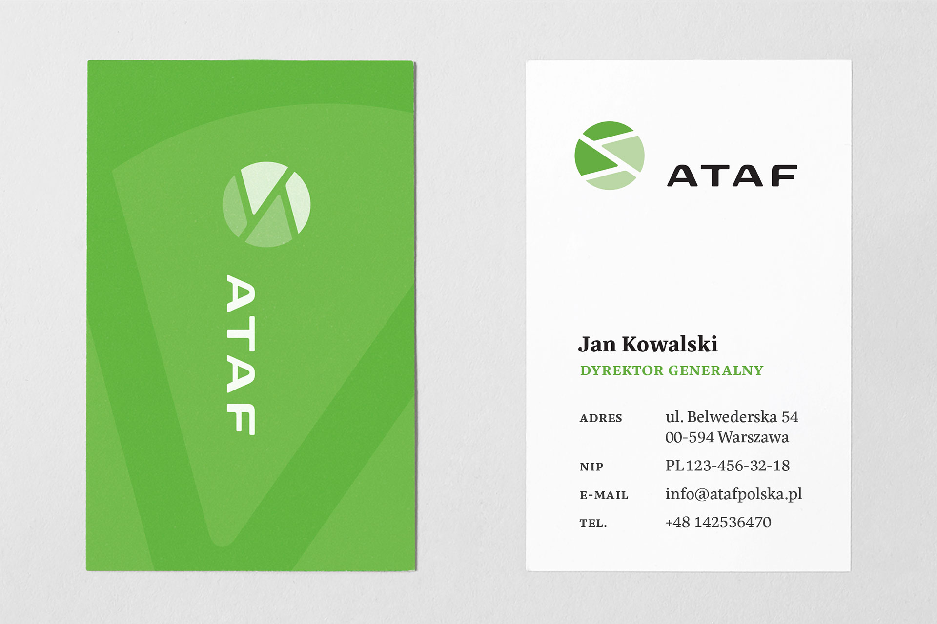
Photo: Florian Runge. License: All Rights Reserved.
Photo: Florian Runge. License: All Rights Reserved.
Photo: Florian Runge. License: All Rights Reserved.
Photo: Florian Runge. License: All Rights Reserved.

Photo: Florian Runge. License: All Rights Reserved.


")


")
