An independent archive of typography.
to participate.
Topics
Formats
Typefaces

Stadtaspekte, special issue “Land in Sicht!”

Contributed by Love Lagerkvist on Apr 30th, 2017. Artwork published in .
    Stadtaspekte, special issue “Land in Sicht!” 1
    Source: www.behance.net Any Studio. License: CC BY-NC-ND.

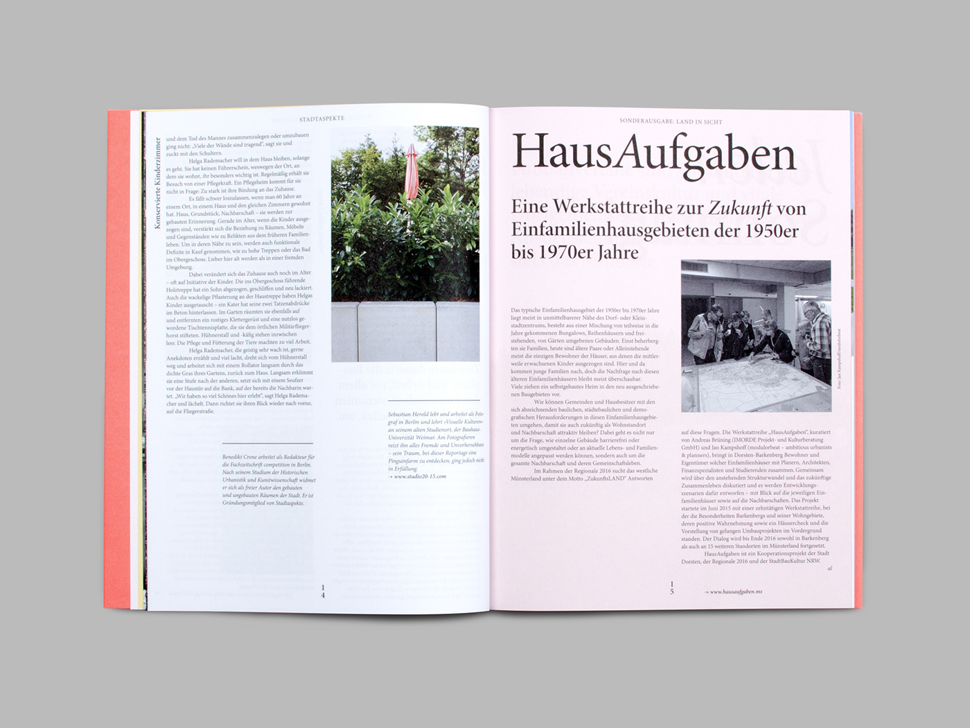
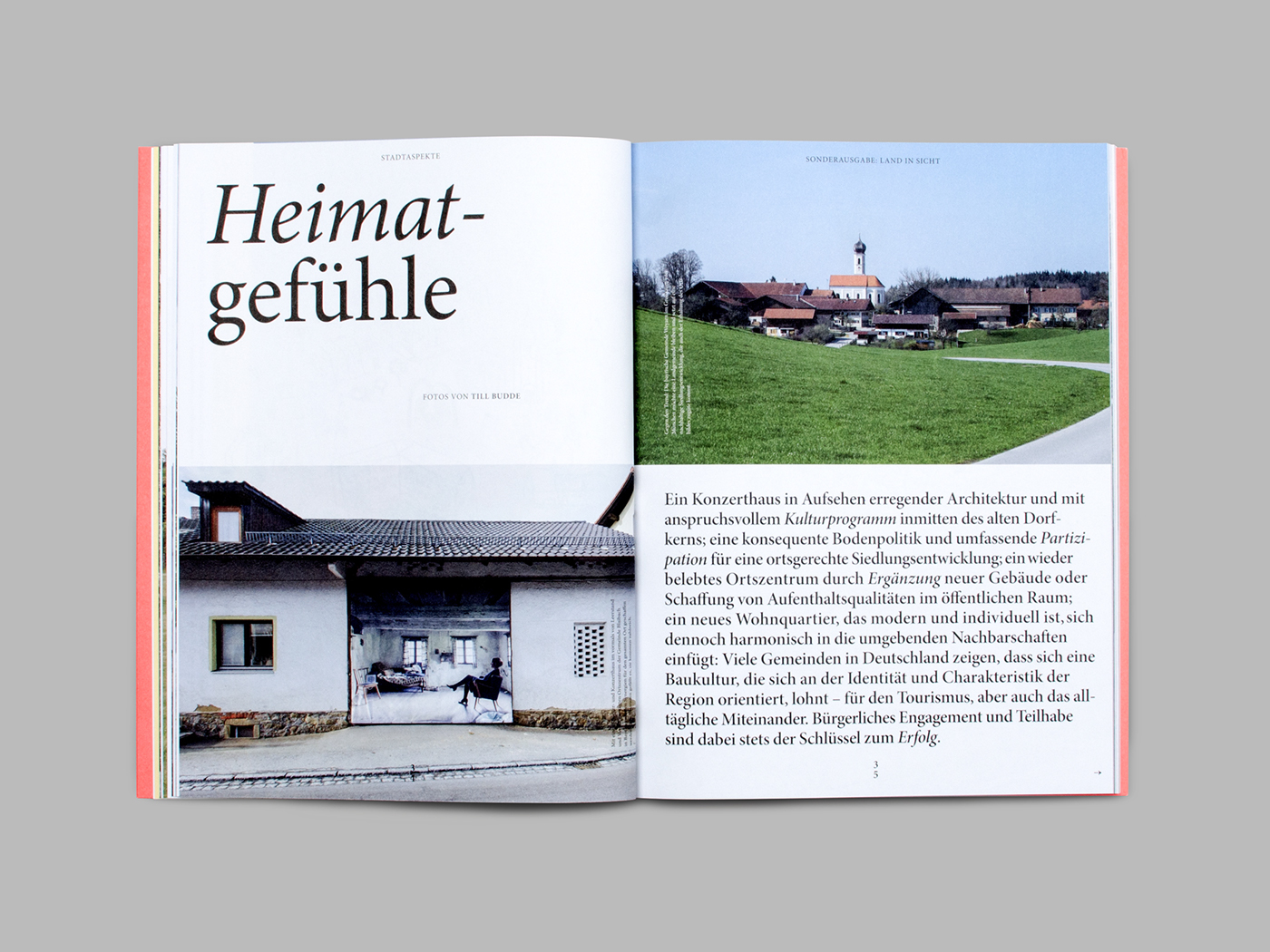
    In this special issue of Stadtaspekte magazine Jakob Kornelli masterfully explores the four different optical sizes of Robert Slimbach’s masterpiece Minion. The composition alternates between huge headlines and page-stuffing long form, arranged on a stage of color and photography, grabbing every opportunity to show off this modern classic.

    Stadtaspekte, special issue “Land in Sicht!” 2
    Source: www.behance.net Any Studio. License: CC BY-NC-ND.
    Stadtaspekte, special issue “Land in Sicht!” 3
    Source: www.behance.net Any Studio. License: CC BY-NC-ND.
    Stadtaspekte, special issue “Land in Sicht!” 4
    Source: www.behance.net Any Studio. License: CC BY-NC-ND.
    Stadtaspekte, special issue “Land in Sicht!” 5
    Source: www.behance.net Any Studio. License: CC BY-NC-ND.
    Stadtaspekte, special issue “Land in Sicht!” 6
    Source: www.behance.net Any Studio. License: CC BY-NC-ND.
    Stadtaspekte, special issue “Land in Sicht!” 7
    Source: www.behance.net Any Studio. License: CC BY-NC-ND.
    Stadtaspekte, special issue “Land in Sicht!” 8
    Source: www.behance.net Any Studio. License: CC BY-NC-ND.

    2 Comments on “Stadtaspekte, special issue “Land in Sicht!””

    1. So after TNR, Arial and Georgia, we’re now finally exploiting the default-ness of Minion?

      I have very, very mixed feelings about this.

    2. @Peiran Tan, so finally the circle will close! Anyway what’s wrong with that?

    Post a comment