
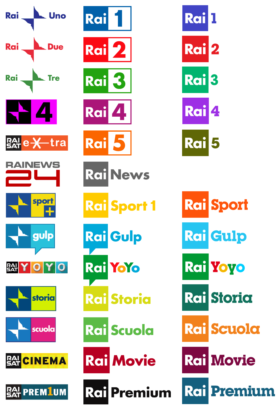
RAI Radiotelevisione italiana logos (2016/17 redesign)
Rai — Radiotelevisione italiana S.p.A. is Italy’s national public broadcasting company, owned by the Ministry of Economy and Finance. [Wikipedia] Rai has been using Futura Bold as its primary typeface since the “farfalla” (butterfly) identity designed by Stefano Aureli and introduced in 2000, which was the first to harmonize the logos of the various channels. From May 2010 on, the Rai acronym has been shown reversed in a colored square (see Brand New).
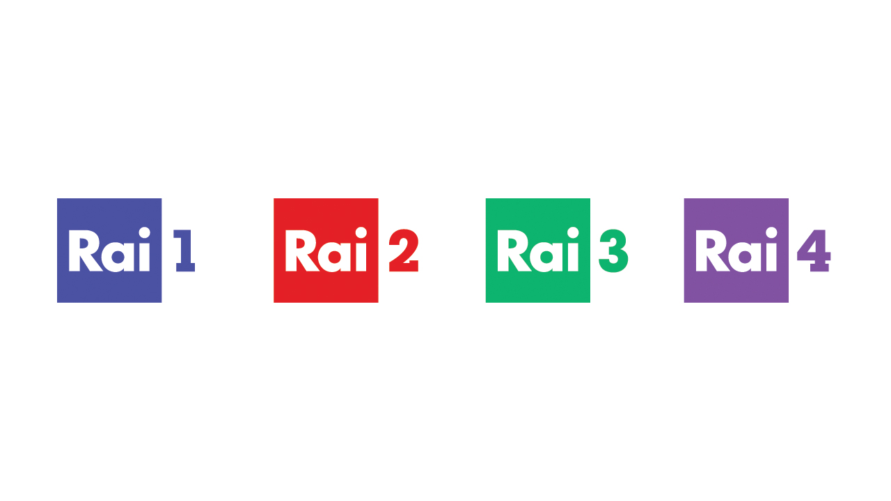
The latest rebrand was launched in September 2016 under the direction of Massimo Maritan and Roberto Bagatti, Creative Directors at Rai (see Designtagebuch). Now the numbers for the various TV networks — Rai 1, Rai 2, Rai 3, Rai 4 — are shown in a slightly modified ITC Lubalin Graph Bold, a typeface that is also used off-the-shelf for other aspects of the brand. The differentiation through colors was refined and now includes distinct animation styles:
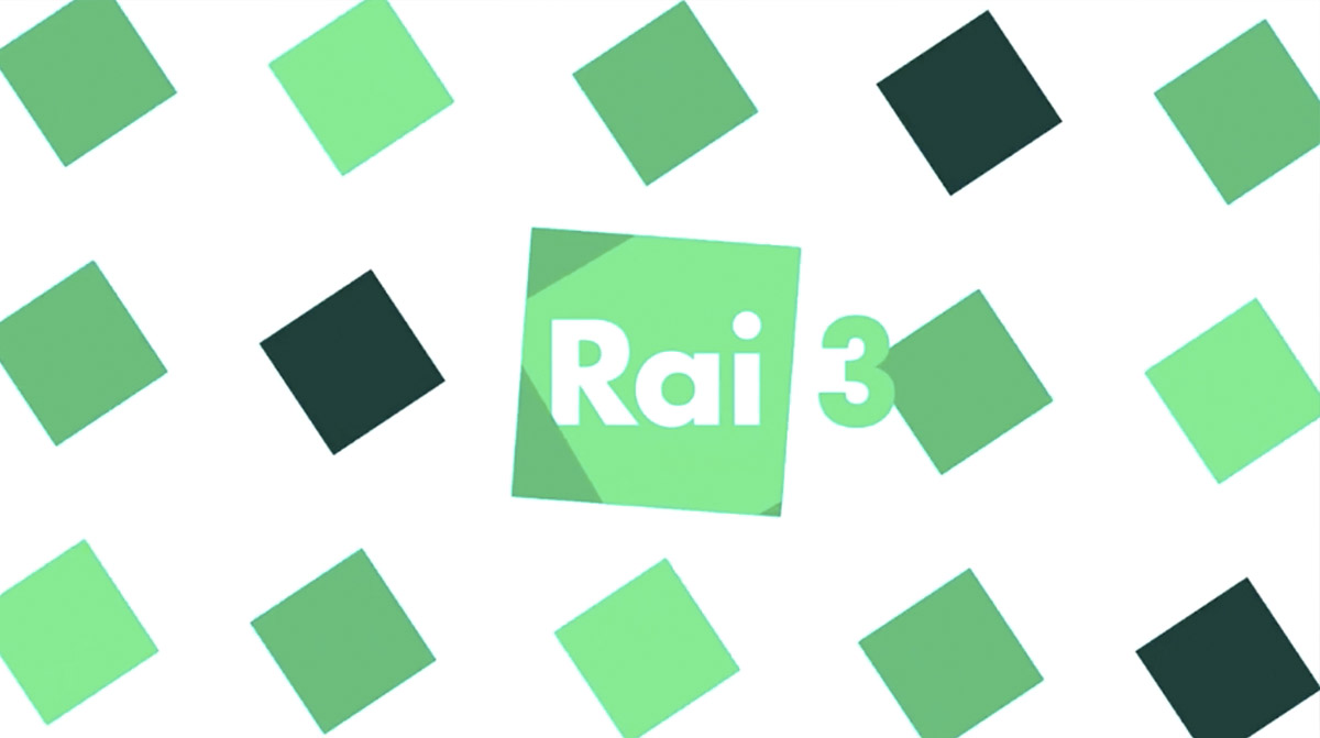
The square, the shape of the Rai logo, becomes the protagonist of the new look. Rai 1 assumes a blue of the warmest kind, Rai 2 becomes carmine-colored (while the square sharpens towards a rhombus), Rai 3 is light green (squares are multiplied and intersect each other), Rai 4 purple (with a fragmented square).
In April 2017, together with designer Florencia Picco, the new identity was extended to the thematic channels like Rai 5 (culture, music, documentaries), Rai Movie, Rai Sport, Rai Yoyo (kids), Rai Gulp (teens), Rai Scuola (education), Rai Storia (history), etc.
Learn more about the historic evolution of the Rai visual identity in general and the logos of the company and the channels in particular on the dedicated site La Nuvola Delle Sigle.

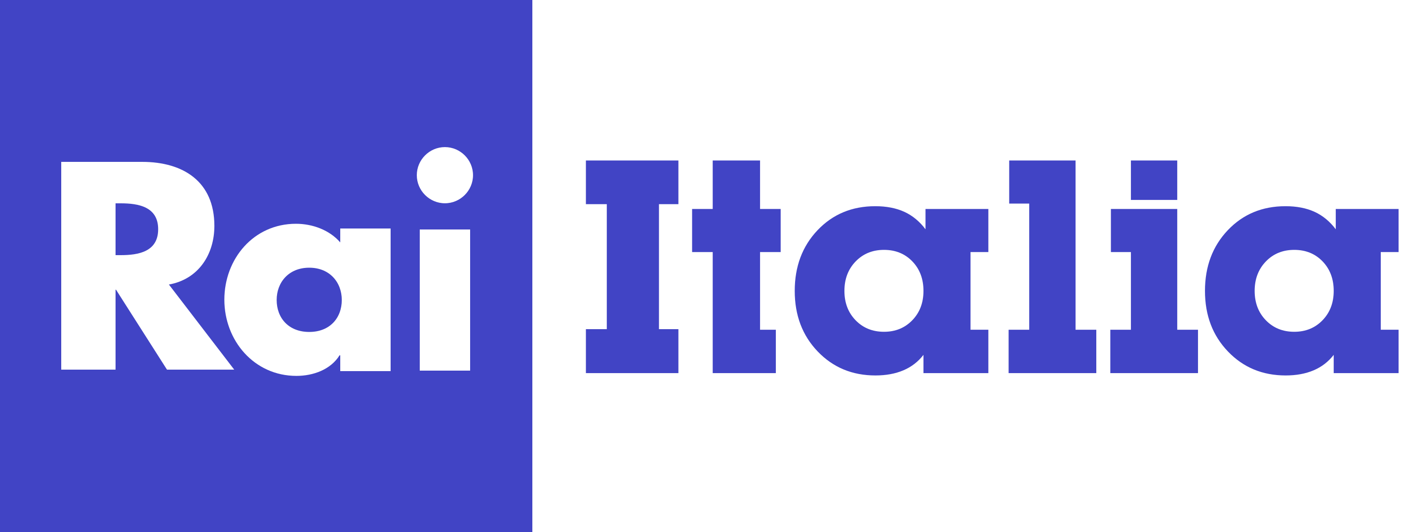
Rai Italia is the international television service of Rai Internazionale


")


, <cite>Beyond the Galactic Lens</cite> (1975), <cite>The Galactiad</cite> (1983) by Gregory Kern (DAW)")

")


 movie poster")

 Czechoslovak movie poster")


")


")

