
Palm Restaurant (2009 redesign)
Contributed by Andrew Lohin on May 2nd, 2017. Artwork published in
circa 2009
.
Source: www.korndesign.com License: All Rights Reserved.
License: All Rights Reserved.
Previous logo. Note Parsons’ right-facing feet on the ‘P’ and ‘l’.
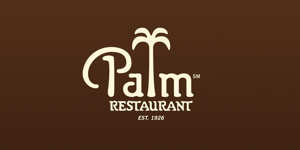
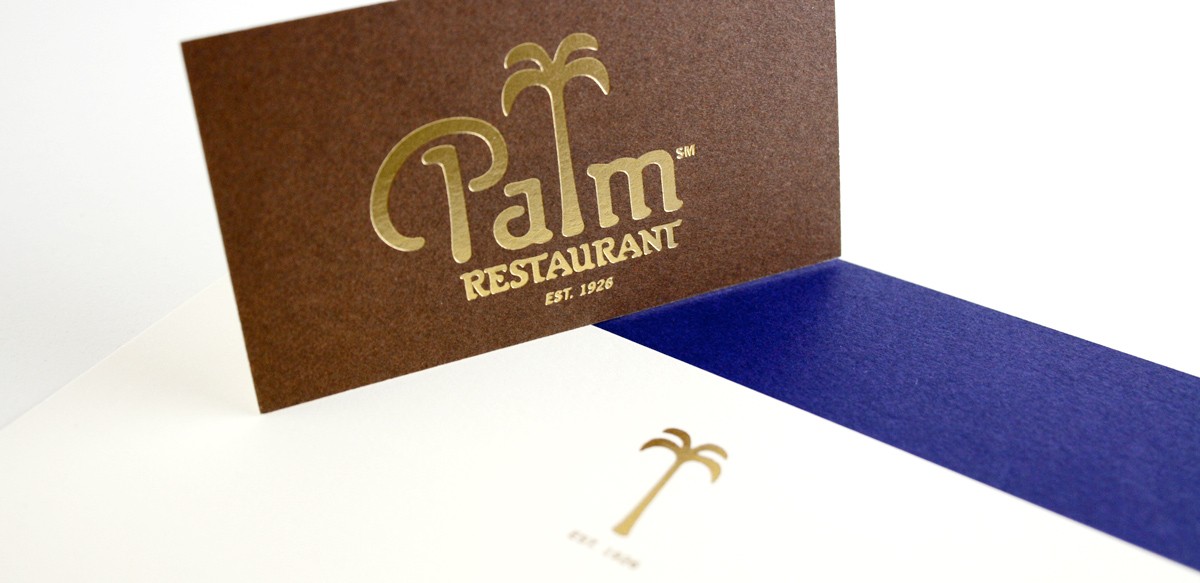
The first Palm Restaurant was established on Second Avenue in Manhattan in 1926. At some point, the early-20th-century Parsons was used to reflect the restaurant’s history. The soft, flaring stems of Parsons Bold make for a good palm tree. The type family even offered alternates with long ascenders and descenders not so different from the ‘l’ seen here.
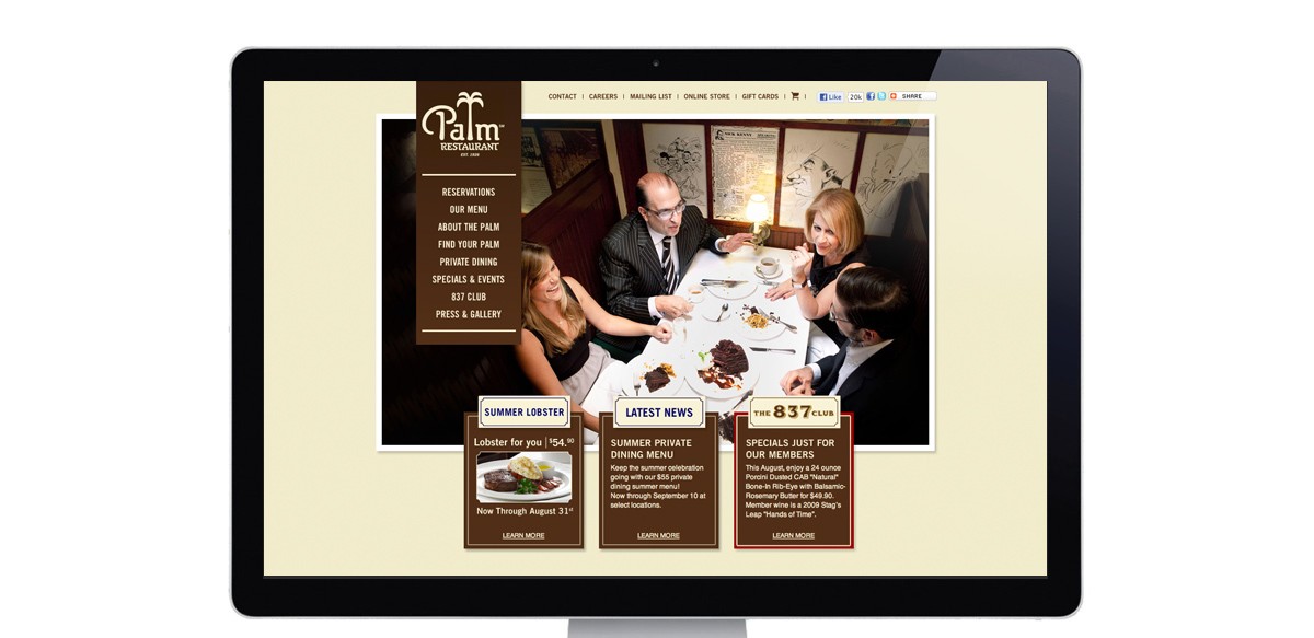
Over the years the logo had deteriorated into a mess of overcopied or autotraced art. Around 2009, Korn Design rebuilt the logo (replacing Copperplate Gothic with the original Parsons), and revamped the restaurant group’s entire identity, website, and menu system. Trade Gothic is used for text and trimmings.
Source: www.korndesign.com License: All Rights Reserved.
Source: www.korndesign.com License: All Rights Reserved.


")


")


