
Boiler Room poster series
Contributed by Love Lagerkvist on Jun 20th, 2017. Artwork published in
.
Source: eyeondesign.aiga.org License: All Rights Reserved.
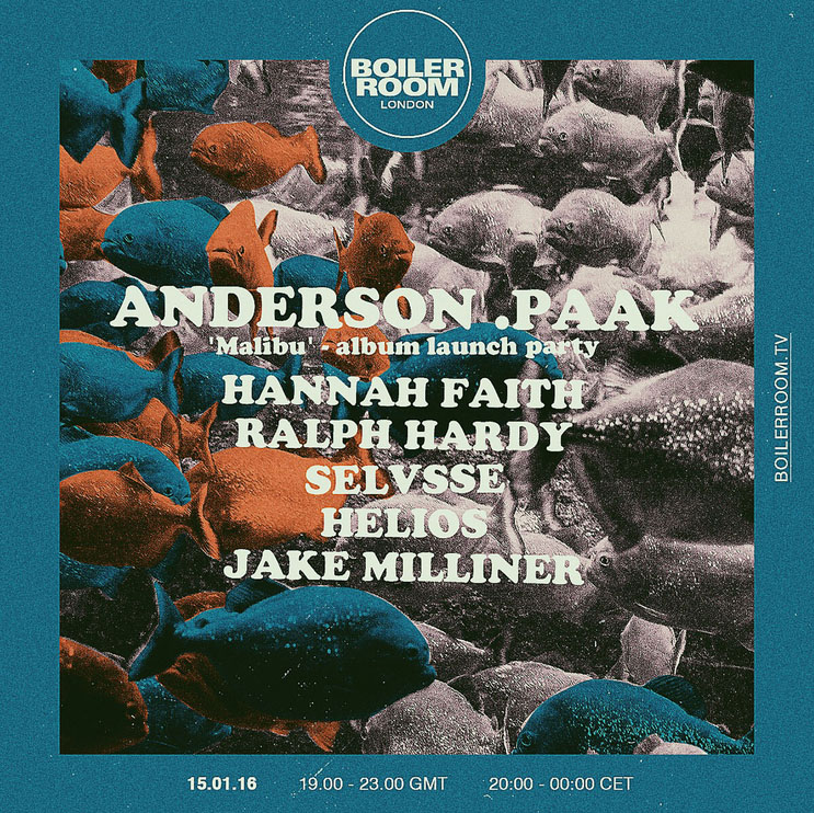
Poster using Cooper Black.
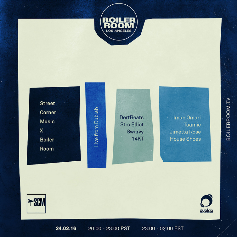
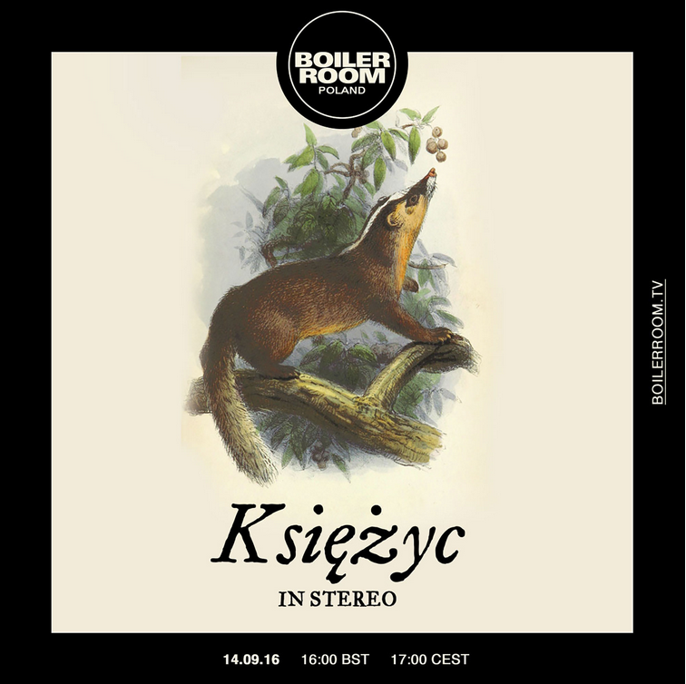
Self-taught London designer Joe Prytherch landed “the dream job”, doing posters for Boiler Room, a worldwide organiser of electronic music parties and events. The series is extremely varied and often referential, with compositions placed in a recurring square frame. Typefaces typically change from poster to poster, making the absolute most out of those licenses.
Source: eyeondesign.aiga.org License: All Rights Reserved.
Poster using Akkurat.
Source: eyeondesign.aiga.org License: All Rights Reserved.
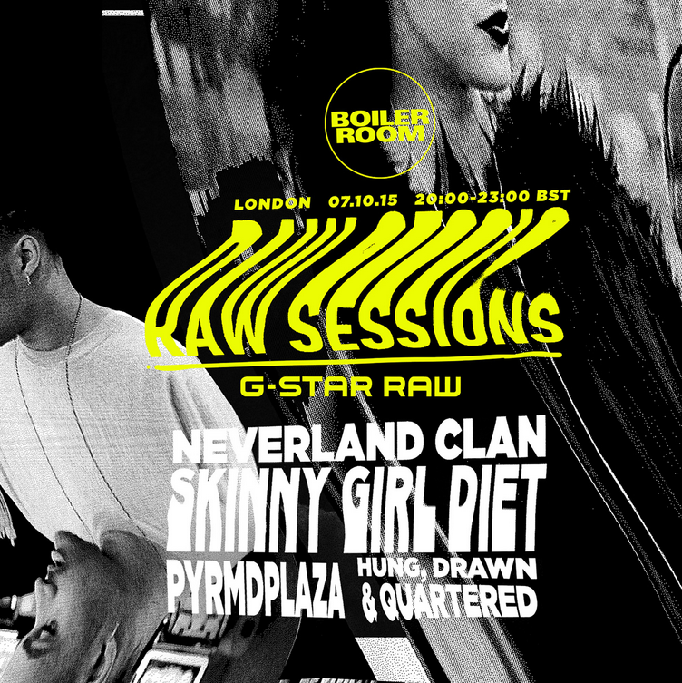
Poster using Helvetica with a splash of Trade Gothic.
Source: eyeondesign.aiga.org License: All Rights Reserved.
Poster using a scanned and stretched Gotham.

Source: eyeondesign.aiga.org License: All Rights Reserved.
Poster using Helvetica, as the actual MacOS system font San Francisco is unavailable for general licensing.
Source: eyeondesign.aiga.org License: All Rights Reserved.
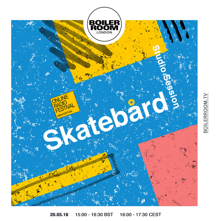
Poster using FF DIN.
Source: eyeondesign.aiga.org License: All Rights Reserved.
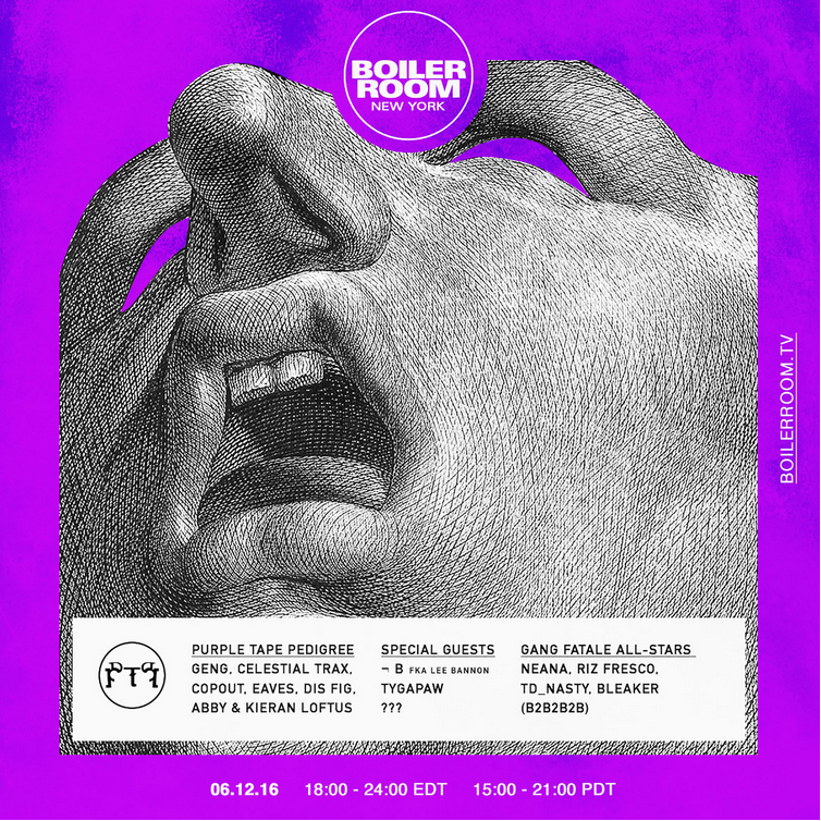
Poster using Hoefler's beautiful Fell interpretation.


")


1 Comment on “Boiler Room poster series”
The distressed face in the last picture appears to be Hoefler & Co.’s interpretation of the Fell Types. The diacritics don’t quite match, though – while the ogonek is less blotchy, the kropka is more organic and also better positioned.