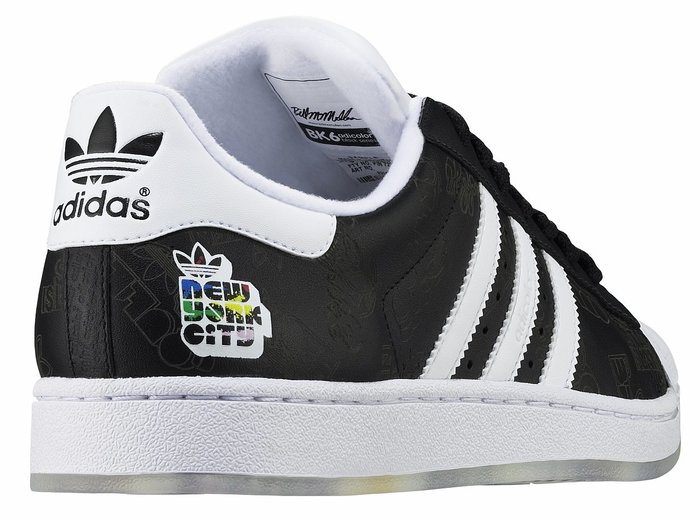
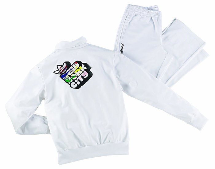
Adidas Adicolor NYC Series
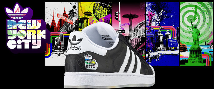
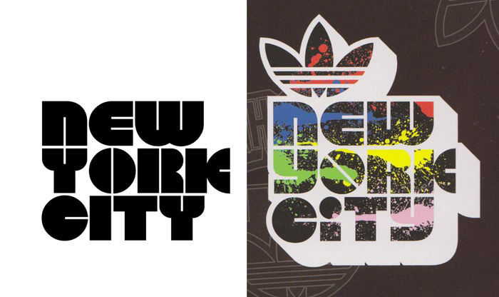
The logo for the “New York City” series of sneakers and related streetwear designed by Bill McMullen as a special Adidas Adicolor edition for Footlocker is most likely custom. It probably started out with a font, though: Several letterforms are very similar to Disco. Especially ‘C’, ‘E’, ‘N’, and the unique ‘K’ with a split semicircle for the legs indicate it was based on this 1960s/1970s typeface, or one of its many digital interpretations.
The direct comparison with Outland, one of the better digitizations made by FontBank, Inc. in 1990–1993, demonstrates the ingenuity of McMullen’s tweaks. Gaps in the blocky setting are reduced by appending a corner to ‘W’ (aligned with the ‘R’ below) and giving the ‘Y’ a more compact lowercase form. The biform nature is further emphasized by dotting the ‘I’, a change that improves the rhythm of rounds and straights. Restoring separate counters in ‘R’ increases the legiblity and tones down the verticality So does rotating the ‘O’, which enlivens the whole thing and renders it more dynamic. Finally, the counters/bridges are opened up a bit, to prevent them from clogging up.

Formats
- Object/Product (707)
Topics
- Fashion/Apparel (976)
Designers/Agencies
- Bill McMullen (1)
Tagged with
- logos (2687)
- Adidas (5)
- shoes/footwear (68)
- hip hop fashion (1)
- streetwear (22)
- New York City (77)
- modified typeface (1144)
- Adicolor (1)
- Footlocker (1)
- special editions (33)
- biform/unicase (125)
- stacked lines (194)
- shadow effects (701)
- type with image fill (106)
- colorful/multicolored (779)
Artwork location
- United States (6361)
- New York City (1704)

