“New Items !” sign, Trader Joe’s Rockridge, Oakland
The playful grocery store’s hand-painted signs sometimes replicate digital type so well they contradict the brand’s analog visual identity.
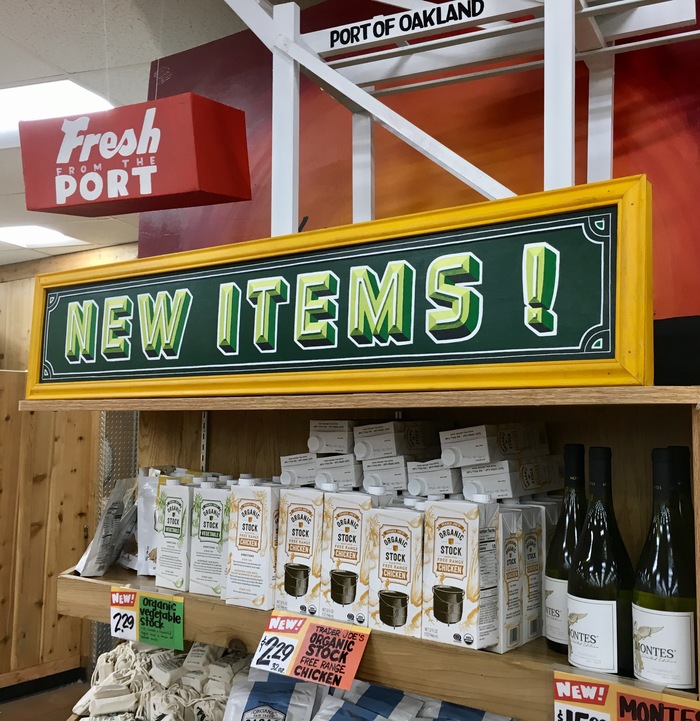
The Trader Joe’s in Rockridge, Oakland, CA. All the signs and price cards in this photo are painted or written by hand, but one is not like the others.
Grocery store chain Trader Joe’s is known for its colorful, cheeky shopping experience, with handmade signs and chalkboards often featuring amusing puns and local flavor. The company employs signmakers, called Store Sign Artists, at each location to create all the displays and tags in the store. The individuality of artists adds to the playfulness and variety of the Trader Joe’s identity, pushing the idea of a neighborhood grocer (despite the international trust behind the brand). The scheme works well for many shoppers, including Jill Bell, a professional letterer in her own right:
Their signage is inconsistent, both within different stores and within any one store, depending on the skill of the artist doing it. Doesn’t bother me … makes it fun to go to different stores and see how good, bad, or mediocre it is.
Many Trader Joe’s Sign Artists are competent craftspeople, but they aren’t always trained as sign painters. They come from various backrounds, like fine art, illustration, or graffiti. Most eschew traditional sign painting methods, such as perfecting a personal style informed by historical lettering models, expediency, and the practicalities of brush strokes. Instead, they sometimes base their letterforms on digital fonts, drawing the letters with a paint marker.
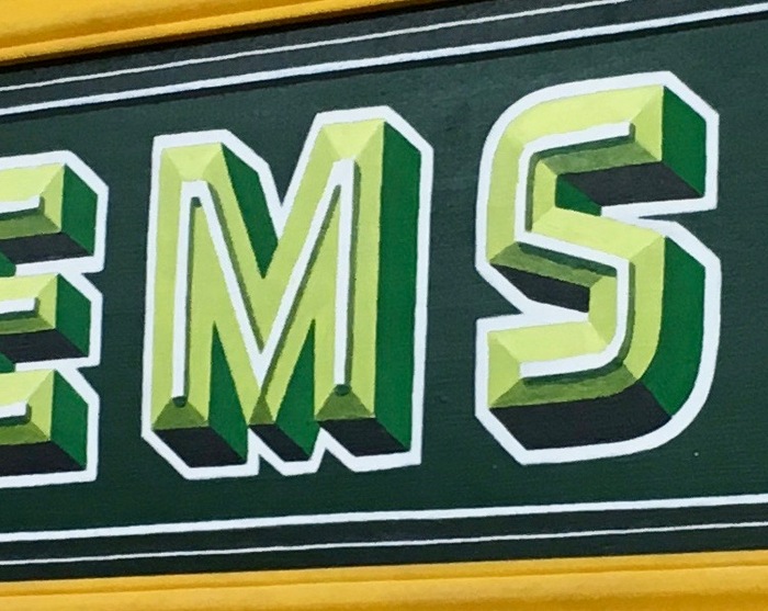
It took me quite a while to realize this sign was painted — not printed, or cut from vinyl. Staring closely at the sign for a long time earned me plenty of quizzical looks from fellow shoppers.
This sign is one such case, in which the artist rendered the faceted and chromatic Detroit, by type designer Alex Sheldon. The font is so well replicated, in fact, that it’s difficult to tell it was drawn/painted by hand — which works against the main point of Trader Joe’s homespun, anti-corporate identity. Of course, most customers wouldn’t know Detroit as a font, but the perfection of these letters belies the sign’s handmade reality. (The wordspace before the exclamation mark is also an interesting choice.) All that said, I can tell you from first-hand experience: this particular sign really pops !
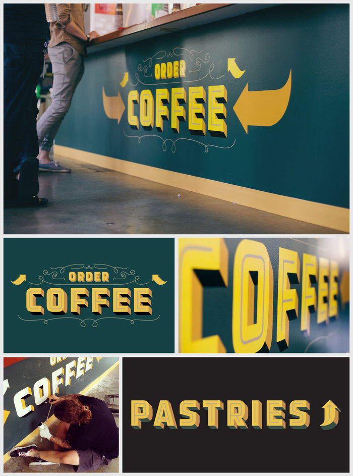
Detroit, by the way, is one of the first subjects of the newly launched Font Review Journal. Bethany Heck emphasizes the typeface’s roots in handmade signs and the “gaspipe” lettering style which was prevelant in signs and posters of the 1930–50s. She shows that this isn’t the first time the typeface has been used as a model for sign painting: Danny Jones spec’d it in his design for a coffee shop on the Facebook campus, and employed San Francisco’s New Bohemia Signs, to then paint it by hand.
These uses raise questions about the craft of sign painting in contemporary design. Does it make sense to paint something by hand if the shapes are so directly tied to digital typography? Is the charm of hand-painted letters in the forms themselves or simply the physical material?
Typefaces
Formats
- Signs (1396)
Topics
- Food/Beverage (1961)
- Retail/Shopping (679)
Designers/Agencies
- unknown (2168)
- Danny Jones (1)
- Trader Joe’s (4)
Tagged with
- Trader Joe’s (4)
- lettering derived from typeface (483)
- painted (75)
- critique of use (81)
- chromatic (472)
- borders and rules (667)
- green (495)
- groceries (28)
Artwork location
- United States (6397)
- Oakland (24)





















5 Comments on ““New Items !” sign, Trader Joe’s Rockridge, Oakland”
Thanks for the correction, John. Fixed. Can you share with us your thoughts on the content of the piece?
Jill Bell’s 2014 commentary on lettering signage trends in grocery stores. She notes that, although Trader Joe’s signs are sometimes illegible, the chain “is one place where naive lettering really works. It’s an effective part of their branding. They don’t want it to look too clean and corporate.”
Detroit was one of a shortlist of layerable typefaces which I suggested to Monotype three years ago as part of an attempt to build an intriguing library of color fonts that could make that technique into a product with some charisma. (They stuck with the Monotype library and alas, the project was killed, or infinitely postponed.) I’m glad that the Detroit family’s popularity as illustrated here kind of vindicates my intuitive choice.
Big difference between this and computer generated, IMHO. Maybe you have to see it in person but it looks more hand-painted than the smaller signs below it. It looks like the spacing gets increasingly and equally spaced from left to right, as do the shadows, as if it’s supposed to look closer to you as you walk up to it. If I had that typeface installed on a computer and I printed it, then put them one above the other, I think the difference would be more apparent.