
HEADS. debut album
Contributed by Production Type on Sep 8th, 2017. Artwork published in
May 2015
.
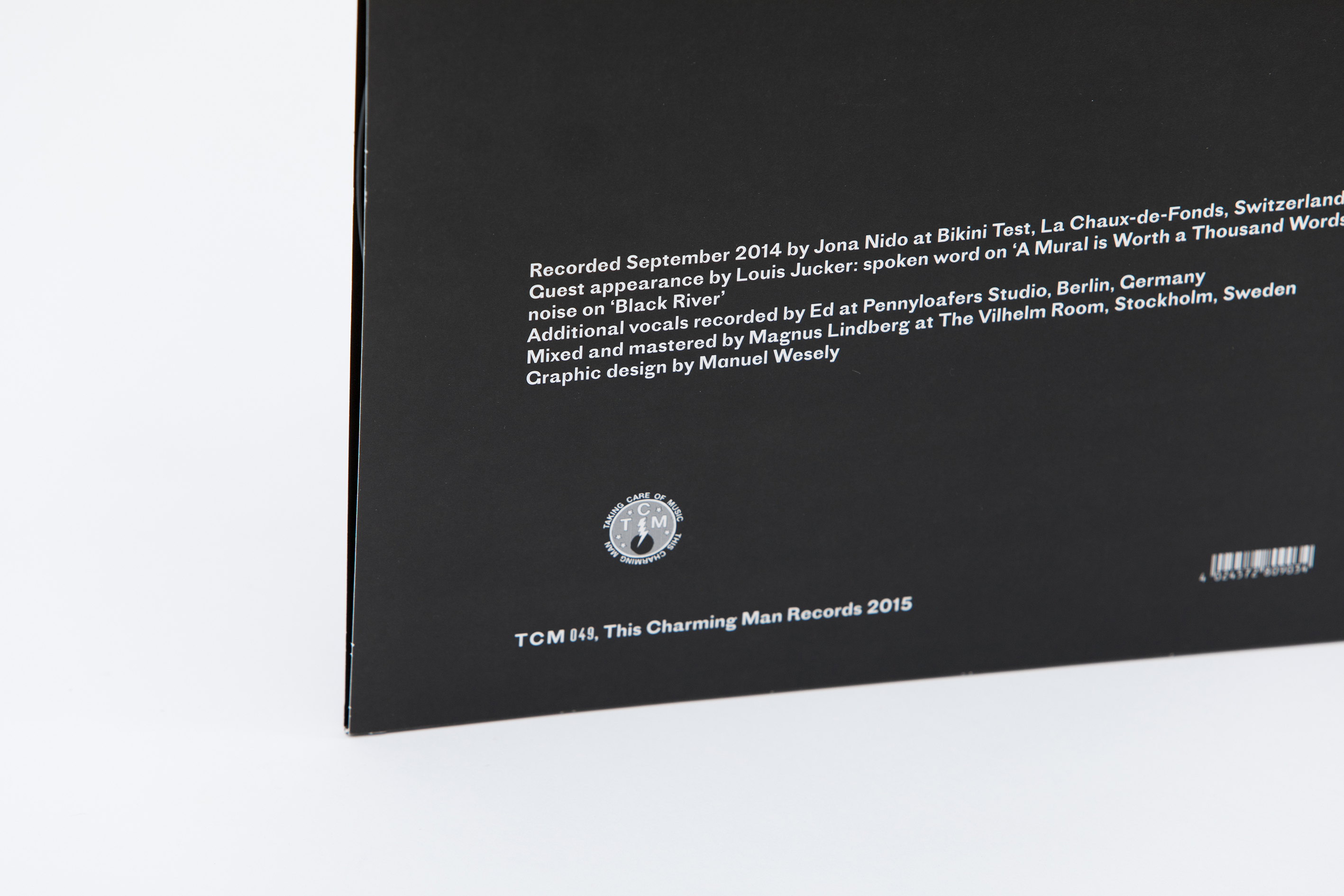
The self-titled debut record by Heads. was designed by Manuel Wesely from mm, m using only the Regular weight of Proto Grotesk.
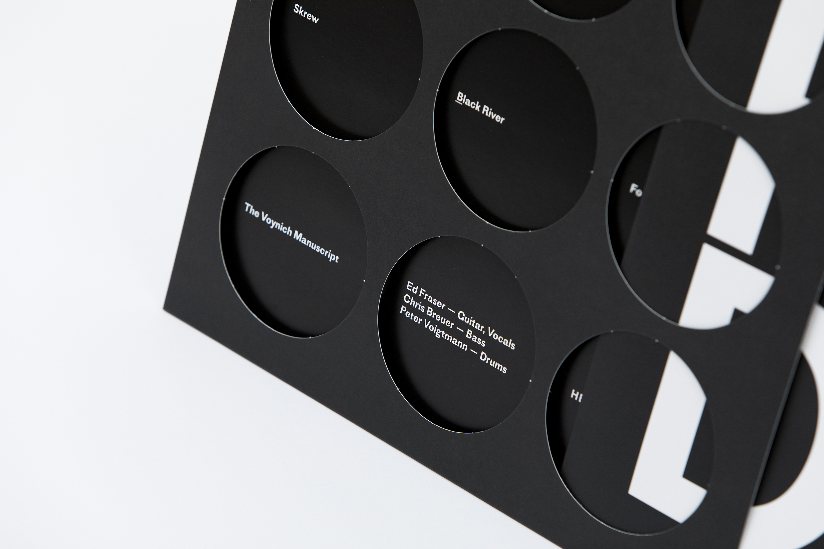
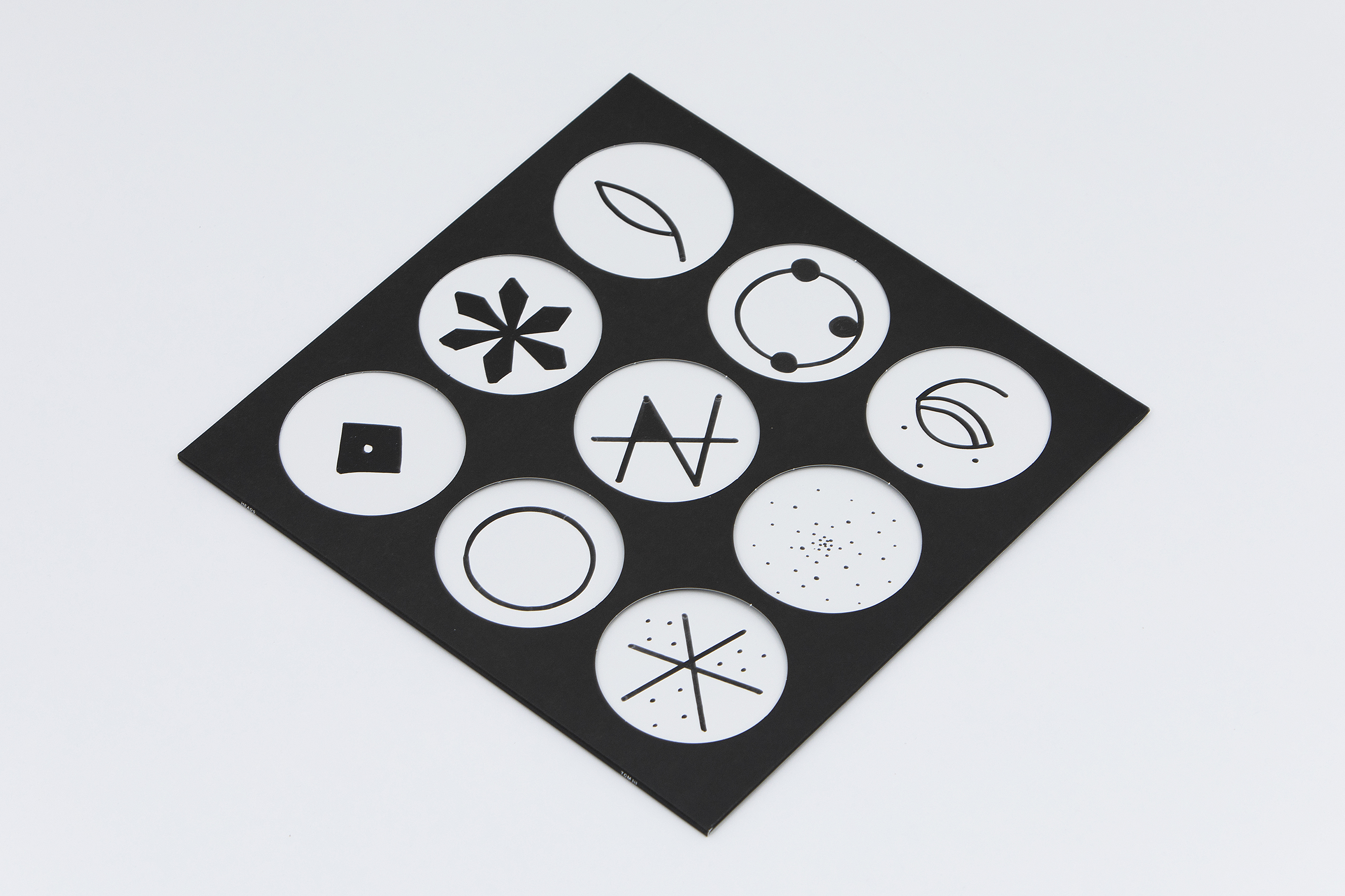
The 5 letters from the band’s name are rearranged (E is even merged with A) and stacked into a big square shape, seen through die-cut holes in the sleeve. On the back of the inner sleeve, are drawn esoteric symbols on white background, each one matching one of the holes.
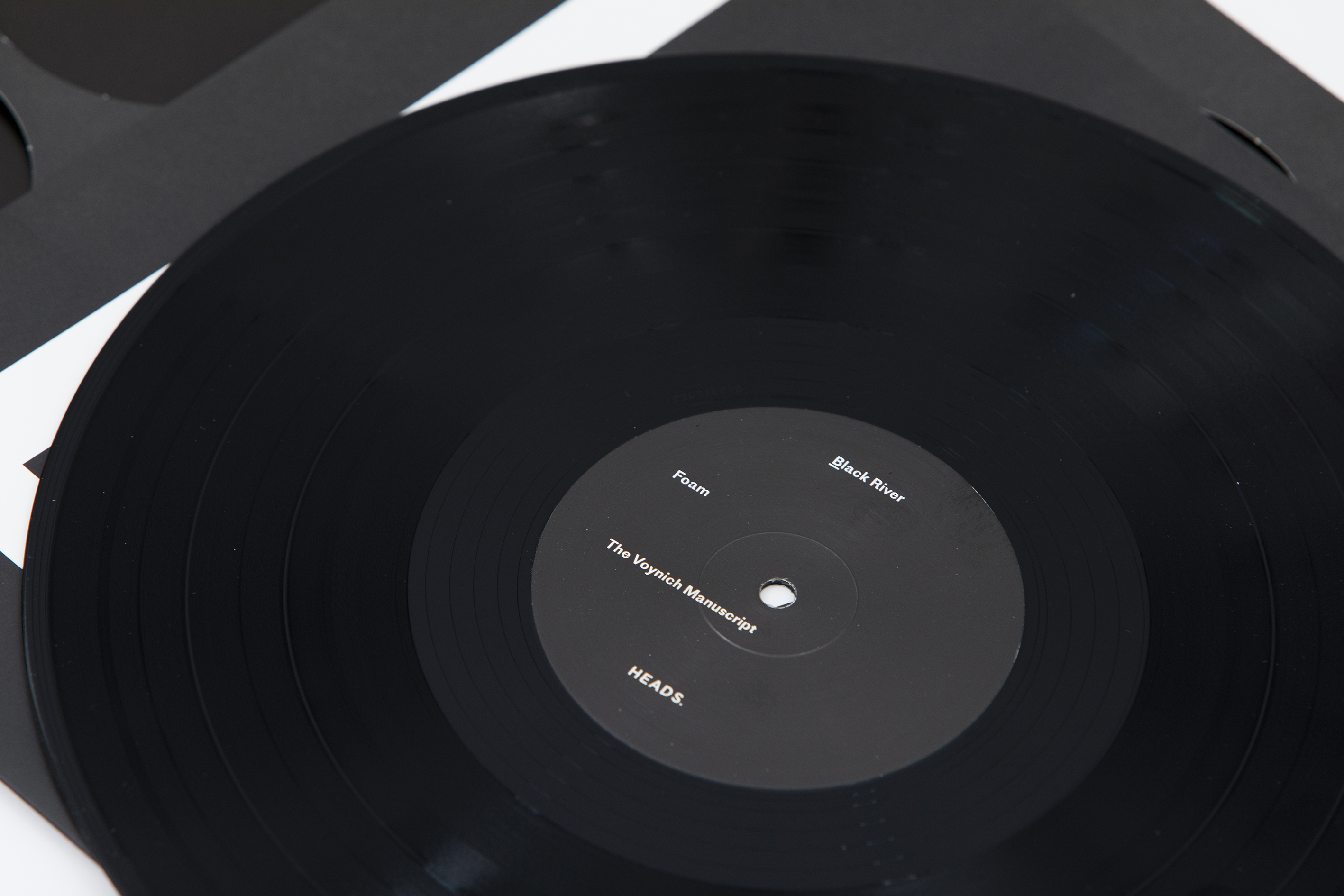
When the inner sleeve is removed, holes reveal track names and credits, matching the point size of the record label.


")


1 Comment on “HEADS. debut album”
Thank you so much for adding the LP to FIU, wow!
It’s a funny coincidence that the Voynich Manuscript, name giver of track B3, was in media again these last few days.
Here’s a little bonus on the die-cut holes: brbl-zoom.library.yale.edu/…
cheers!