
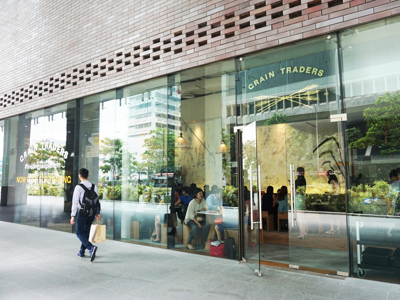
Grain Traders restaurant
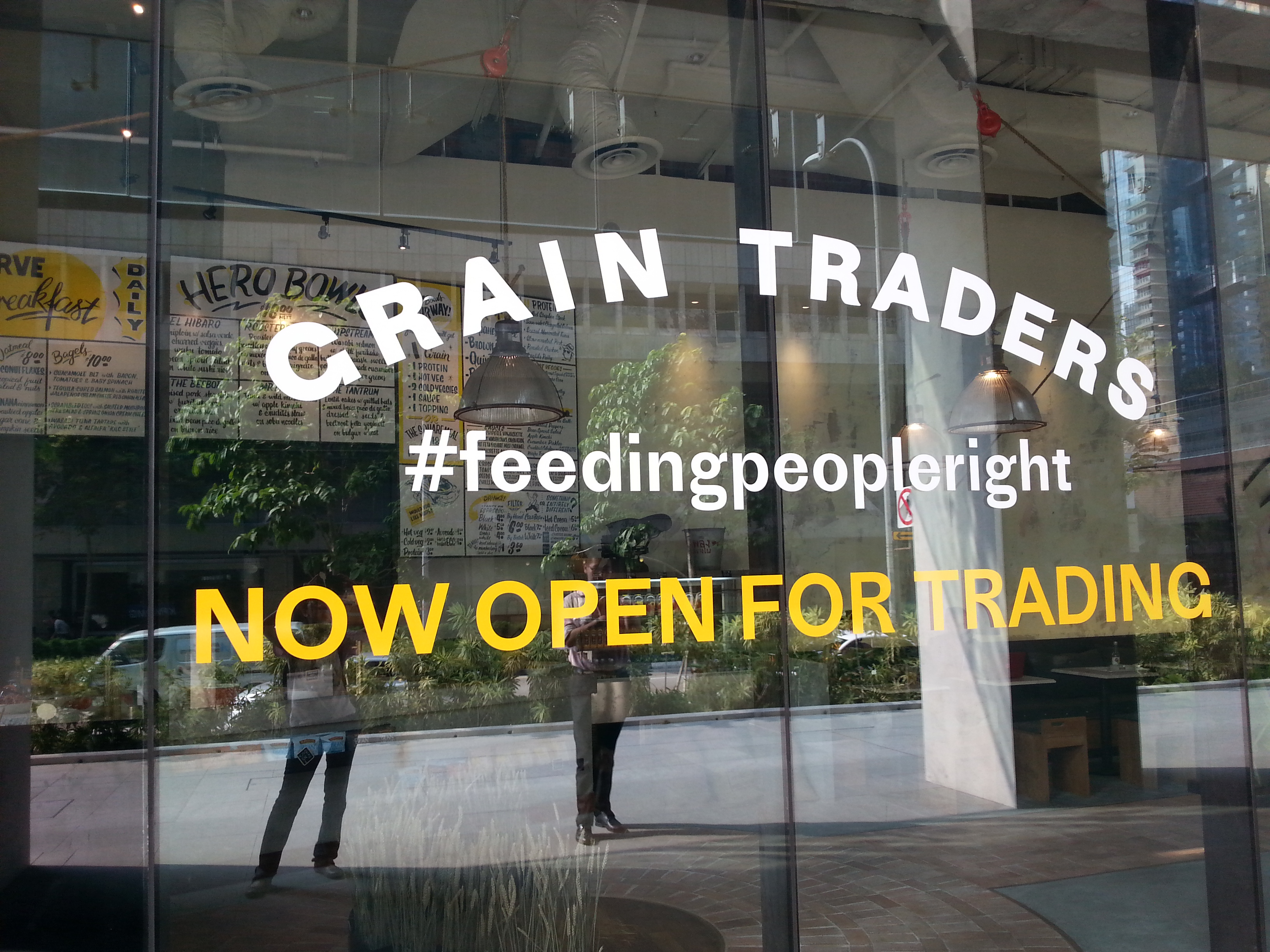
The main logo on the window shop is hand painted, adding smooth corners to Proto Grotesk. This is especially visible in the ‘A’.
Grain Traders is a restaurant that wants to feed people right. Everything about the brand and space had to tell this story in the quick moments people are there for their workday lunch.
We drew inspiration from a variety of places and sources : Anthony Bourdain’s food trips into the Bronx and Queens, alongside flour sacks from the Mid-West and old Puerto Rican posters were key in providing a base for the Grain Traders visual and spatial universe.
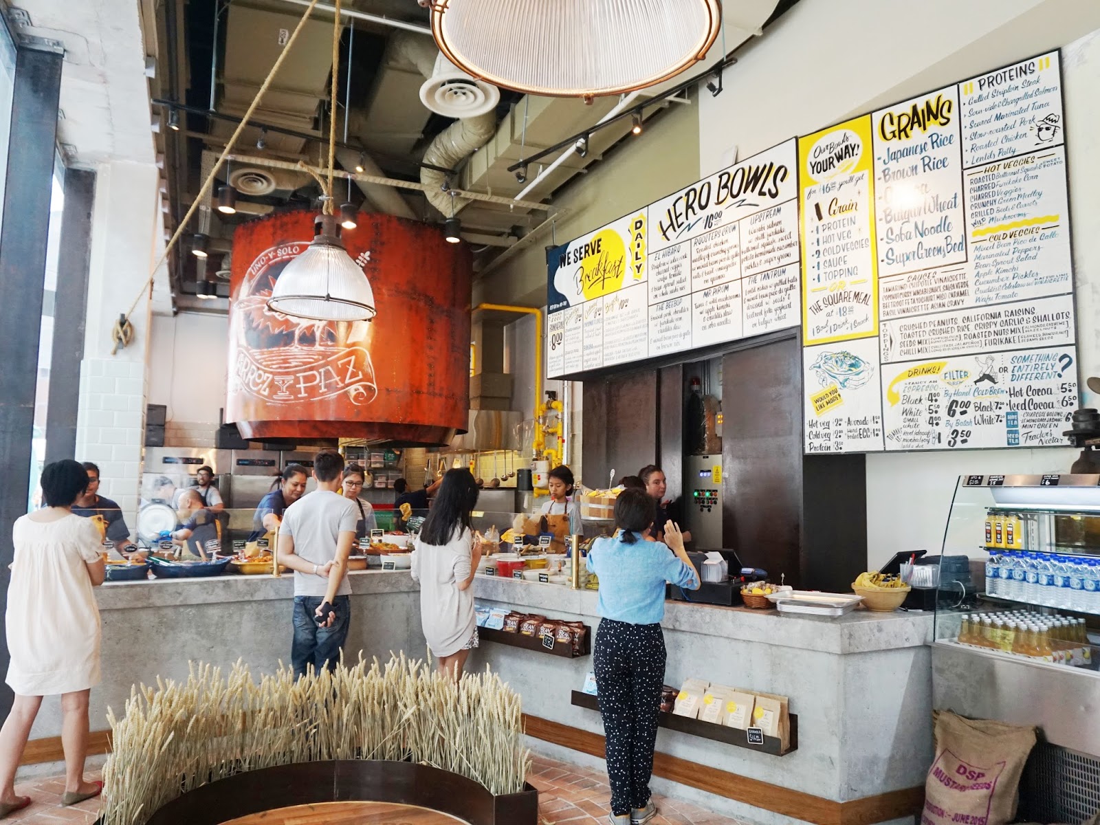
Because this concept essentially puts users through a queue, choose and pay process our brief for the space was to make these activities disappear by immersing guests in a authentic atmosphere. This led to special touch points higher than eye level so wherever you are in the space you would not feel left out of the experience. [Parable Studio]
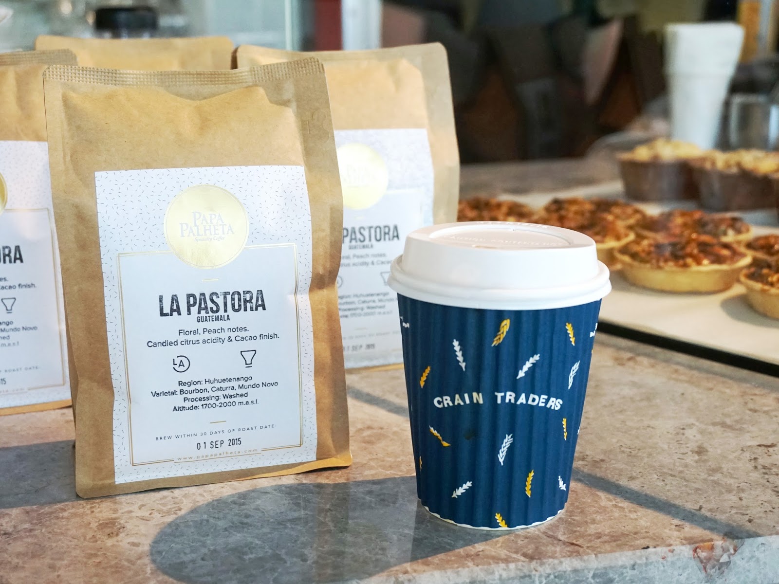
Parable Studio built the logotype and main identity of this Singapore restaurant with Proto Grotesk. Even if the menu on the actual location is hand-painted to add a bit of cachet to the atmosphere, Proto Grotesk is used for everything else, from shop window to stationery and coffee cups. On printed menus, it is paired with a bunch of typefaces from Hoefler & Co. to add an American flavor. Klim Type’s Pitch makes an appearance, too.
As always, Parable are playing with glyphs included in the font that most designers underestimate or forget, and their layouts are full of such typographic details: circled digits, arrows, alternate number set, ornaments …

Detail from the hand-painted menu. Some of the styles might be modeled after fonts, see e.g. House Industries’ Signpainter Collection, and especially House Script for “Black” / “By Hand”.
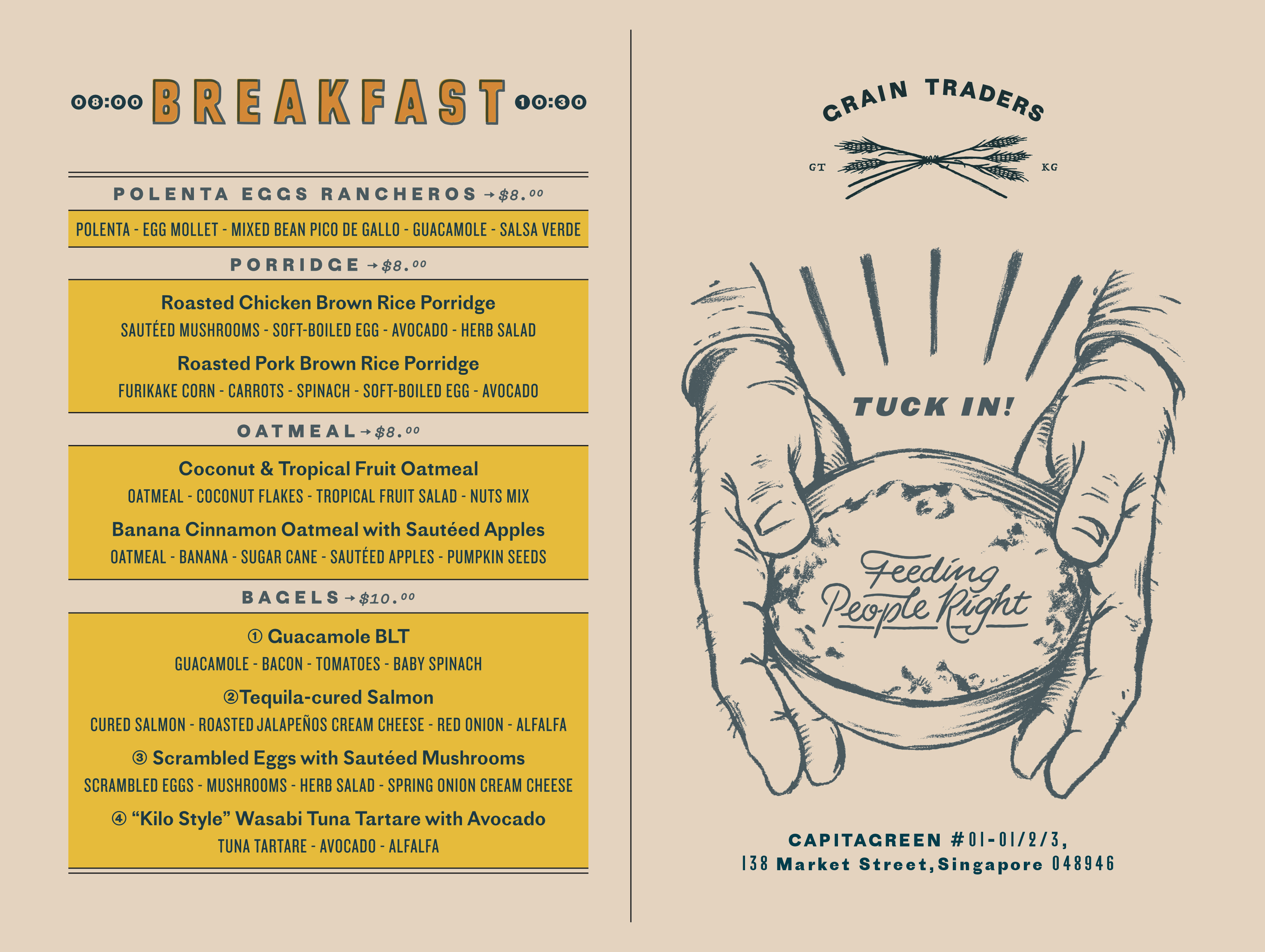
Proto Grotesk is used alongside Knockout, Pitch and Leviathan on this menu. Note the circled digits.
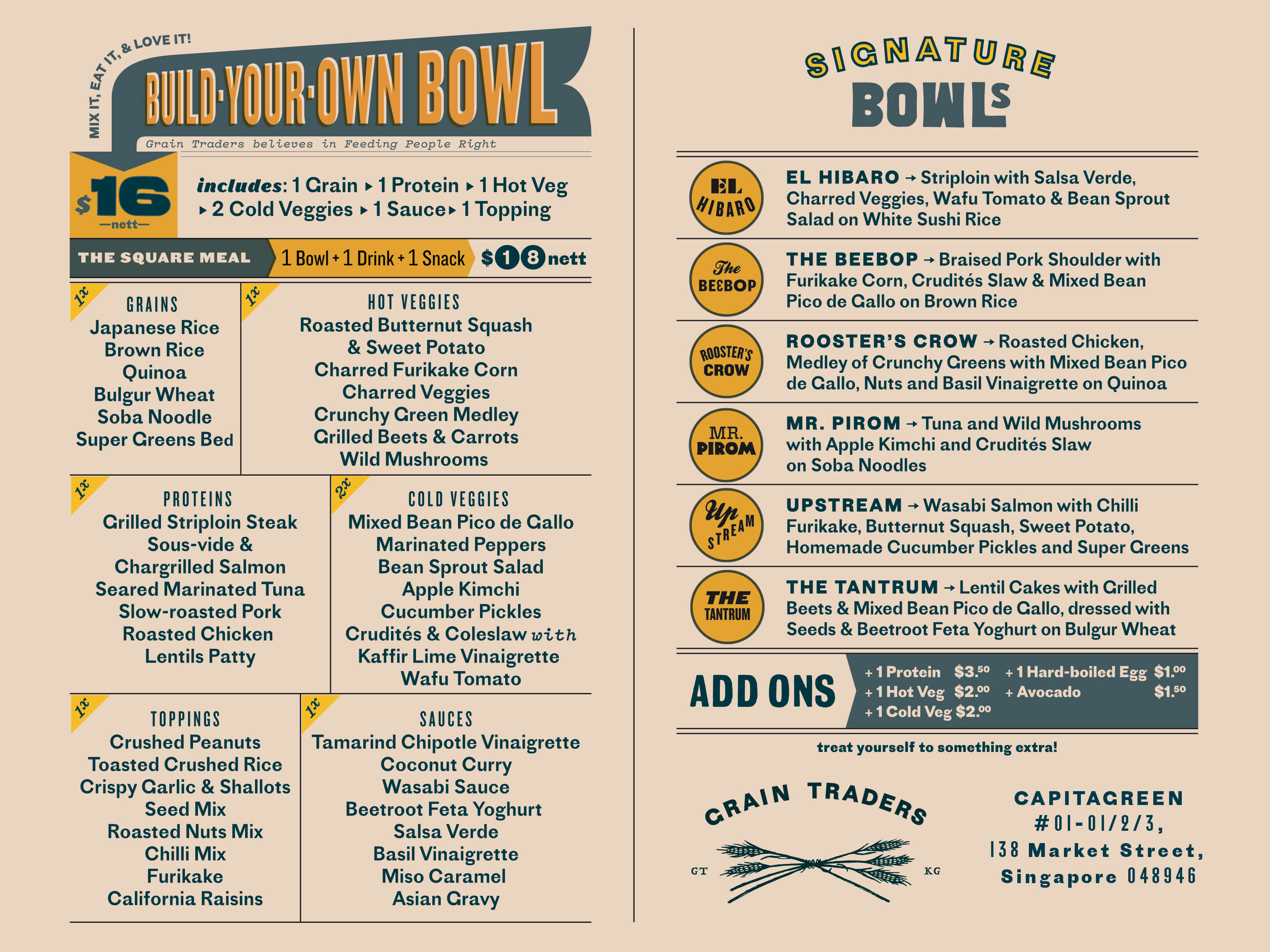
The menu features a plethora of additional fonts, including Page No. 508 (“Bowls”, with upside-down ‘M’ for ‘W’), Kestrel Script and Local Gothic (“The Beebop”), Vitesse and Neuland (“Mr. Pirom”), Bureau Grot (“Add Ons”), and more.


")


")


")


