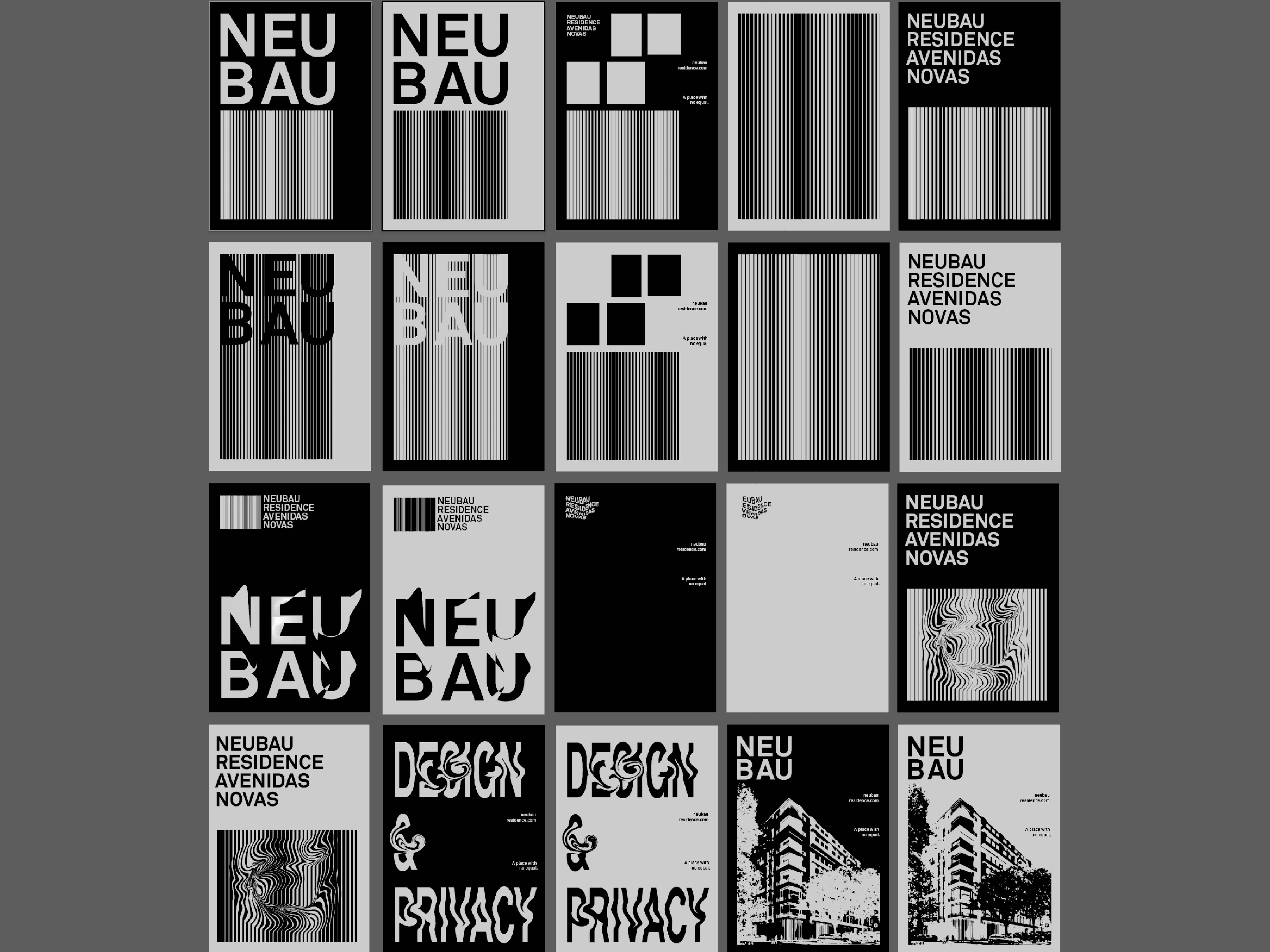
An independent archive of typography.
to participate.
Topics
Formats
Typefaces

Neubau residence

Contributed by Simão Duarte on Oct 31st, 2017. Artwork published in
October 2017
.
    Neubau residence 1
    Source: www.behance.net Nomadesign. License: CC BY-NC-ND.

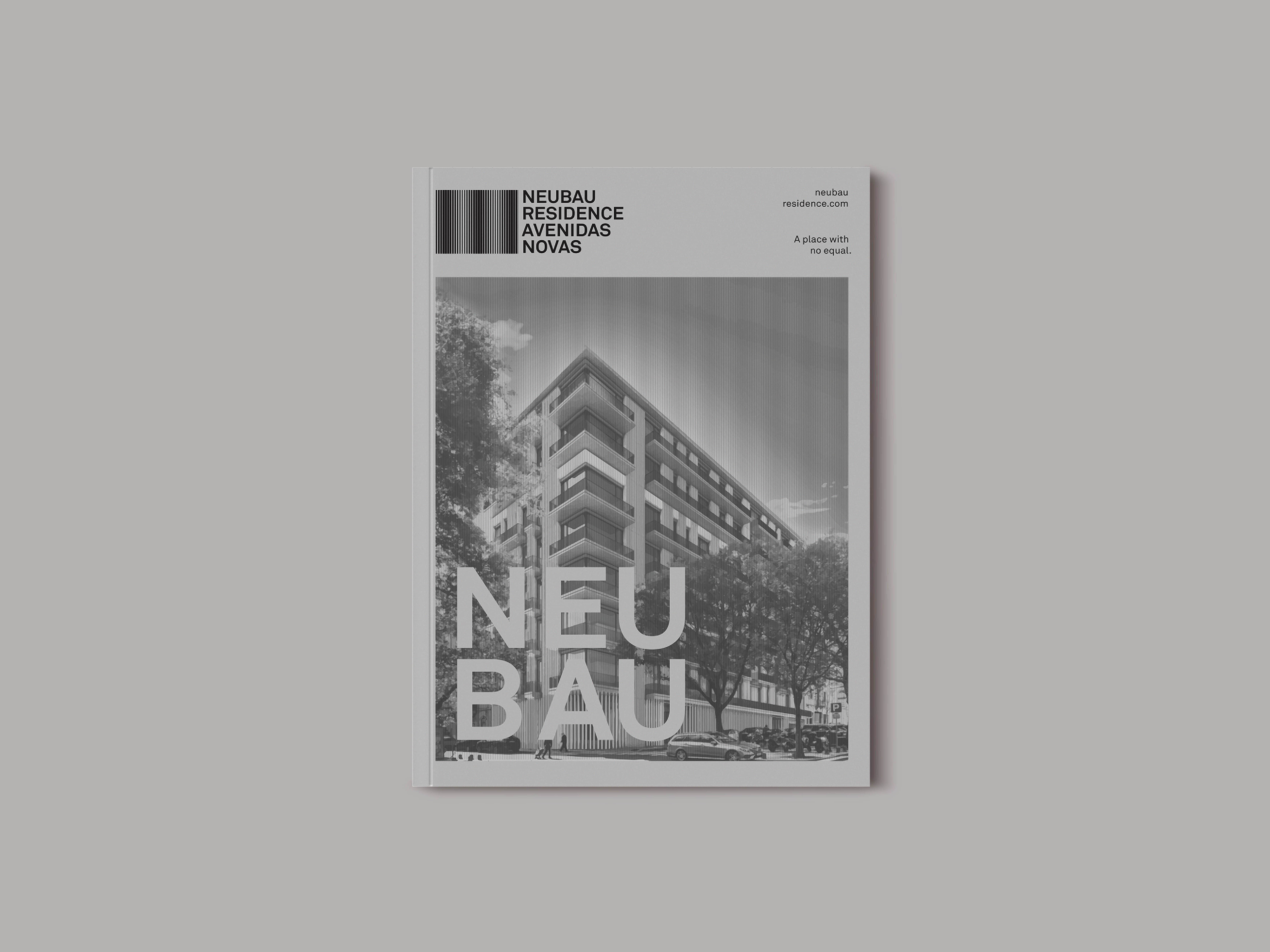
    Neubau is a luxury residence building concept in the heart of Lisbon.

    Neubau residence 2
    Source: www.behance.net Nomadesign. License: CC BY-NC-ND.
    Neubau residence 3
    Source: www.behance.net Nomadesign. License: CC BY-NC-ND.
    Neubau residence 4
    Source: www.behance.net Nomadesign. License: CC BY-NC-ND.
    Neubau residence 5
    Source: www.behance.net Nomadesign. License: CC BY-NC-ND.

    Typefaces

    • LL Akkurat

    Formats

    Topics

    Designers/Agencies

    Artwork location

    In Sets

    2 Comments on “Neubau residence”

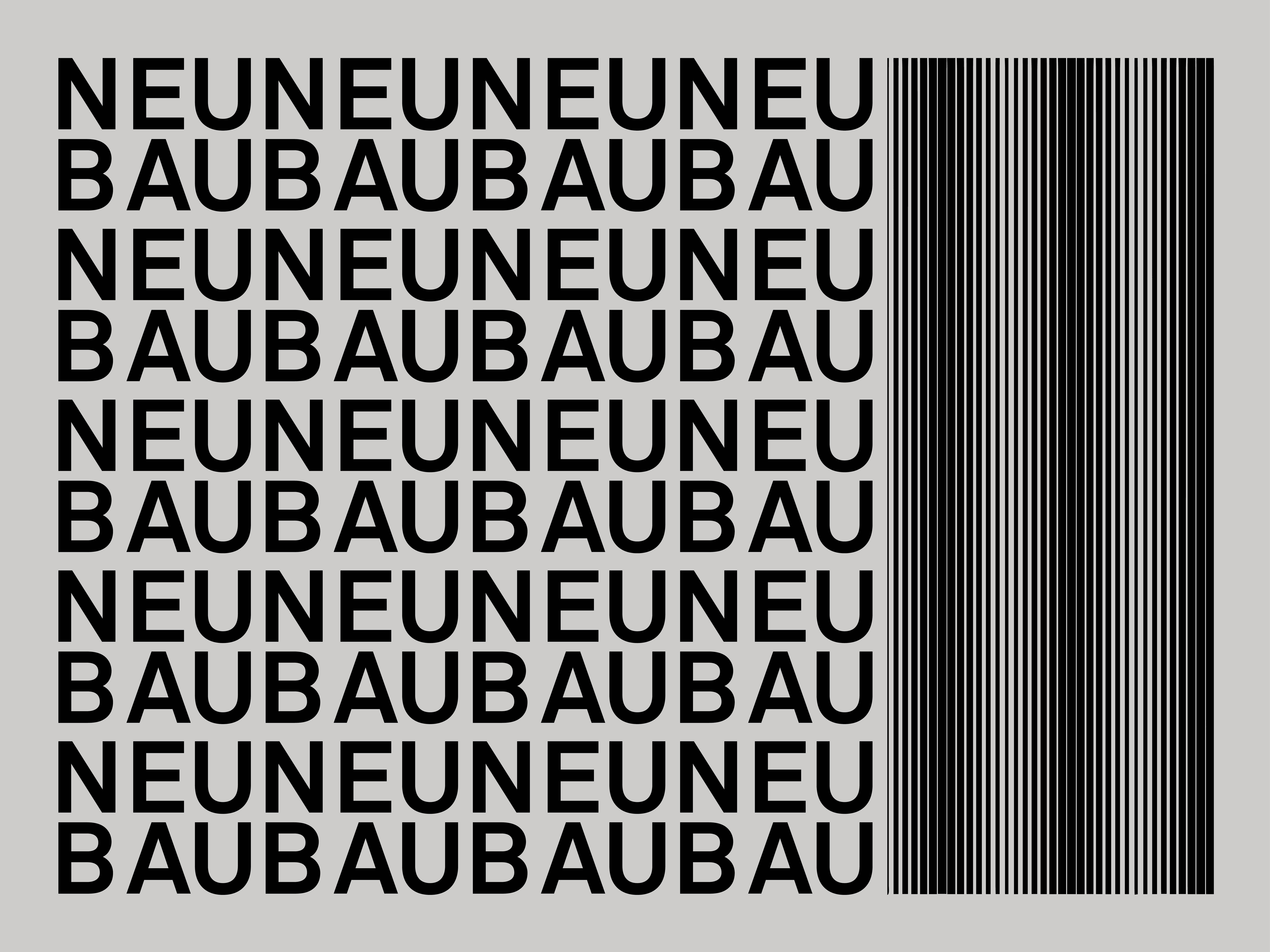
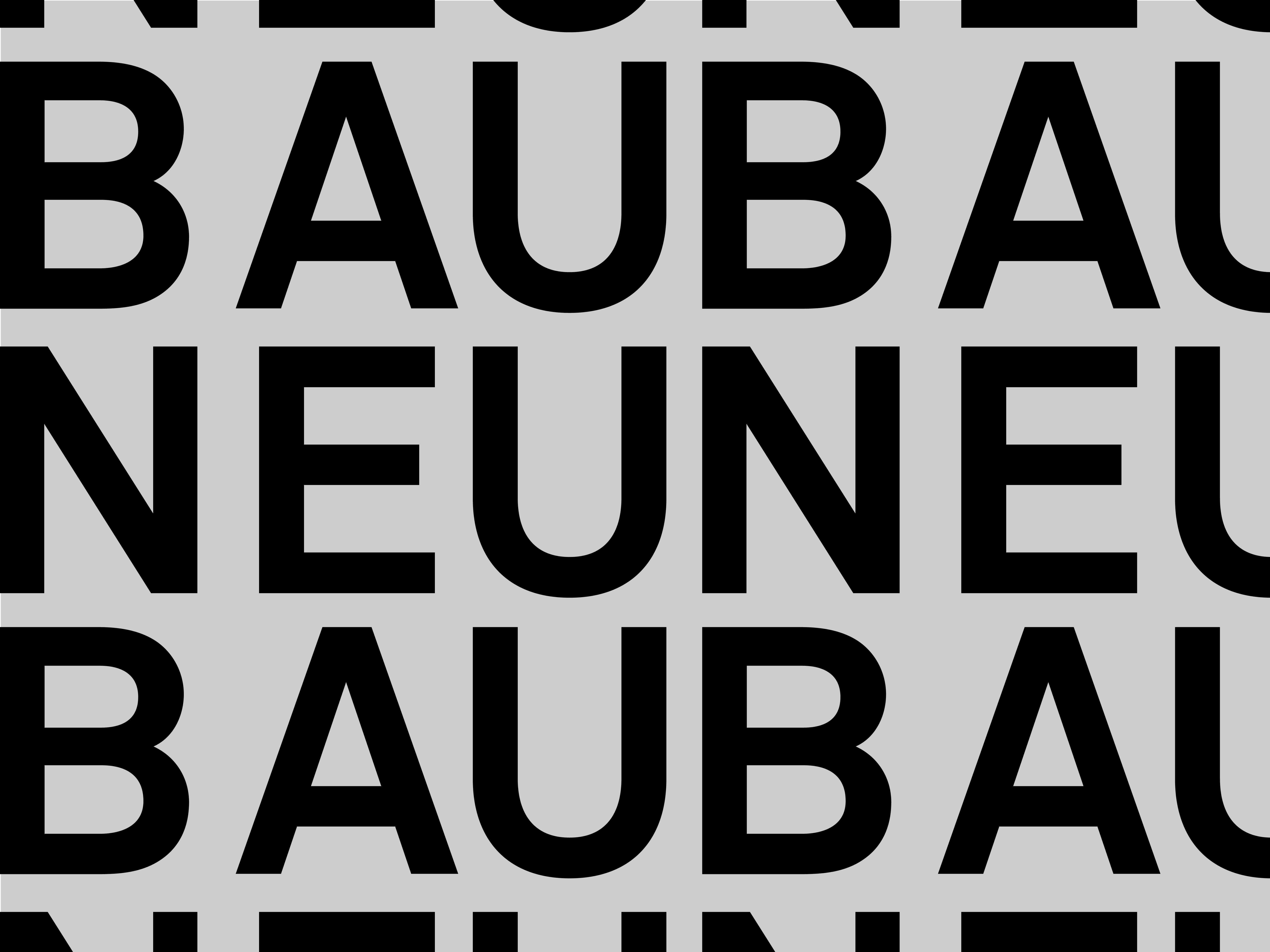
    1. For vertically aligning the letters in NEU and BAU, Akkurat Mono would have been a better choice. In the proportionally spaced version, ‘N’ is wider than ‘B’, which leads to a glaring gap.

    2. Simão Duarte says:
      Oct 31st, 2017 11:00 am
      You are correct, the gap is obvious. And actually I will try akkurat mono. Thank you

    Post a comment