An independent archive of typography.
to participate.
Topics
Formats
Typefaces

Schönheit und Abgrund magazine

Contributed by 205TF on Nov 24th, 2017. Artwork published in .
    Schönheit und Abgrund magazine 1
    Source: www.seitezwei.com Seite Zwei. License: All Rights Reserved.

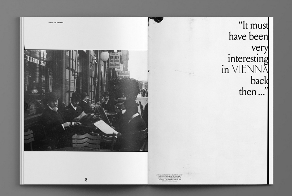
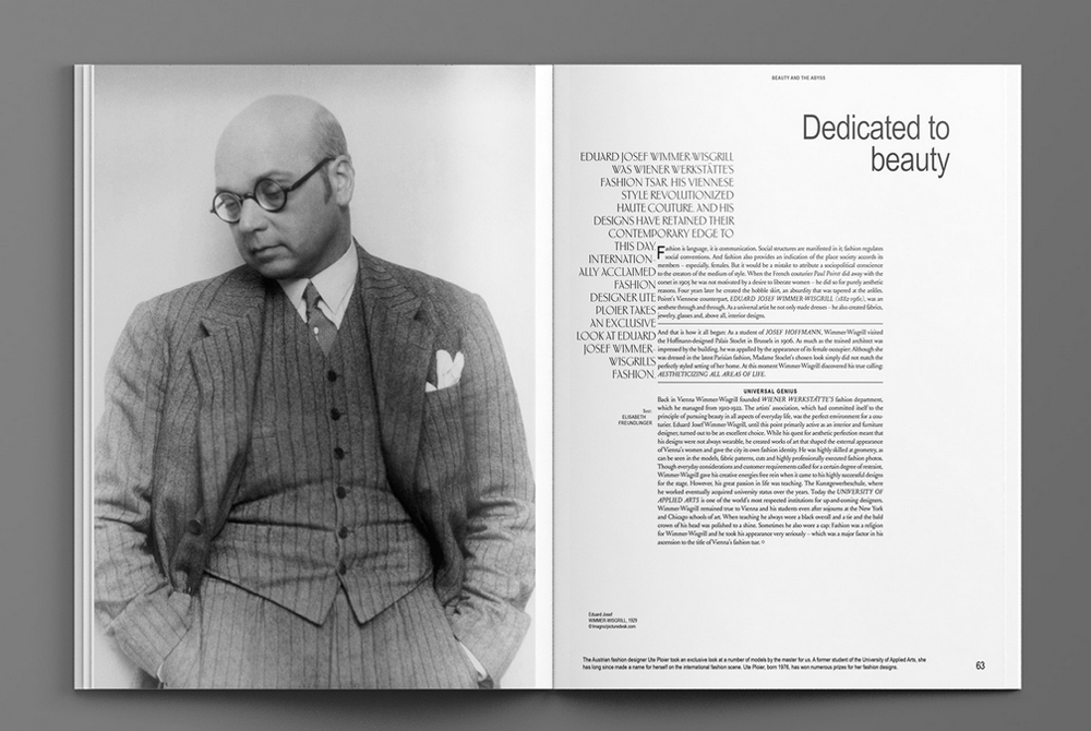
    Schönheit und Abgrund / Beauty and the Abyss is the main publication for the celebration of Viennese Modernism by the Vienna Tourist Board. Seite Zwei created a magazine that refers to this holistic approach by providing complete freedom to give each article a formally and conceptually conclusive design. By ignoring grid and typographic definitions, using analogue reproduction methods and unedited archive images, the design references something “old” and raw, yet refined and modern, with great attention to detail. The typeface in use is Louize Display, created by Matthieu Cortat and available on 205.tf.

    Schönheit und Abgrund magazine 2
    Source: www.seitezwei.com Seite Zwei. License: All Rights Reserved.
    Schönheit und Abgrund magazine 3
    Source: www.seitezwei.com Seite Zwei. License: All Rights Reserved.
    Schönheit und Abgrund magazine 4
    Source: www.seitezwei.com Seite Zwei. License: All Rights Reserved.
    Schönheit und Abgrund magazine 5
    Source: www.seitezwei.com Seite Zwei. License: All Rights Reserved.
    Schönheit und Abgrund magazine 6
    Source: www.seitezwei.com Seite Zwei. License: All Rights Reserved.
    Schönheit und Abgrund magazine 7
    Source: www.seitezwei.com Seite Zwei. License: All Rights Reserved.
    Schönheit und Abgrund magazine 8
    Source: www.seitezwei.com Seite Zwei. License: All Rights Reserved.
    Schönheit und Abgrund magazine 9
    Source: www.seitezwei.com Seite Zwei. License: All Rights Reserved.

    1 Comment on “Schönheit und Abgrund magazine”

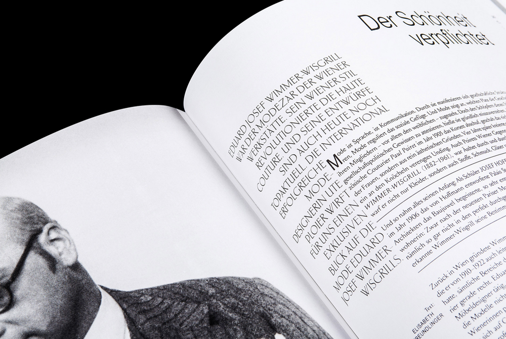
    1. The second serif is some interpretation of Ehmcke-Antiqua aka Carlton, maybe a modified Antiqua Roman.

    Post a comment