
Deutschland Plakate specimen, Berthold (ca. 1934)
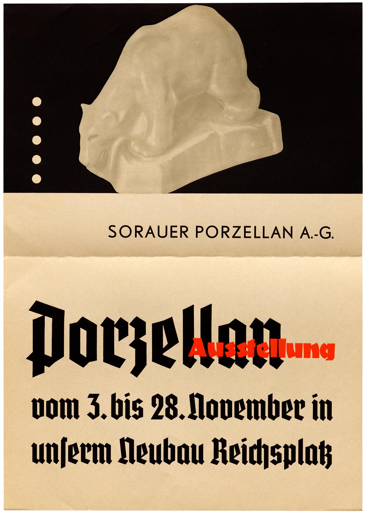
A3-size poster for a porcelain exhibition by Sorauer Porzellan A.-G., a company established in 1888 in Sorau, Prussia (today Żary, Poland) and destroyed in February 1945, shortly before the end of the war.
In-use examples from Berthold’s poster specimen for Deutschland, released in 1933–35 in five styles including an uncommon oblique. These exemplary uses show the schmalfett (bold condensed, 1933) which was available in metal in sizes from 6 to 96pt, and larger sizes in Plakadur or wood. Together with Potsdam, Tannenberg, National, Element and others, Deutschland was part of the surge of simplified blackletters issued in the first years of Nazi Germany. Many of them were named and advertised with a nationalist background, and the specimens often are littered with propaganda.
The secondary typeface printed in red (“Ausstellung”, “Kempinski Weinen”) is Fanfare. As Erik Spiekermann notes, it was designed by a Jewish designer, Louis Oppenheim (1879–1936), in 1927. The sans serif caps are from Berthold-Grotesk.
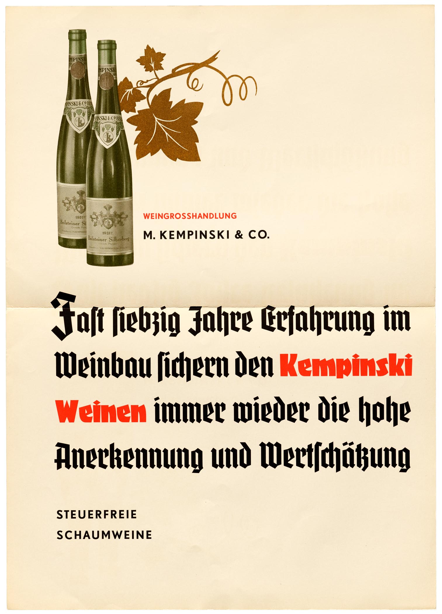
Poster ad for “tax-exempt sparkling wines” by M. Kempinski & Co. The wine company was founded by German-Jewish merchant Berthold Kempinski (1843–1910) in 1862. In 1937, a few years after this specimen was published, Kempinski’s son-in-law Richard Unger (1866–1947) was forced to sell the company and emigrate to the US. As a graphic sign of this “Aryanization”, the star in the logo (still visible on the labels shown here) was replaced by grapes. In 1941, the Jewish name Kempinski was changed to F. W. Borchardt.
Cover of the specimen folder
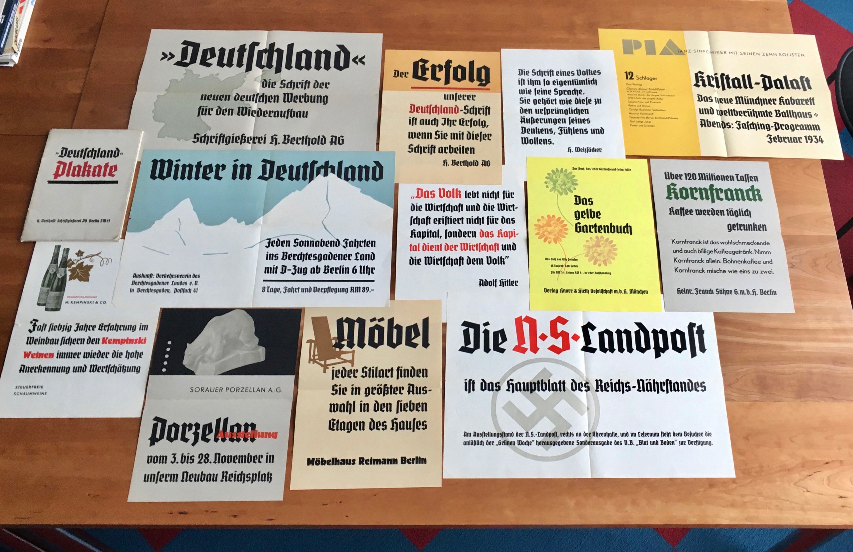
This specimen of Deutschland’s Plakat (poster) sizes contains twelve folded A3 and A2 sheets. Several of them are littered with Nazi propaganda — see the quote by Adolf Hitler, or the ad for the Nationalsozialistische Landpost, the organ of the Reichs-Nährstand, announcing a special “Blood and Soil” issue of the Völkischer Beobachter, the newspaper of the Nazi Party notorious for their racist agitation.


")


 movie posters")

, 25 May 2013")


")


")


")

")


3 Comments on “Deutschland Plakate specimen, Berthold (ca. 1934)”
this is fascinating, and the typeface is beautiful.
i would appreciate if you can help me find a similar font or a type specimen containing all the characters. i want to use it for a student work.
thanks,
Yaronimus
Hi Yaronimus,
there is a digitization by Gerhard Helzel, spanning 3 weights plus a (newly added?) licht (outlined and shaded) style. This information was missing from our typeface page. I have added it just now. Here is a showing from his specimen catalog:
Single styles are €25. The mager (light) is €20. A bundle of mager and halbfett is €40. Helzel’s website may look a tad unconventional, but ordering is pretty straightforward. Send him an email (he speaks English) and pay via Paypal.
The original logo of M. Kempinski & Co. with the seven-pointed star that I had mentioned in the caption to the second image was designed by Karl Schulpig. It is shown together with one of this graphic artist’s more famous creations, the logo for Allianz, in an ad in the Gebrauchsgraphik issue from September 1934.