10,000 Uses on Fonts In Use
To celebrate this landmark, we look back at nine previous milestones.
Fonts In Use launched in December 2010, initially as a blog. In July 2012, we introduced the Collection, a much larger archive of typographic design open to public contributions. Looking back over the last 10,000 Uses we remember a few notable contributions, discussions, and typographic trends along the way.
1,000 Uses: September 2012
Not long after we opened the Collection to the public it gathered its first 1,000 Uses. As we crossed that milestone, eBay and Microsoft had just introduced new logos. Our readers learned that vintage Apple ads and the Patagonia logo use the same typeface. And Barack Obama was about to be elected for a second term. Anyone remember Snapjoy?
2,000 Uses: May 2013
Less than a year later, the Collection had doubled in size — seeding the ground for an Advanced Search. The Great Gatsby hit the movie theaters. The New York Times got a new look, and The Netherlands a new king. We saw early uses of Arek (for Armenian) and Metro Nova (for Icelandic). It was then that emoji reared their colorful heads on Fonts In Use for the first time. The eclecticism of the re:publica poster series required us to raise the limit of fonts per use.
3,000 Uses: January 2014
The third thousand was reached at the beginning of 2014. We examined a new prayer and song book and the typography of Disneyland. Morton Salt turned 100. So did Cochin and LoType. The rediscovery of ITC Serif Gothic picked up steam. Fresh type included Odesta, FF Mark, Lava, Line, and Landmark. Swiss Typefaces posted the first of now more than one hundred contributions. On the Blog, Jennifer Kennard told The Story of Our Friend, the Fat Face.
4,000 Uses: August 2014
Germany was still celebrating the victory at the FIFA World Cup, but it was the US team who won Best Typeface. Pique and Input were just released and already put to good use. Meanwhile, in the Czech Republic: Briefcase Type adds a dozen intriguing Uses.
5,000 Uses: May 2015
In May 2015, Hillary Clinton entered the presidential campaign. Fontstand launched. Robb Rice redesigned Women’s Wear Daily with Chiswick and Forma DJR, both unreleased at that time. We marveled at the Vertigo opening titles and distrusted Errol Morris’s declaration of the most truthworthy typeface.
6,000 Uses: January 2016
We bid farewell to David Bowie and Bram de Does. Visible Language got on online archive of all its issues. It’s hot to use Druk in all its widths.
7,000 Uses: August 2016
The next milestone was reached just seven months later, after we finished binge-watching Stranger Things. We remembered Massimo Vignelli and his Few Basic Typefaces, and we saluted New York magazine for looking beyond the canon with Hobeaux and Atlantic. Type designers shared early uses of their creations: Totentanz, bb-book A, Monumental Grotesk, Lausanne. In 2016 we presented a history of the project in Berlin and San Francisco. Here’s video of the second talk.
8,000 Uses: April 2017
In April 2017, Fonts In Use turned an eight-thousander. Yes, a good portion of it is Cooper Black. Our critique of the cover art for DAMN. became one of the most discussed articles. It was also around this time that French foundries and type designers really turned on to Fonts In Use. They introduced us to a custom typeface for Air Inuit, Memories of the Moon Age, and Gulliver’s Travels in 2pt type, to name but three examples.
9,000 Uses: September 2017
Within five months, another thousand Uses were added. We looked at Trader Joe’s hand-painted signs and ATypI’s playful identity, and celebrated the revival of Marvin. Gareth Hague posted his 200th submission, making him our most active guest contributor. Close on his heels: Love Lagerkvist with a dissection of Taylor Swift’s Reputation. And Blythwood set a new record for oldest Use.
10,000 Uses: March 2018
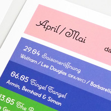
Today, we hit the 10K mark, thanks to 1,274 active contributors who shine a light on the diverse world of typographic design, new and old, and keep our comment threads lively with interesting commentary. We also reach this milestone through the support of sponsors from the type and design community. That roster currently includes Mark Simonson, TypeTogether, and Font of the Month Club, whose typefaces Refrigerator, Fino, and Nickel are used for the graphic on this page. Today, we welcome Cargo Collective, who joins Mark as a core sponsor. Thank you, all. This independent and communal archive of typography could not exist without you.













2 Comments on “10,000 Uses on Fonts In Use”
I never realized there were so many fonts and growing.
Wow… I had no idea!