

“The best gyms in the world” — Men’s Health
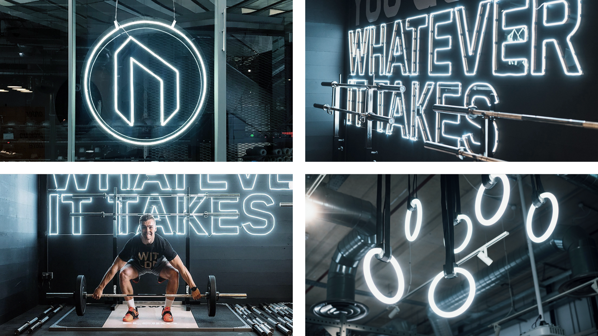
Founded in 2015, WIT Fitness had grown quickly from their physical and digital stores in Europe, Asia and the Middle East, to establishing flagship gym/retail facilities in London and across North America. Fluoro were commissioned to create a brand identity, digital strategy and design language that would assist in forging their position as the world’s leading training hub specialist.
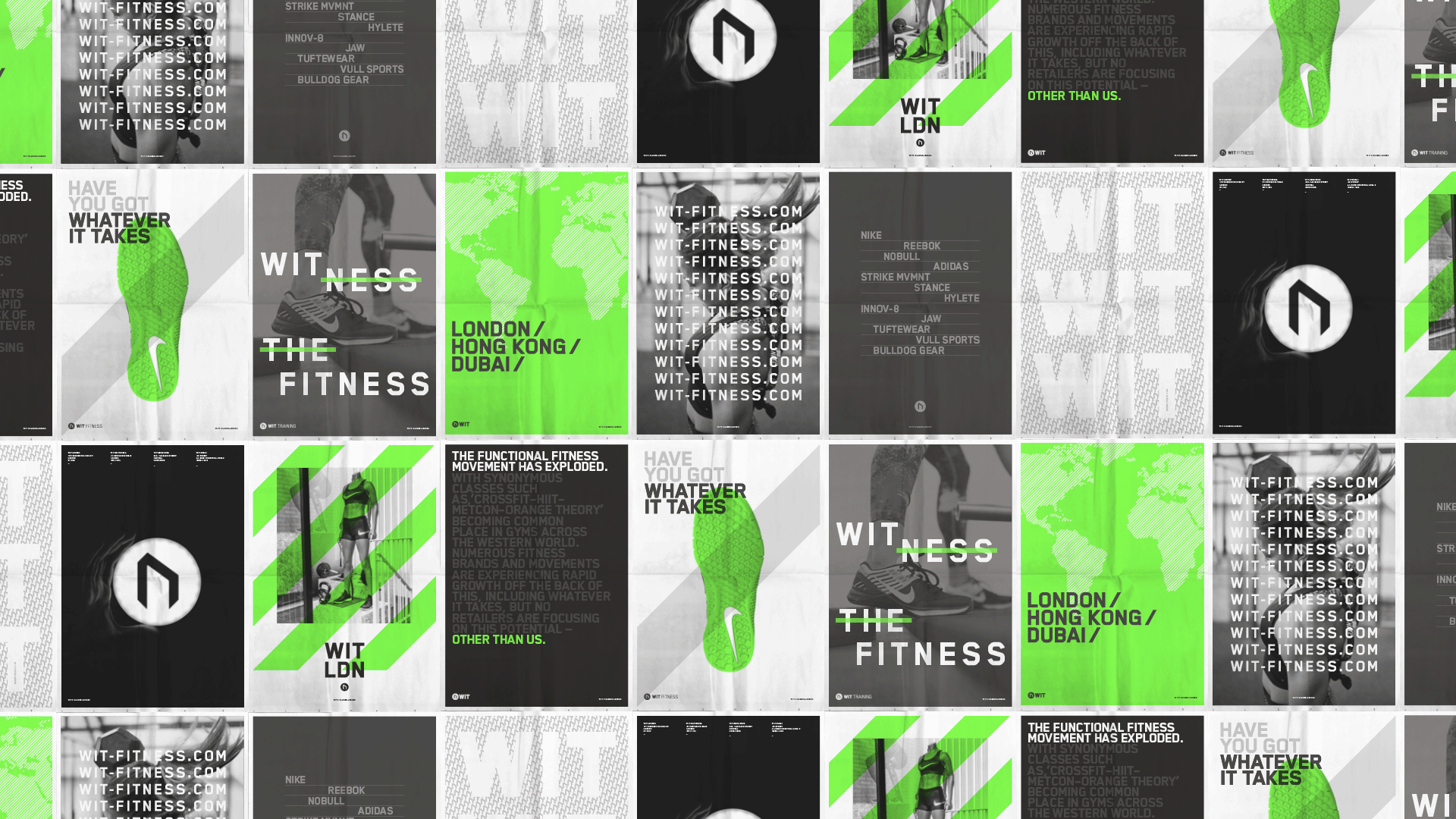
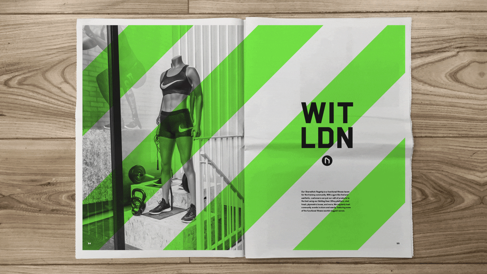
Working closely with the team at WIT, we created a graphic system that uses typographic messaging, grids and patterns that reflect the brands’ urban appeal and city influence. This created a contemporary, fresh and bold aesthetic conveying movement and athleticism. We developed and implemented this design strategy across all parts of the user journey – WIT retail & training websites, social channels and in-store digital systems – an ecosystem designed to showcase the entire portfolio of retail brands, stores and services.
The results were clear: higher sales conversion, a unique and ownable brand aesthetic, building awareness with new and existing consumers, improved community engagement, new partner-brand launches, product launches, and pro-athlete events. In 2018 WIT’s position as the worlds leading training hub was cemented as global fitness mega-brands: Nike, Reebok and Crossfit selected WIT, St Pauls as the platform for their global product launches.


")


")

")


")


