
Linotype Library ad in U&lc, 1992
Contributed by Stephen Coles on Sep 7th, 2012. Artwork published in
.
U&lc, Vol. 19, No. 1, Spring 1992. License: All Rights Reserved.
Over the last 100 years type has been forged from molten lead, exposed on film, drawn by laser beams. Through it all there’s been a way to recognize an honest face.
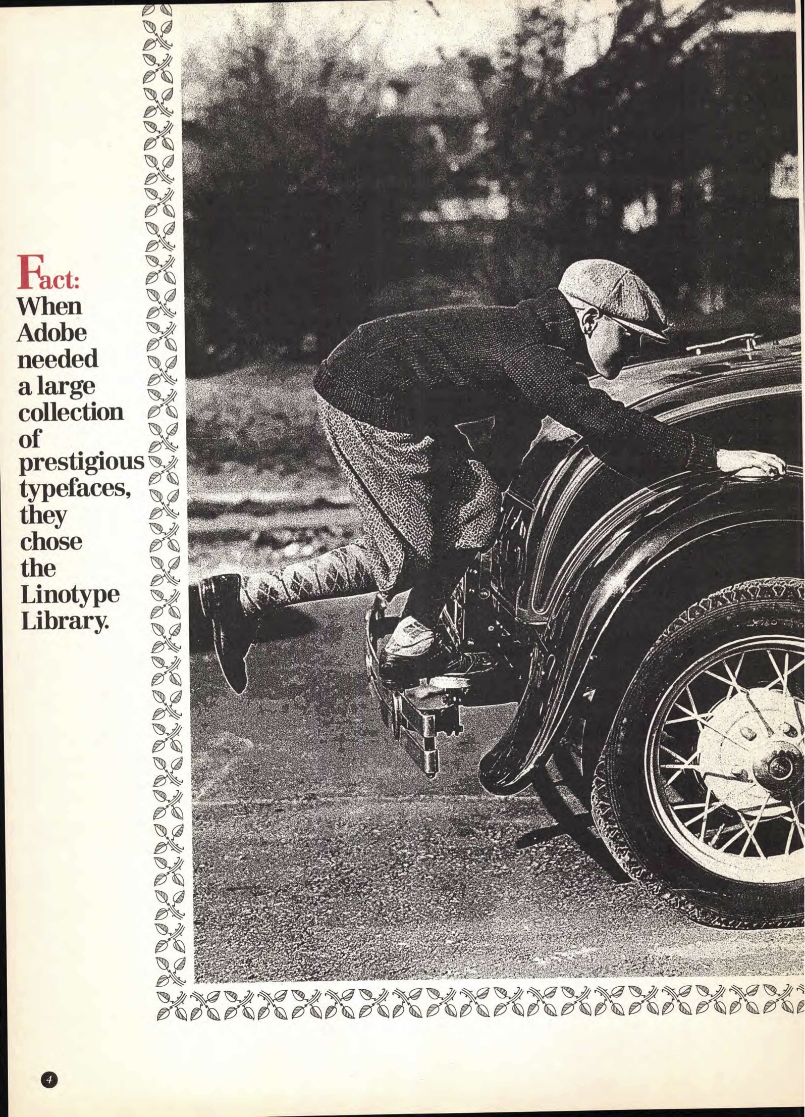
Fact: When Adobe needed a large collection of prestigious typefaces, they chose the Linotype Library.
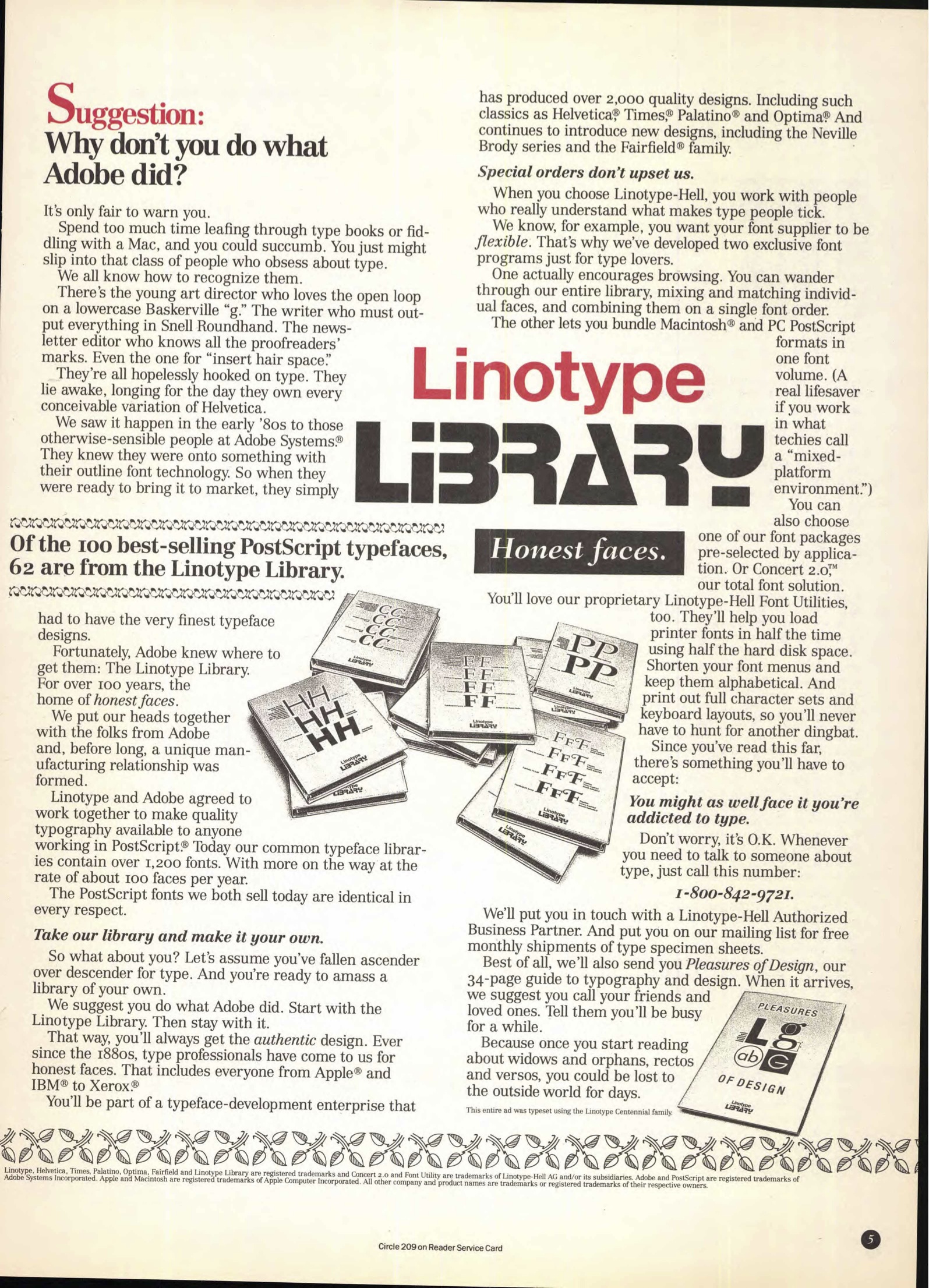
Suggestion: Why don’t you do what Adobe did?
U&lc, Vol. 19, No. 1, Spring 1992. License: All Rights Reserved.
U&lc, Vol. 19, No. 1, Spring 1992. License: All Rights Reserved.


 album art")


4 Comments on “Linotype Library ad in U&lc, 1992”
It’s not clear what the photograph on the second page represents. Is it a young Adobe hitching a ride on the classic, authentic Linotype Library?
Ha! I think you may be right.
“Linotype-Hell” is quite the unflattering name in English, but I’m sure it was worth it for Hell GmbH’s library.
I imagine they chose Stop to evoke the old Adobe logo.
Also: the “honest faces” tagline below the logo is actually in Fairfield.
Thanks, added. The Linotype logo was introduced shortly before. I vaguely remember hearing something about Alessio Leonardi being involved in its design (or was it the subsequent version?). There’s a related ad about “how Fairfield became the latest addition to the Linotype Library” in U&lc Vol. 18 No. 4 from winter 1991. It already featured the logo in Stop.