
Evangelisches Frankfurt
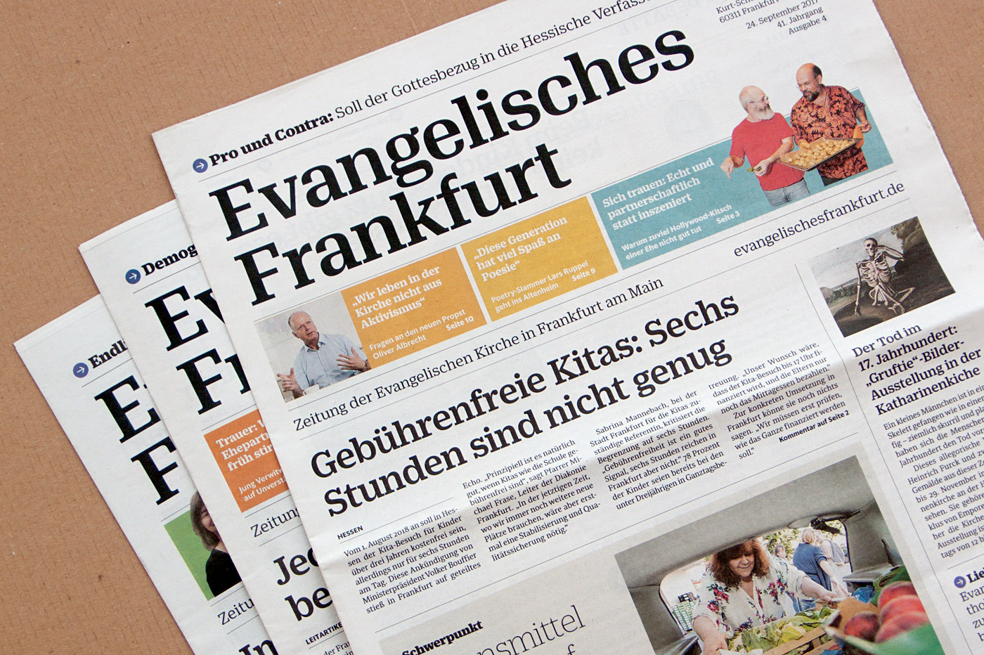
Evangelisches Frankfurt is the newspaper of the Protestant Church in Frankfurt. It was designed by German newspaper designer Jan Famira.
The newspaper gets published five times a year and is sent to all Protestants living in Frankfurt free of charge. It seems the newspaper’s new design has easily convinced the audience as the post by a regular reader suggests: “The new design is really well done, very beautiful, appealing, and lively. Thanks a lot for that!”
Art director Jan Famira puts it this way: “Evangelisches Frankfurt has chosen its 40th anniversary to introduce readers to a completely redesigned newspaper, with a new nameplate, headline and body type. Among our core objectives was an improvement of legibility, especially for older readers. The newspaper’s new text face, Sindelar, along with an increase in text size, makes reading the paper far more easy.”


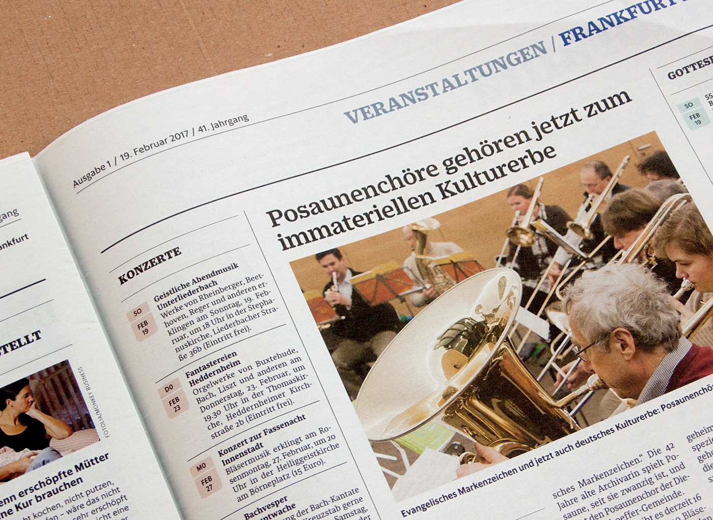
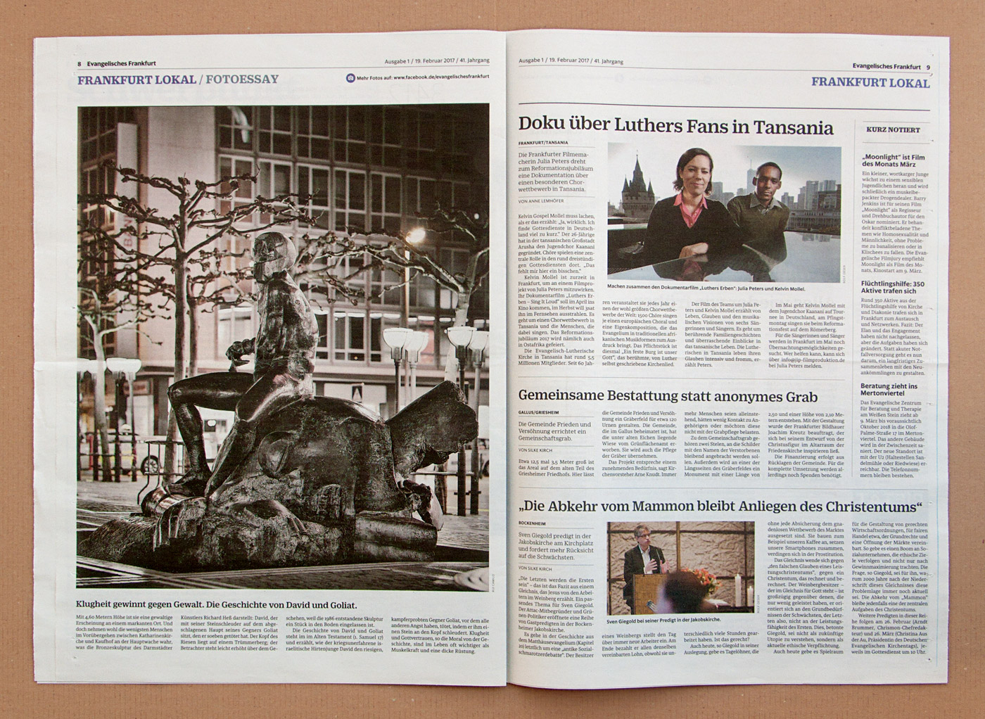
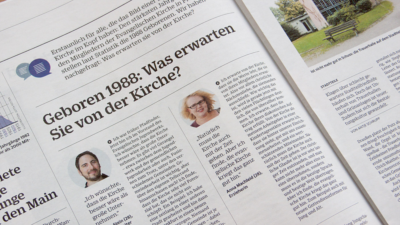
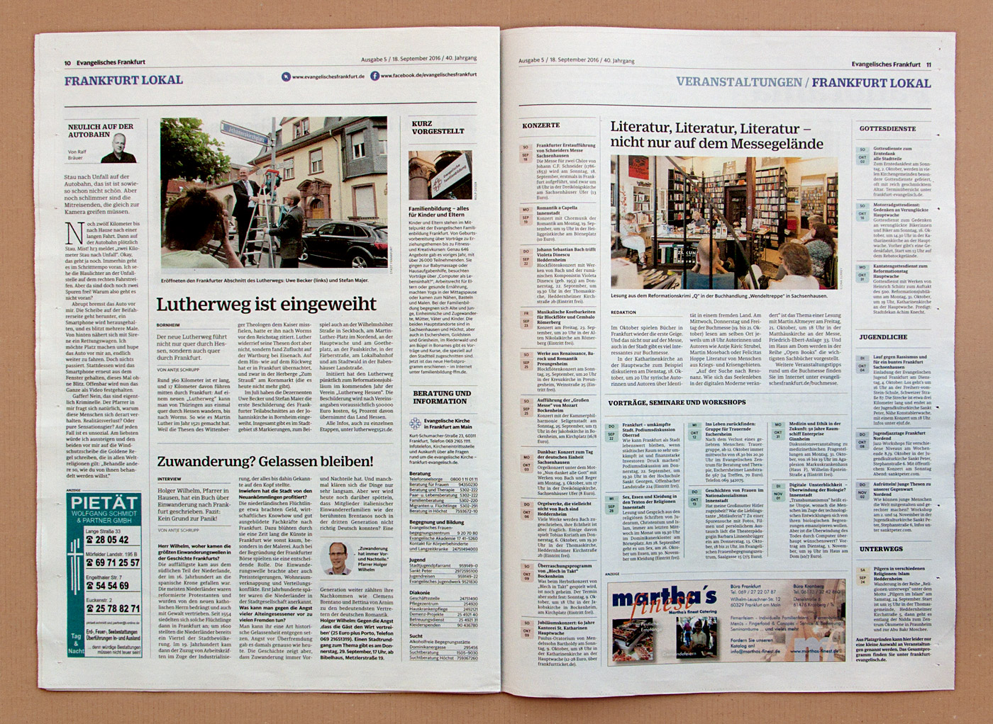
Sindelar’s great legibility qualities can been seen throughout the newspaper.


")


")


2 Comments on “Evangelisches Frankfurt”
The logo seems to be set in a custom version of Algebra.
Well spotted, Connor! Here’s a comparison of the nameplate (top) and Algebra Medium (bottom, with some negative tracking). The main modifications include shorter ascenders, the omission of the center serifs in E and F, a k with horizontal link, and an upward-pointing flag on g: