Caetano Veloso – Transa album art
Contributed by Fernando Mello on Jul 21st, 2018. Artwork published in
circa 1972
.
Topics▼ |
Formats▼ |
Typefaces▼ |
6 Comments on “Caetano Veloso – Transa album art”
Very nice — both the Use and the info about Brazilian photo-lettering. Muito obrigado, Fernando!
Additional images on Discogs show that the album comes with a tri-fold cover. Together with a triangular fold-out, it can be transformed into a prism:
The circle on the bottom right picture holds the credits. It’s quite small, but it looks like the design is by Aldo Luiz. On Arte Educação, Luiz has shared some info about his life and career:
Great info there, Florian. Aldo Luiz is known to have designed lots of record covers in the 70s. He supposedly appears in a 2007 documentary called “Ouça o Disco, Veja a Capa” (something like “Listen to the Record, Look at the Cover”), which focuses on Brazilian album art from the 60s/70s. I couldn’t find much more about the film yet, though.
Apparently, Caetano wasn’t that fond of the design, as once stated in an interview: “I called my friends to record in London, the arrangements are by Jards Macalé, Tutti Moreno, Moacyr Albuquerque and Áureo de Sousa. They weren’t credited and I had the biggest fight with my friend who designed the sleeve. How do you pull off this folding and unfolding silliness—looks like you’re going to make a lamp with the cover—, and forget the credits?”. :)
Didn’t know about that, Angelo. I have the record and it is indeed a bit tricky to make the folding piramid thing to work :)


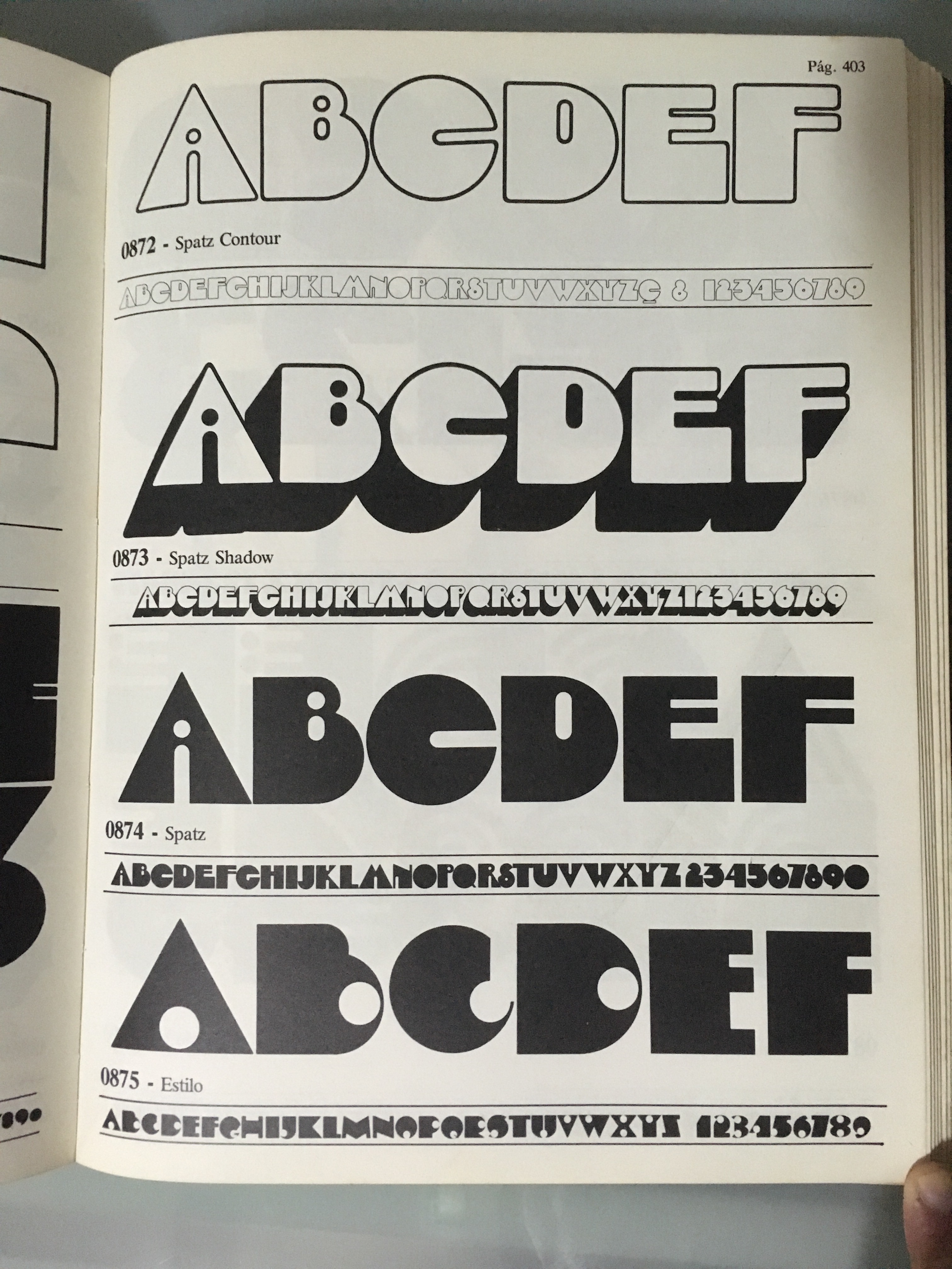
On another note, here are snaps from the Tipograph Fotoletras cover and the 'Spatz’ type page. It matches the one used in the album cover design, as the 'C’ also lacks the inner dot of Mierop Ginger Snap.
Nice! Mine is the plain gatefold 1972 reissue, not the trifold.
Talking 'bout credit, maybe Álvaro Guimarães should also be listed alongside Aldo Luiz, as the 'discobject’ folding concept is his.
And Spatz sure is the match!
Besides the 'C’ dot, the corners in Ginger Snap are softer, rounded.
Here’s what’s probably another use of Spatz, for the cover of Tim Maia’s 1976 album: