
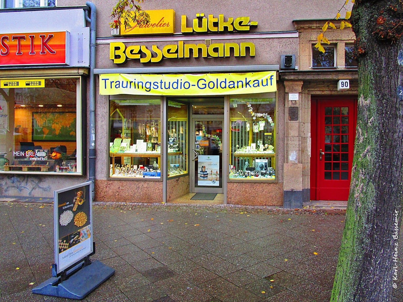
Juwelier Lütke-Besselmann
Contributed by Florian Hardwig on May 4th, 2019.
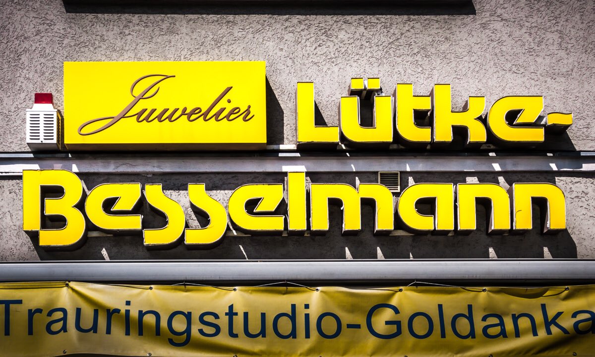
Lemon Motter Tektura with its trademark descending s and a wavy (custom?) hyphen, used for the sign of a jeweller in Berlin-Spandau. “Juwelier” appears to be in a version of Palace Script. See more yellow signs from this city in Berlin Typography’s color focus post.


 & Steve Jobs business card (1979)")


")


3 Comments on “Juwelier Lütke-Besselmann”
Not sure if the original version of Tektura included a hyphen. This Letragraphica sheet shows some wavy lines at the bottom, but those seem to be tildes.
Talking of Othmar Motter: The “first comprehensive biography on the life and oeuvre of the grand Austrian pioneer of graphic design” will be published shortly. Published by Triest, the book will be presented by author and designer Elias Riedmann on 14 June 2019 in Motter’s hometown Hard.
I truly hope it’s released in June! I don’t know when it was announced, but I paid for my preorder way back in January 2018.
Yes! I just got a message from the publisher, asking if my shipping address is up to date. Gut Ding will Weile haben …