
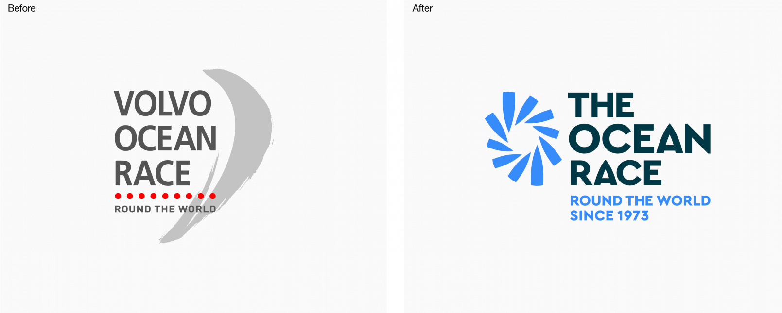
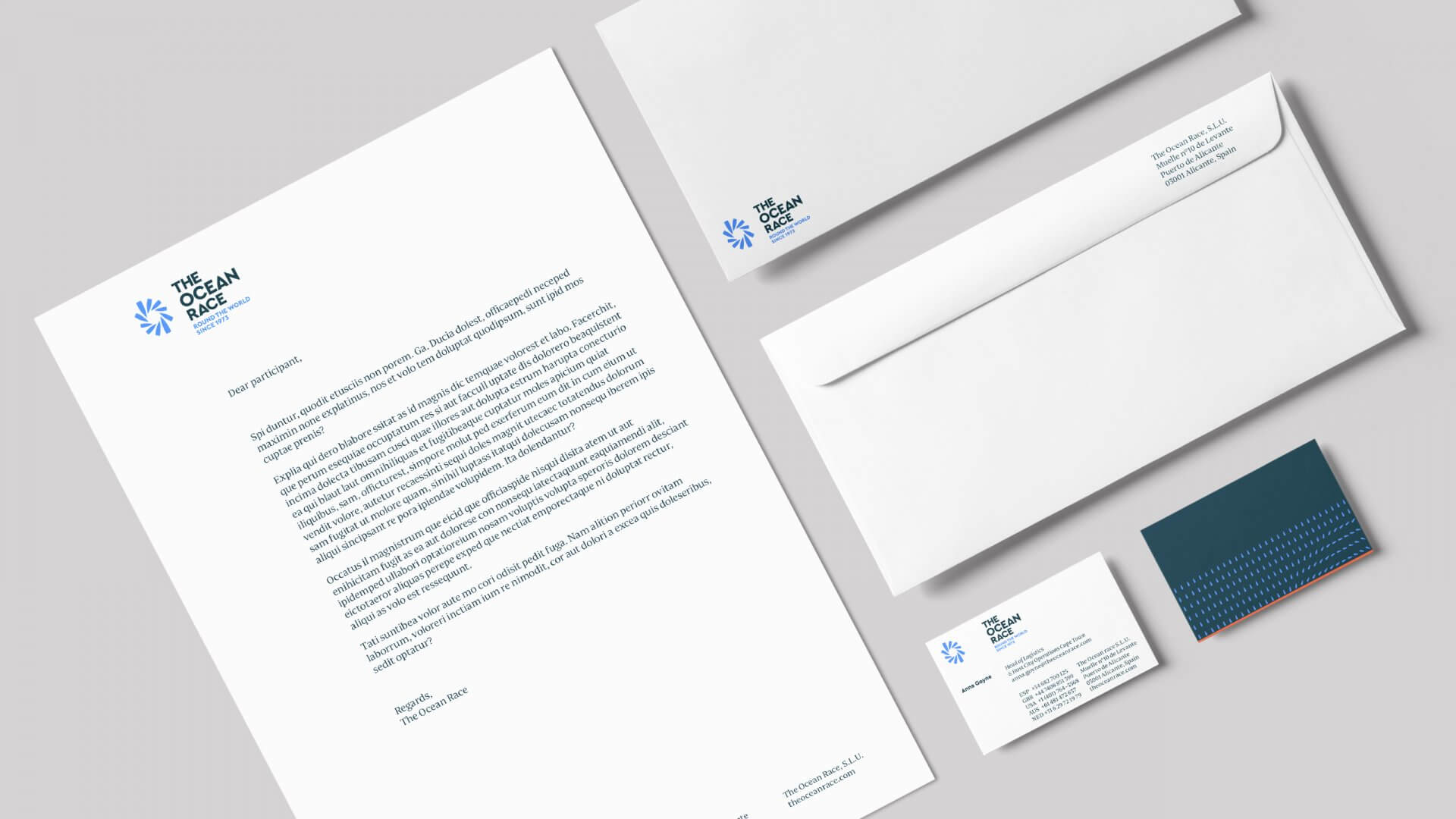
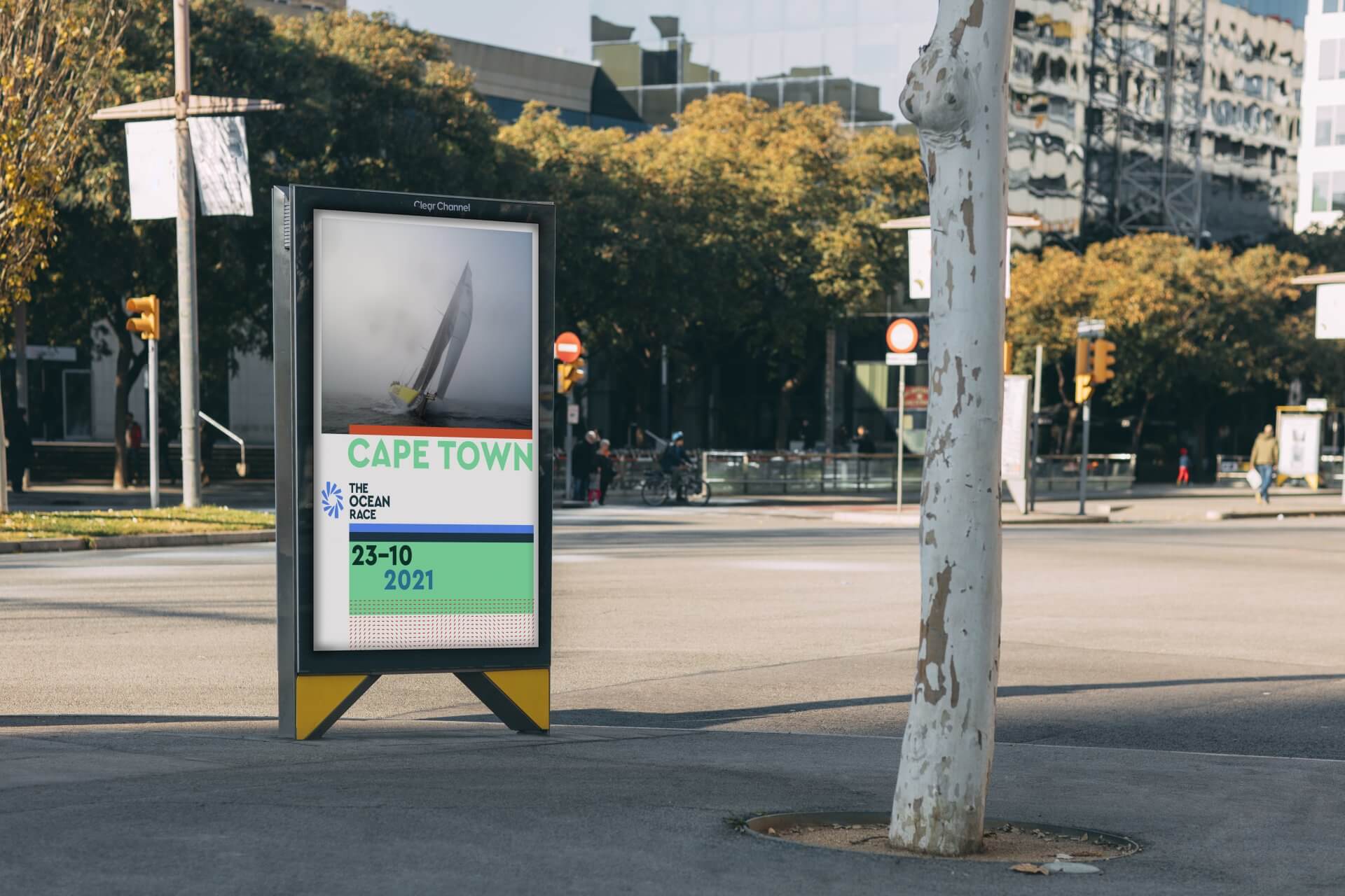
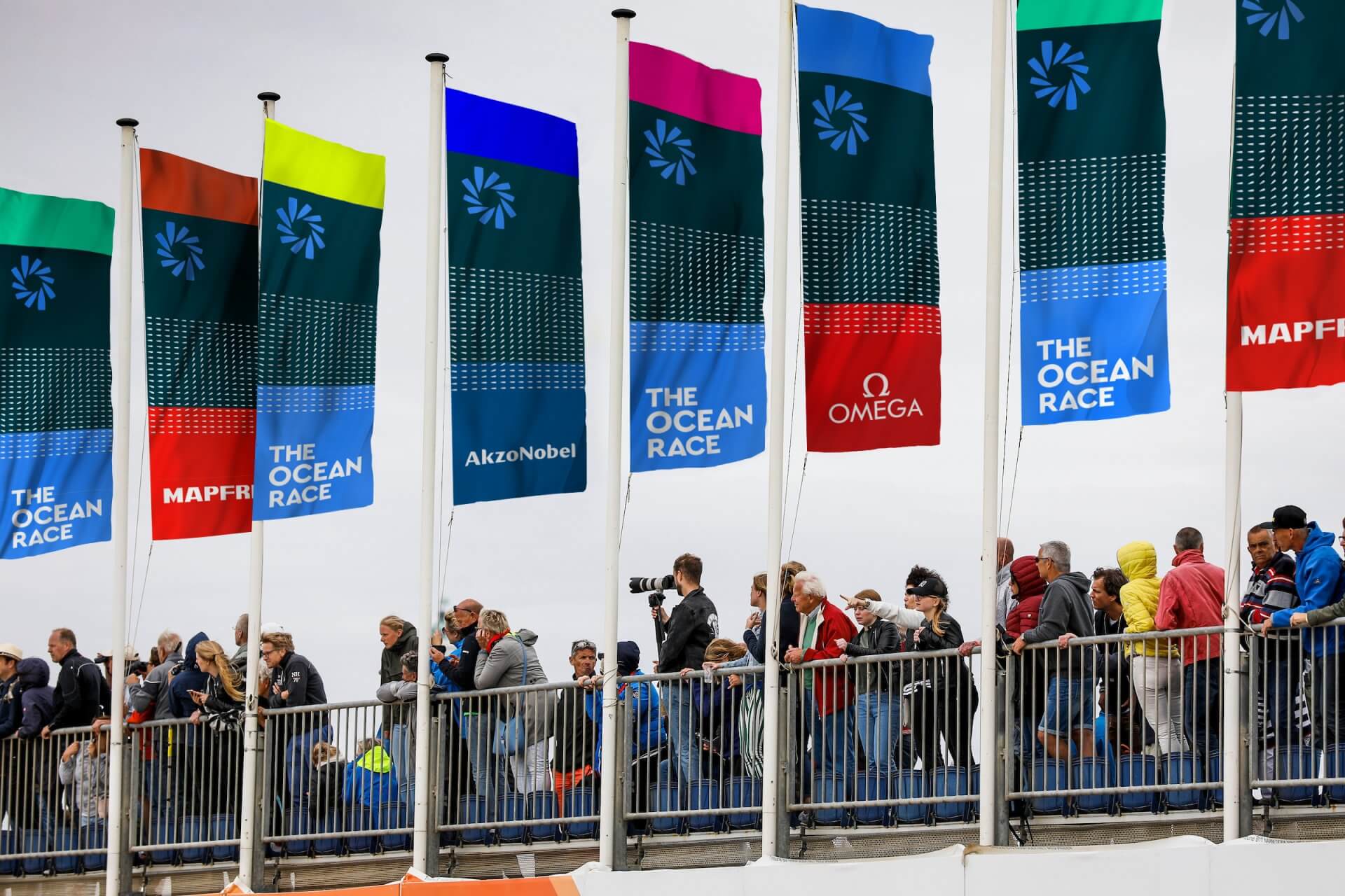
The Ocean Race rebranding

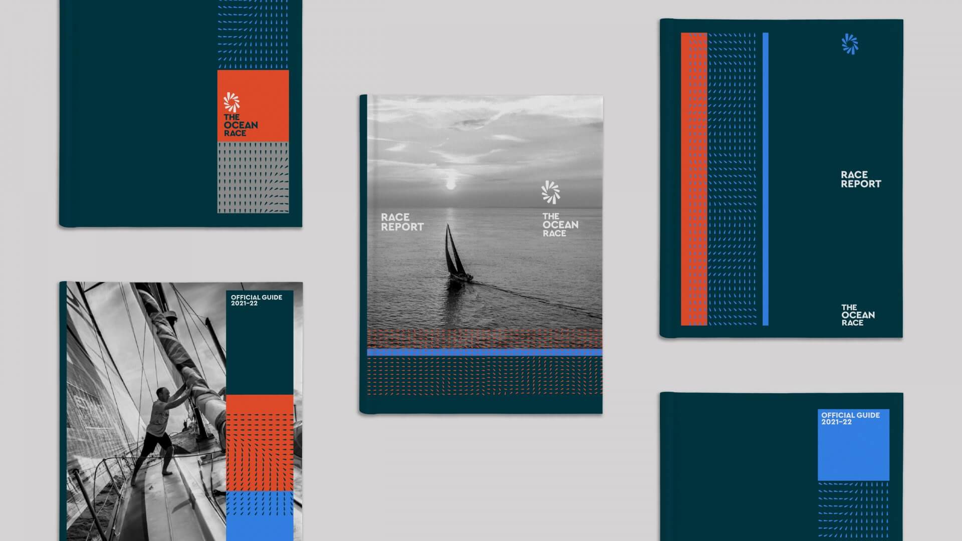
Barcelona-based office of Mucho designed a new logo and identity for – and in collaboration with – sailing regatta The Ocean Race (formerly known as Volvo Ocean Race).
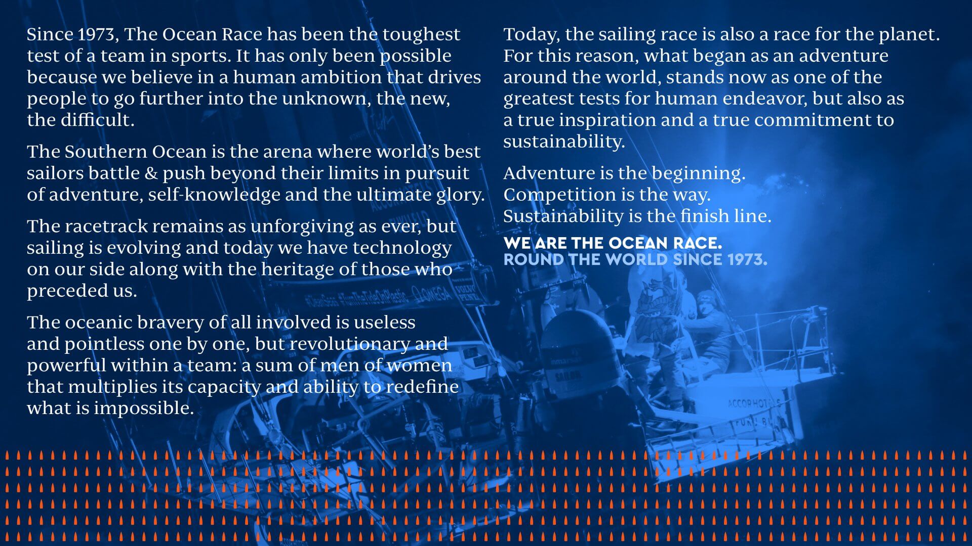
The Ocean Race is often described as the longest and toughest professional sporting event in the world, sailing’s toughest team challenge and one of the sport’s Big Three events, alongside the Olympic Games and America’s Cup. — The Ocean Race
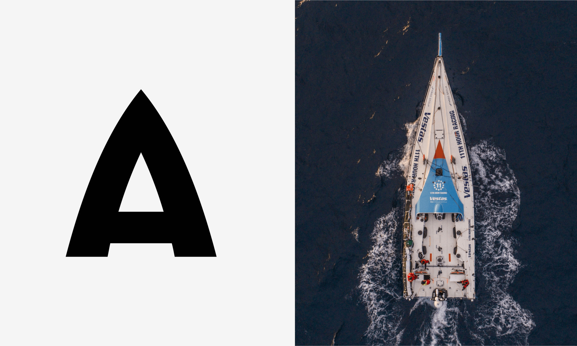
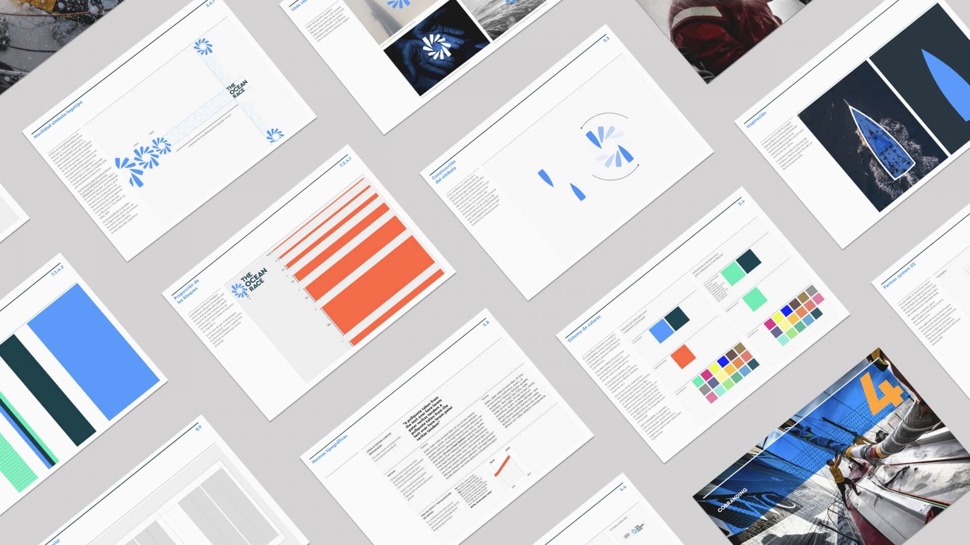
The leading typeface is Cera Pro with a customised capital A, as requested by Mucho and included by TypeMates as an alternate letter to emphasize a boat-like shape that is used in the figurative mark already. In a review on Brand New, Armin Vit summarizes:
It’s funny what a big change a single letter makes to a typeface. In its uppercase, TypeMates’ Cera, already has a vintage Art Deco aesthetic but the custom “A” really turns up the volume on that while creating a strong unifying visual cue for all the applications.
The customized Cera Pro typeface is complemented by a serif typeface by Tipografies. Nomada Serif plays a small role in the branding that has been implemented up to this moment, but the corporate guidelines of Mucho indicate more new design to come.


")


: Le romantique repenti</cite>")

")


