
Vanity Fair, April 2019
Contributed by Juan Parra on Apr 19th, 2019. Artwork published in
April 2019
.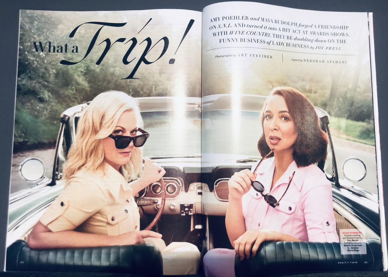
Photo: Juan Parra. License: All Rights Reserved.
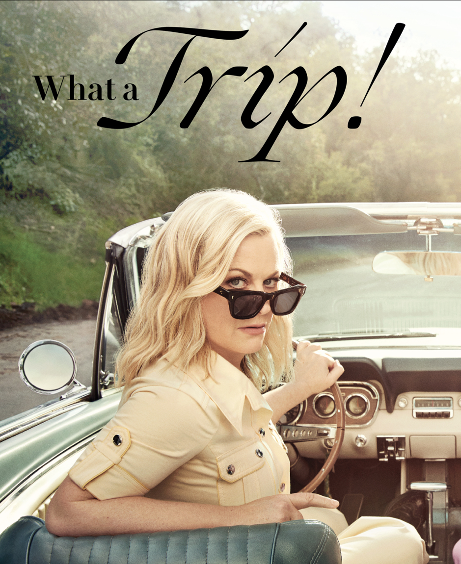
Ogg by Sharp Type is prominently used in the current issue of Vanity Fair. Shown here are pages from the features “What a Trip!” with Amy Poehler and Maya Rudolph, and “The Music Man” about Mark Ronson.
Ogg is paired with VF Didot by Commercial Type. Designed in 2013 as a custom typeface family for Vanity Fair, a retail version was released in 2016 as Le Jeune.

Photo: Juan Parra. License: All Rights Reserved.
“The Music Man” Produced on location by Kristen Terry for Rosco Production. — Vanity Fair
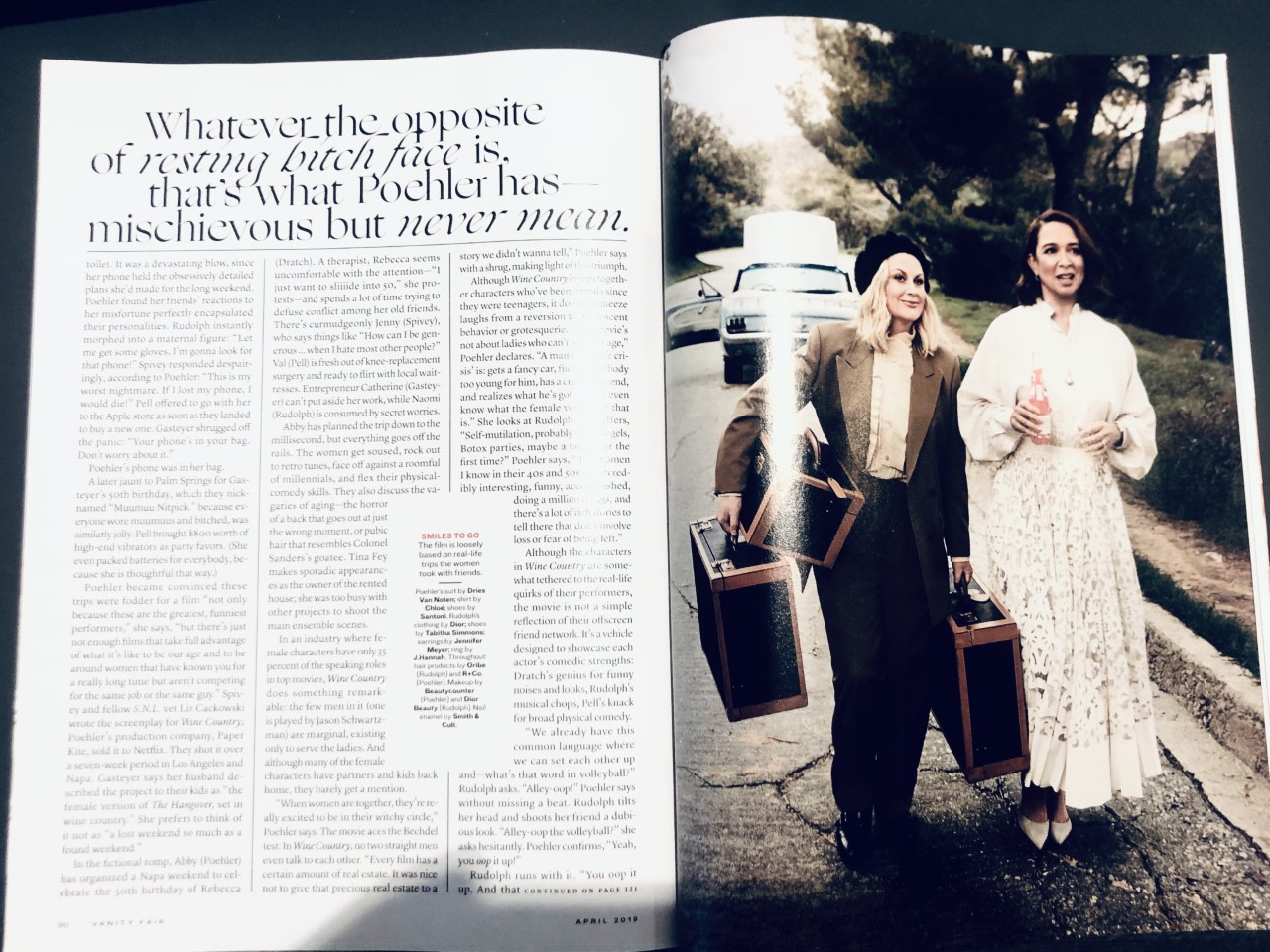
Photo: Juan Parra. License: All Rights Reserved.
“What a Trip!” Photographs by Art Streiber. Styling by Deborah Afshani. Set design by Anthony A. Altomare for Buffalo Art Co. Produced on location by Zoe Talay for Westy Productions. — Vanity Fair
Source: itunes.apple.com License: All Rights Reserved.
Detail


")


")


")


1 Comment on “Vanity Fair, April 2019”
Vanity Fair was redesigned in 2018 by Tonya Douraghy, with creative direction by Chris Dixon and additional design by Kaitlyn Pepe, Marina Grinshpun, and Alison Lenert. The magazine’s standard typographic palette now includes Jeder Grotesque, Lyon, and Sharp Grotesk, in addition to VF Didot. Douraghy used Ogg already in the January 2019 issue. See more images on her portfolio site.
Opening spread for an article by Richard Lawson. The photograph of Alfonso Cuarón is by Peter Hapak.