
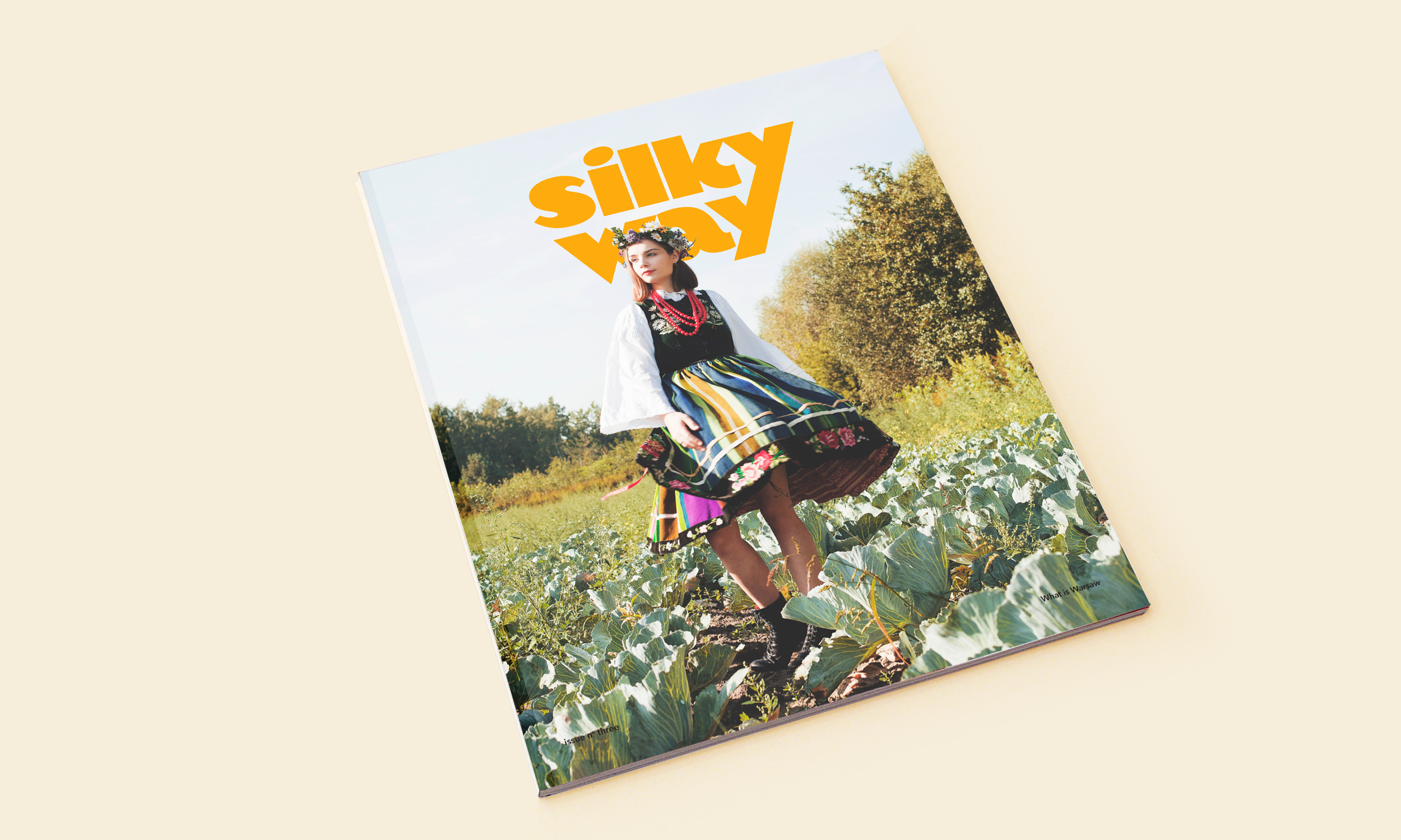
Silky Way magazine, issue 3
Silky Way is a magazine which allows the reader to understand the vibe of the place and encourage to experience it, rather than just see it.
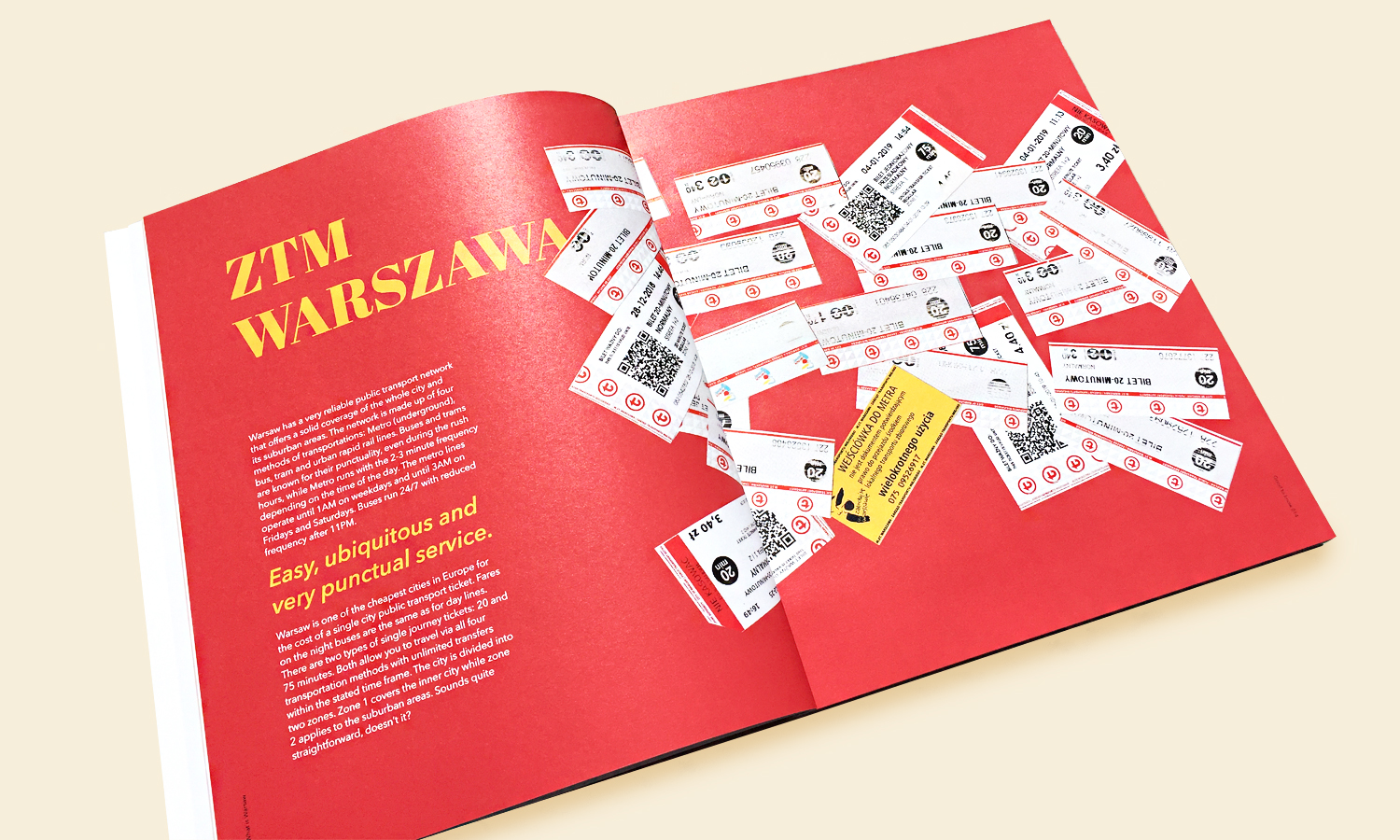
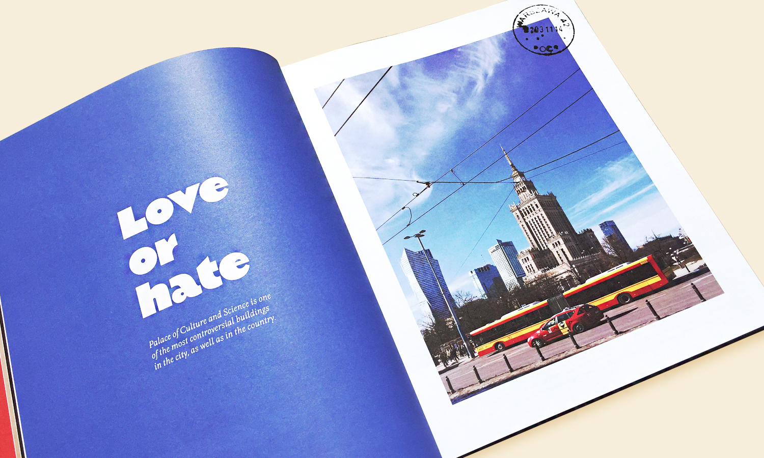
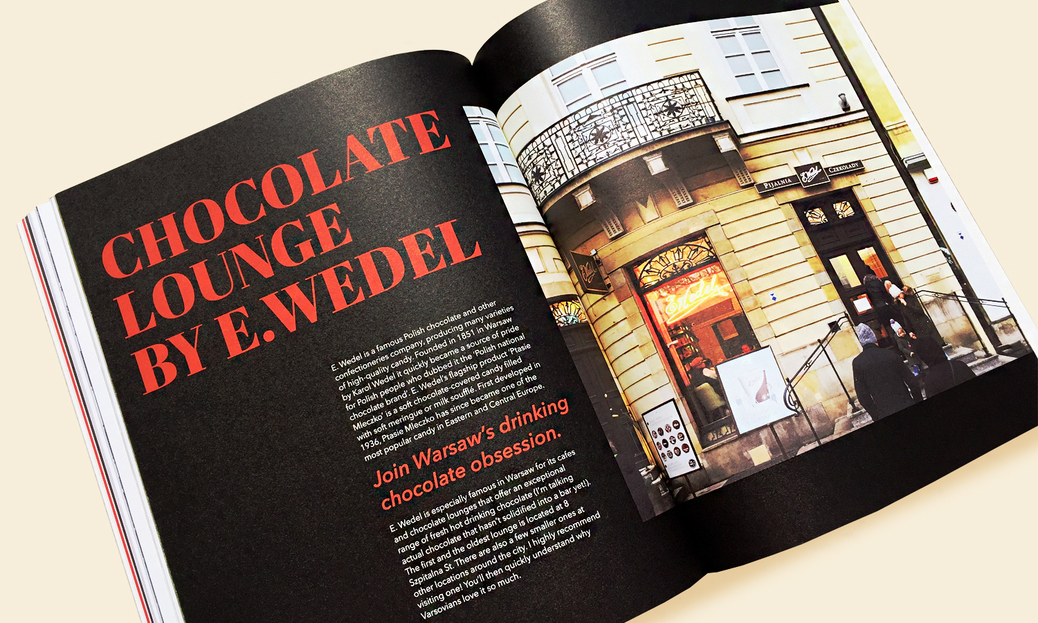
In its 3rd issue Silky Way talks about everything that Warsaw, the capital of Poland, has to offer to the visitors. While usually under Kraków’s shadow, the capital of Poland is an extremely lively place with a very captivating history. Warsaw is a big proud city with visuals heavily reflecting its troubled past. Referred to as a “Phoenix City”, it’s currently one of Europe’s fastest growing cities, making it an extraordinary spot right in the middle of the continent. Issue 3 “What is Warsaw” explores some of the most interesting quirks of the Polish capital. It has been released in April 2019.
Magiel again is being used as the main font, present in the logo and also used as title type. Avenir Next in both Regular and Bold is used as a main body type, and Olympic for subtitles. Abril Fatface (the second heaviest style of April Display) and Quentin are used for Polish words and some titles across the issue.


")


")


