Cherry by Nico Walker (Alfred A. Knopf)
Cover designer Janet Hansen taps into Lettera, a once common alternative source of letterforms
The cover for Nico Walker’s debut novel Cherry was designed by Janet Hansen, senior designer at Alfred A. Knopf, with creative direction from Carol Devine Carson. It was chosen as one of the New York Times’ 12 Best Book Covers of 2018. To get to this superb result wasn’t exactly straightforward, though. Over on LitHub, Hansen recounts the process. “The Trouble With Designing a Book When Its Author is in Jail” is a fascinating and refreshingly candid story full of detours and dead ends, with a happy ending.
In this post, we’ll take a closer look at the type. Strictly speaking, it’s not even type. The title doesn’t use a font, and yet it’s written with prefabricated letters. Janet Hansen has tapped into an alternative format that used to be a common one from the 1950s to the 1970s: alphabet source books. The letters used for “CHERRY” stem from OP-Letter, a set of fat shaded capitals with a number of charmingly wonky details and inconsistencies. Walter Haettenschweiler, the Swiss letterform designer extraordinaire, drew them with a Rapidograph technical pen and named it after the OP Art movement [Swiss Type Design]. His piece of lettering was reproduced in the third volume of Lettera, published by Arthur Niggli in 1968.
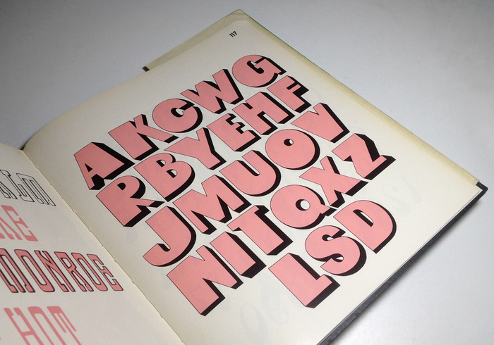
OP-Letter as shown in Lettera 3 by Armin Haab and Walter Haettenschweiler (ed.). Teufen AR: Arthur Niggli, 1968, 2nd edition 1970.
The Lettera series was started by Armin Haab and Alex Stocker in 1954. Following Stocker’s premature death in the same year, Haab continued it together with Haettenschweiler, adding three more volumes until 1972. In addition to dry transfer lettering and the more expensive phototypesetting, alphabet copybooks were an accessible, low-cost letterform source in the pre-digital era. While the usual techniques involved tracing or photocopying, chopped up copies of Lettera books are sad proof that some users chose a less sustainable approach. (Hansen resorted to a scanner, of course.) The editors were well aware that their compendium books effectively served as a fount of letters. The introduction mentions that “every purchaser of LETTERA 3 is entitled to form words or texts for any purpose from the alphabets it contains.”
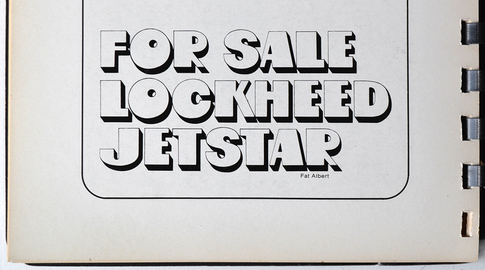
Fat Albert, a – probably unauthorized – phototype adaptation of OP-Letter, as shown in The Complete Lettergraphics Library. Culver City: Lettergraphics International Ltd., 1976.
Despite the fact that this “EULA” prohibited any unauthorized reproduction, OP-Letter was copied by Lettergraphics in the US almost instantly and made into a film typeface dubbed Fat Albert. This version is distinguished by harmonized letter heights and a more even H. Shadows in C, F, R are different, and the missing P as well as numerals etc. were added. This film face also appears as Googie aka Fat Albert Square in Castcraft’s Encyclopedia (1978) and as Albert in 1970s catalogs by Typeshop and Fürst. Moderne Alphabets (Dover, 1999) has it under the alias Zippy. In the preface to Lettera 4 (1972), Armin Haab comments on the radical changes in the industry since the mid 1950s:
… a new industry appeared on the scene and began to distribute typefaces, old and new, in vast quantities. Photocomposition had arrived. Firms in this line mushroomed overnight, stole from LETTERA even the types we had designed ourselves, and sold them to anyone interested at so much per word. (For good or ill I had to ask these gentry to pay up!) – But the new trend had been set. The graphic designer was neither willing nor able to draw letters in accordance with consistent artistic principles. More and more graphic designers, advertising agencies, display managers and publishers came to depend on the faces proviced by photocomposing firms. Today their number is legion. They supply the market with display faces while the typefoundries produce mainly body type.
While the phototype knockoffs are all long gone and forgotten, the Lettera books are still around and, as with this case, continue to provide inspiration and unique letterforms for contemporary applications. Justice will prevail!
Shown below are some of the preliminary versions for the Cherry cover where Janet Hansen also used OP-Letter. See more steps from the journey to an award-winning cover in her walkthrough on LitHub.

After the cover designer ran into another dead end and the creative director suggested the job be given to a freelancer, Hansen drew new hope with this idea: “I quite liked it, as did everyone here at Knopf—the dual suggestion of the cherry of a cigarette and also a gun.”
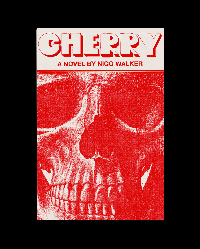
The breakthrough? Almost. “A skull is a good symbol for the book, but the first execution felt too predictable. This is when it dawned on me that there was an important aspect of the novel that I wasn’t including in any of these jackets: the fact that it is uniquely American. I tried adding an American element.”

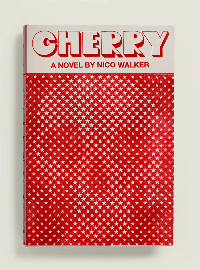
“While the last one is too smiley, the surprise element of it being secondary to the stars felt appropriate. Almost like the skull (and all of the darkness in the novel) came about as some naïve mistake.” For the final version (shown at the top of this post), the death’s head was toned down even more. Once detected, the effect is all the more powerful.
Watch Janet Hansen talk at the Typographics conference on June 14 about the power of simplicity in contemporary book cover design. Fonts In Use is a media partner of Typographics. See more work by speakers of the 2019 edition.
Formats
- Books (4015)
Topics
- Literature (1921)
Designers/Agencies
- Janet Hansen (3)
Tagged with
- Alfred A. Knopf (33)
- book covers (3505)
- Nico Walker (1)
- novels (350)
- red (602)
- stars (178)
- skulls (57)
- one color (218)
- all caps (4089)
- shadow effects (707)
- book jackets (524)
- hardcovers (593)
- Iraq War (1)
- process (68)
- typeface profile (71)
- halftone effects (72)
Artwork location
- United States (6407)
- New York City (1708)
In Sets
- Lettera (Florian Hardwig) (55)
- Typographics 2019 (Fonts In Use Staff) (39)
- Designs by Women (Fonts In Use Staff) (1494)
- like (Claire Santangelo) (11)
- Hihu (CONTEMPT) (227)
- vintage inspired (isabel) (21)
- Colossal Combinations (Jay Mellor) (1863)
- stuffs (jae benjamin) (201)
- Graphic References (Tristan Ford) (5)
- one (Jim Knopf) (13)
- for red B (Lulu Hdez) (4)
- FOR FUN (KALIK S) (12)
- Fonts I Like (Bijou K) (39)



















4 Comments on “Cherry by Nico Walker (Alfred A. Knopf)”
I wonder whether Philip Castle or Bill Gold had seen OP-Letter in Lettera 3 when they designed the poster for the theatrical release of Stanley Kubrick’s A Clockwork Orange in 1971. With the small off-center counter and the south-east shade, the big round “eyeball” O in this iconic piece of lettering certainly reminds me of the letter in Haettenschweiler’s face.
Fascinating article! I didn’t know much about Lettera, so I’m glad I learned more about this historical source.
I looked a bit deeper into the poster for A Clockwork Orange. While the design is often credited to both American graphic designer Bill Gold and British airbrush artist Philip Castle (and often even exclusively to Gold), it seems that the chosen poster was in fact solely Castle’s work – he did both the portrait of Alex with knife and eyeball, as well as the lettering. Gold apparently did the art direction and layout (?) for a different poster design with an illustration by Don Ivan Punchatz, featuring a crucified Alex on a machine, which remained unused.
Design Curial has an article from Blueprint magazine in which Philip Castle comments on designing film posters for Stanley Kubrick:
That half tone skull is pretty slick.