

Britomart
Designer boutiques, award-winning eateries, bars, health, beauty and offices set within some of Auckland’s oldest buildings and newest architecture, Britomart is the place to be from the first meeting of the day to the last whiskey of the night. — Britomart Group
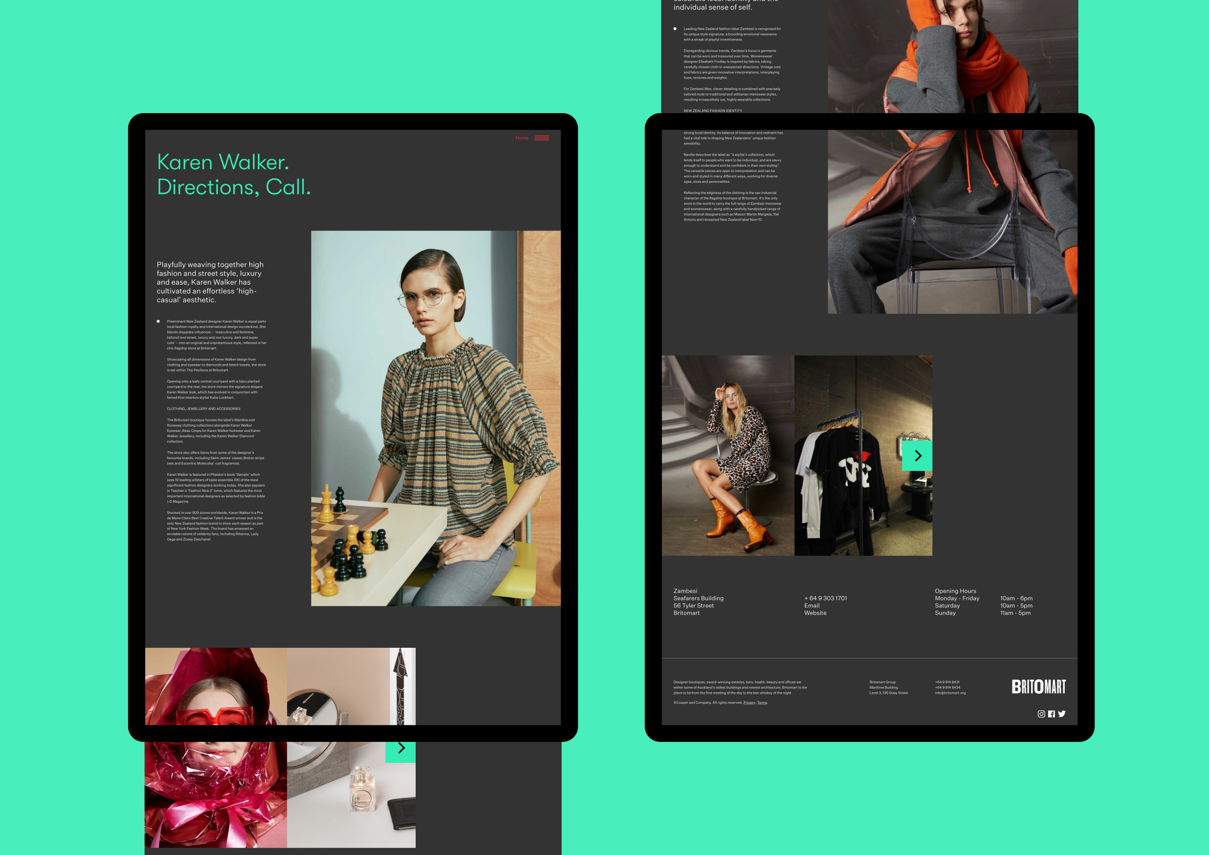
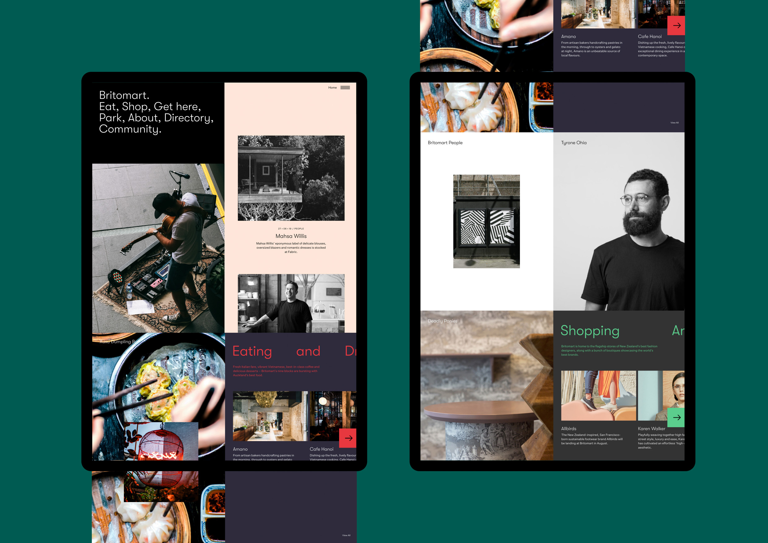
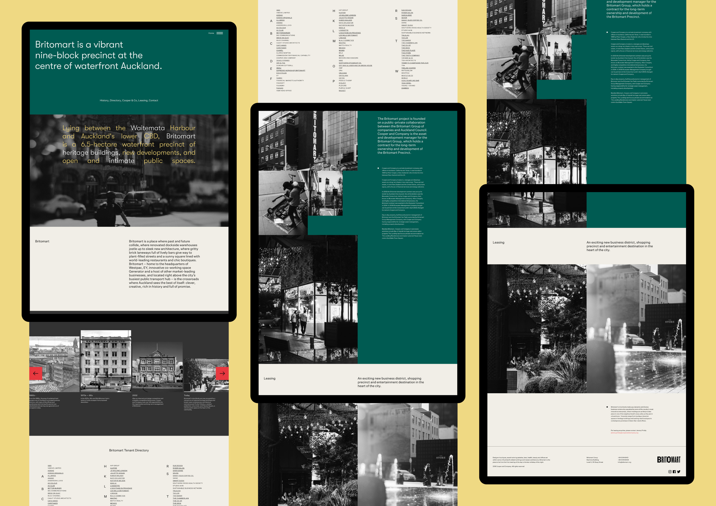
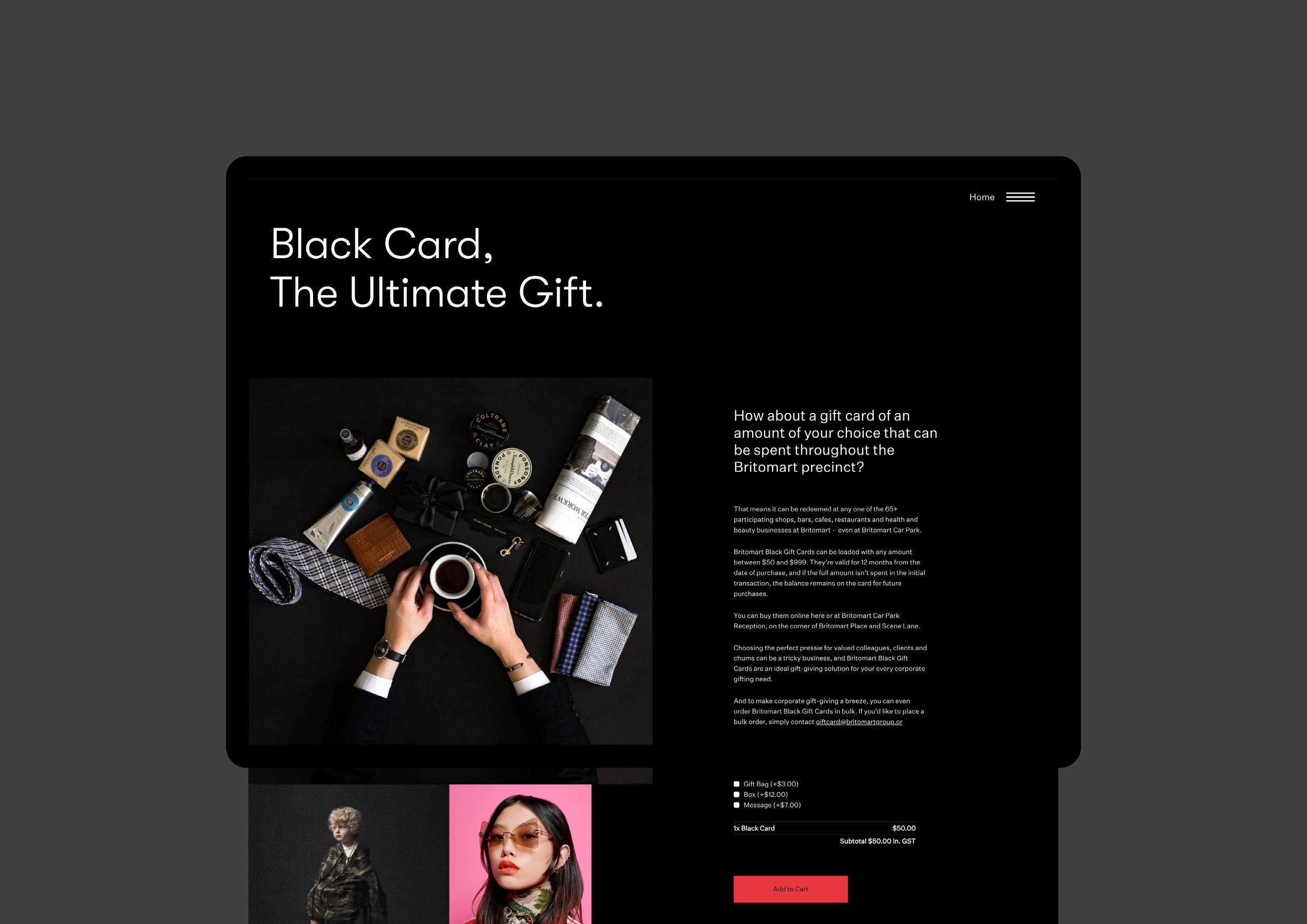
Britomart is a vibrant nine-block precinct at the centre of Waterfront Auckland. The new website represents a colourful evolution of the existing brand, with a focus on the Britomart community.
The slate-coloured website presents information with body copy in Untitled Sans, interspersed with big blocks that contain stylish images and short bits of text using GT Walsheim, set in a big point size and in various colours. The Britomart logo combines two styles of Knockout.
Britomart identity: Inhouse
Website: Inhouse and Grafik
Web development: Grafik


")


