

KFC Russia website (2019)
Source: www.kfc.ru Photo: TypeMates. Mockups by Jakob Runge for TypeMates. License: All Rights Reserved.
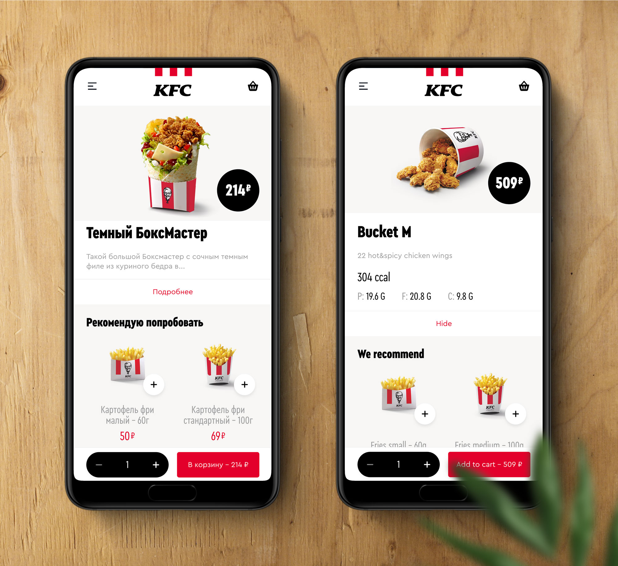
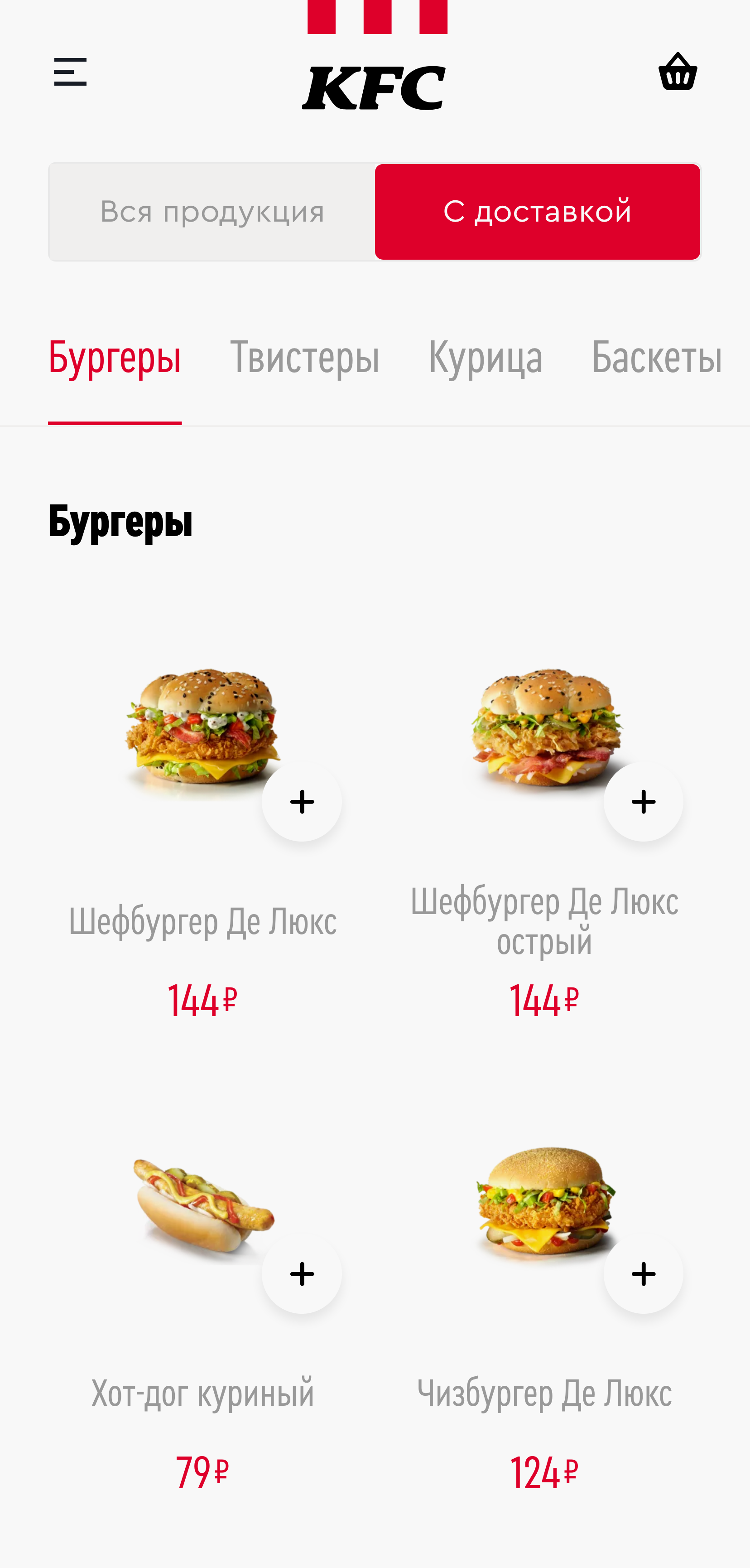
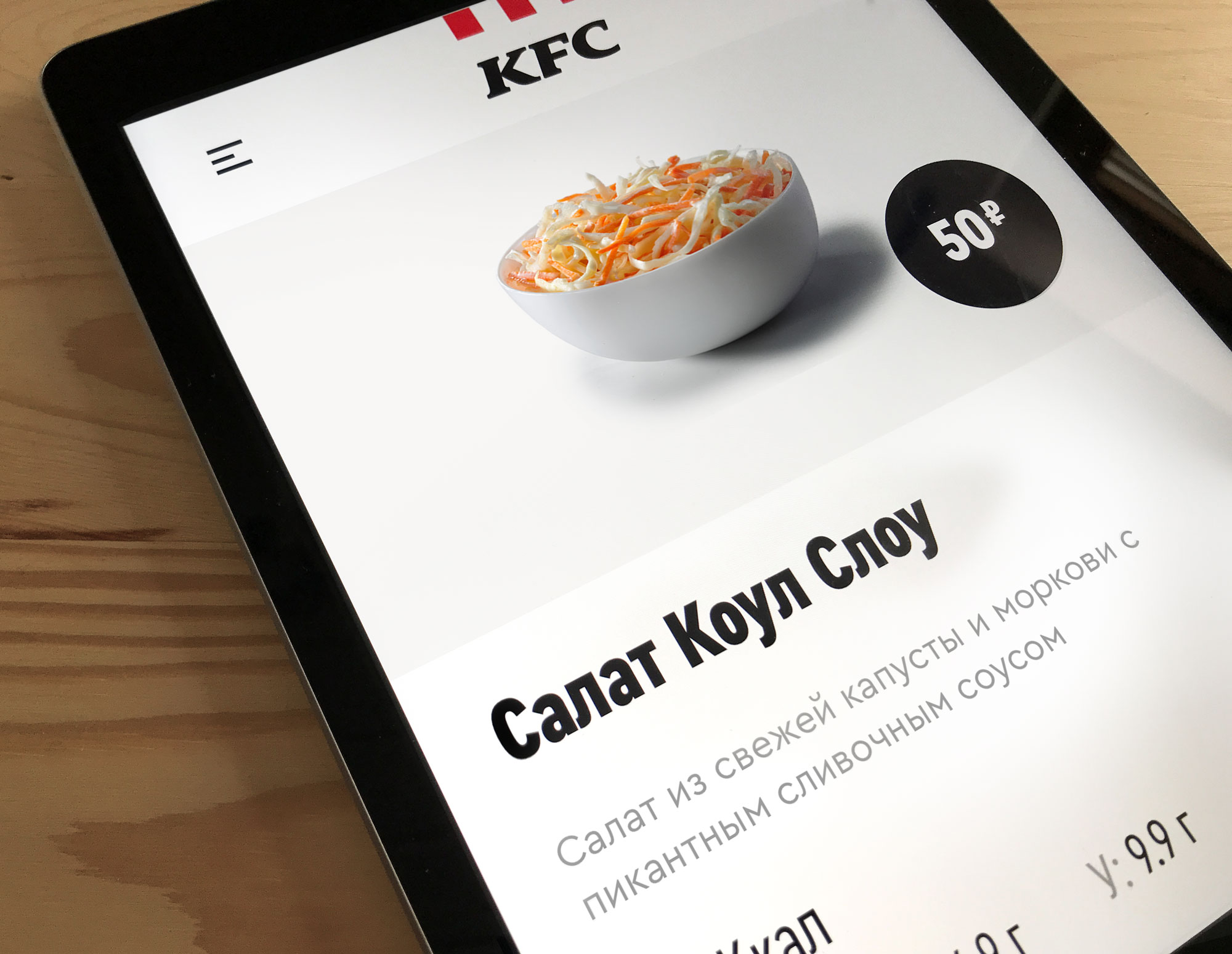
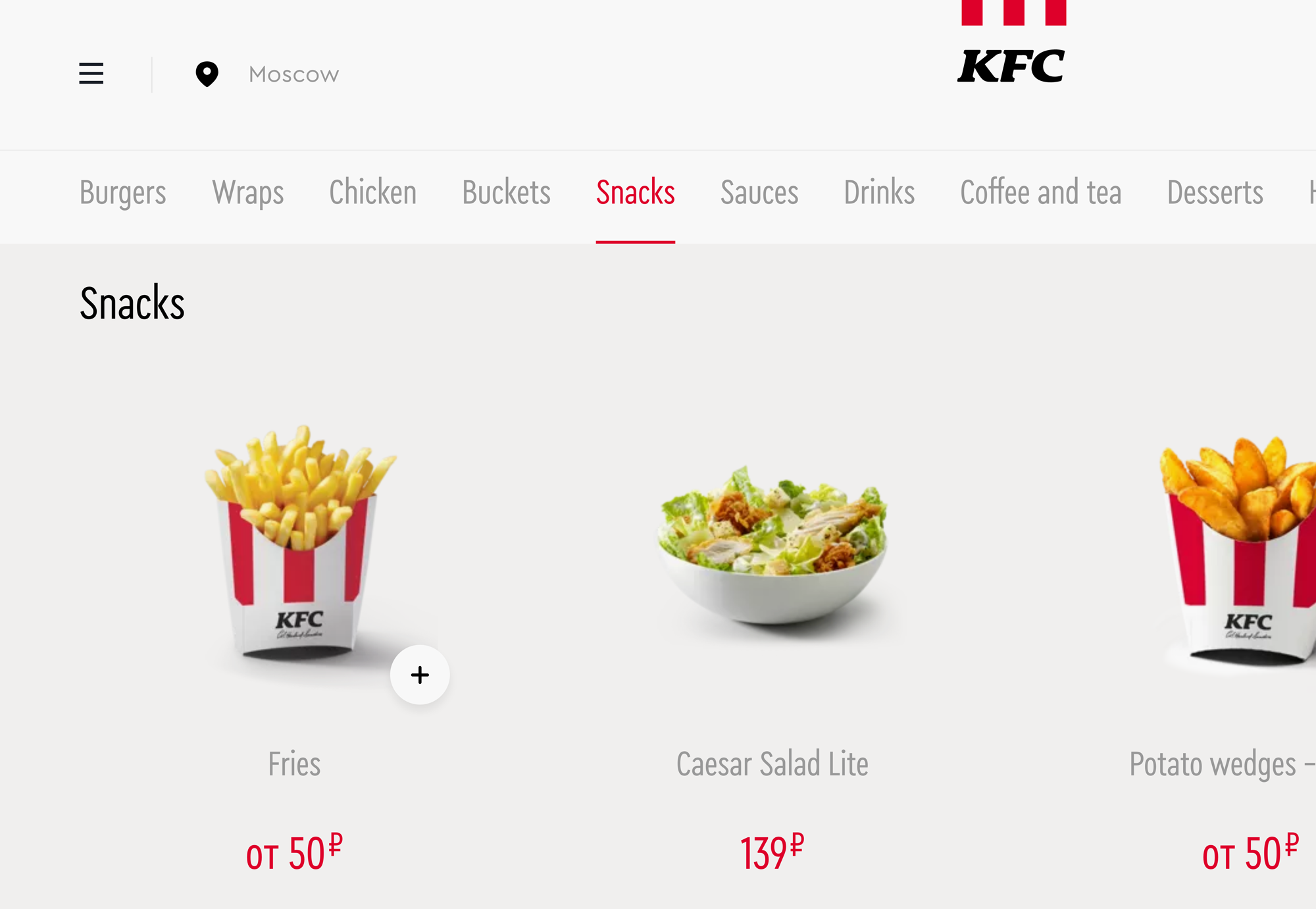
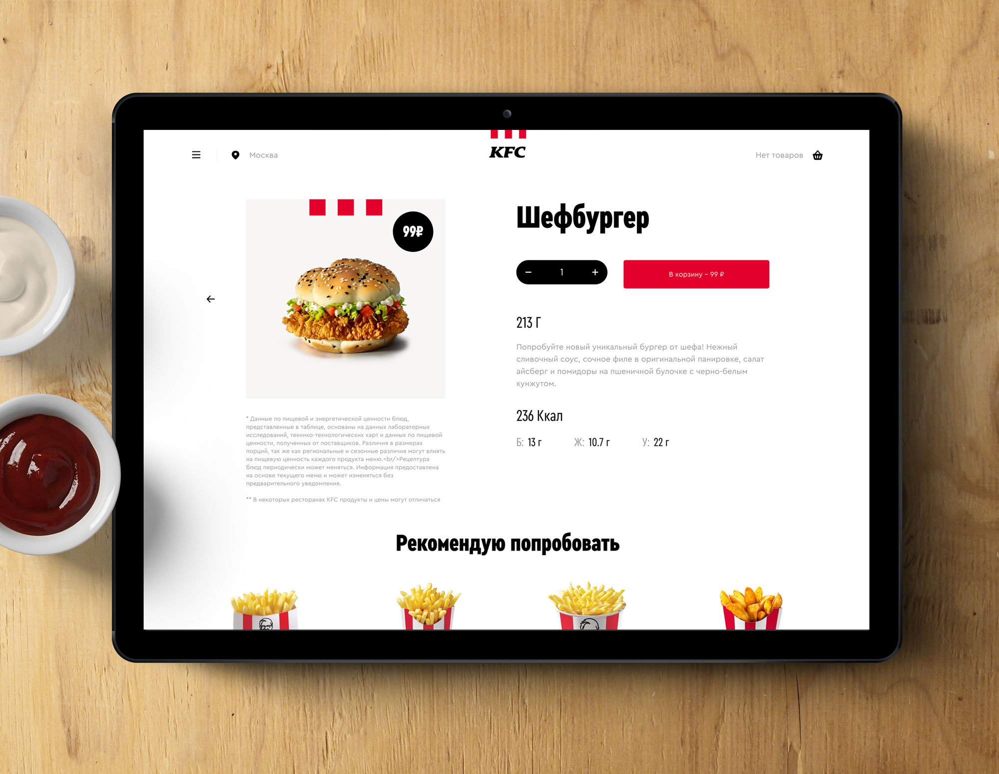
KFC Russia uses Cera Condensed for their new website and touch points in restaurants.
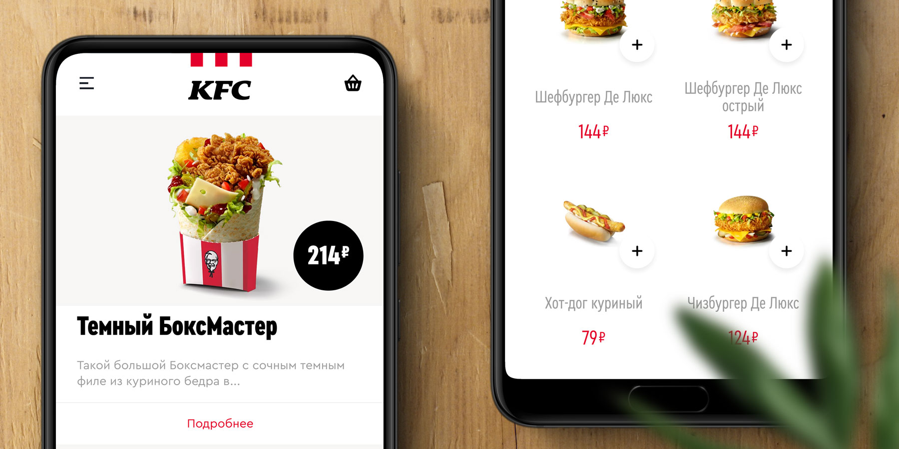
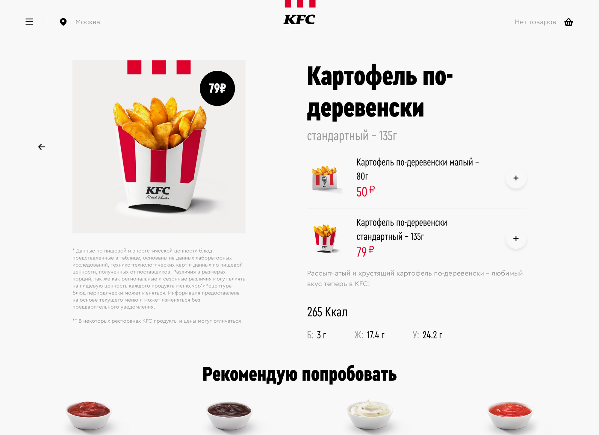
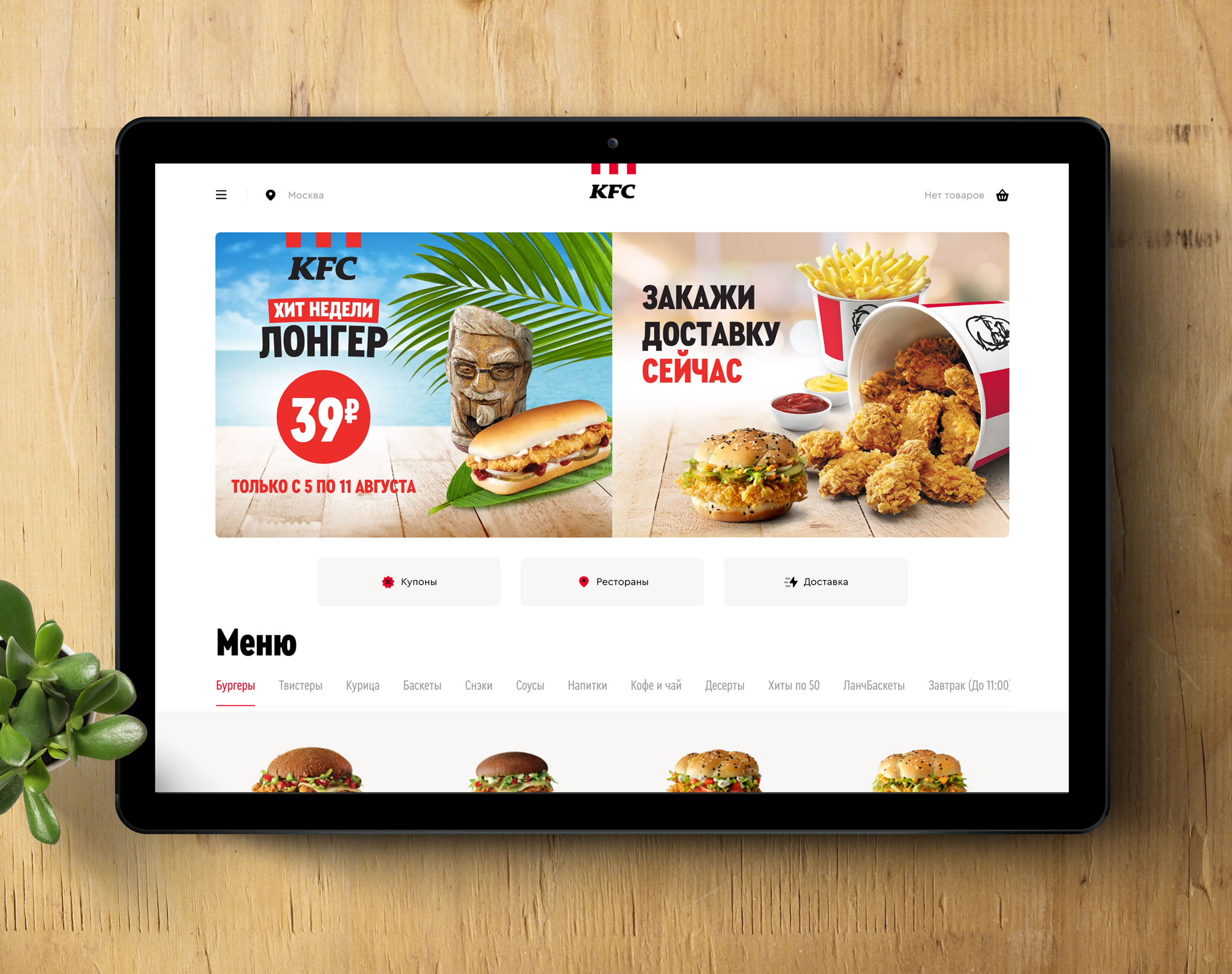
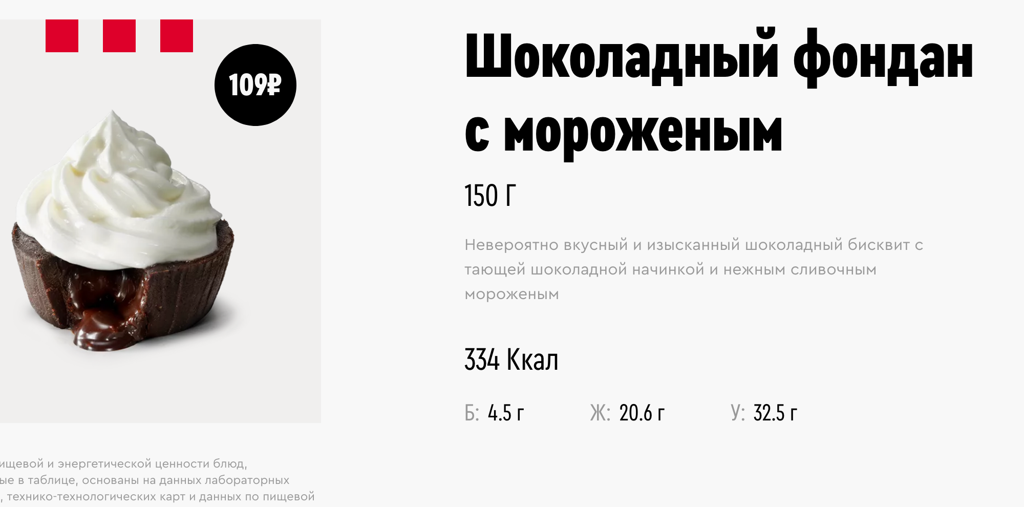
The web UI of the fried chicken fast food chain is clean and pleases with ample whitespace. Fittingly, the typeface of choice for the complete user interface including the bold headlines is Cera Condensed. Its round and regular-wide companion Cera is used for secondary elements and smaller text.
How the global brand style was adapt for the Russian market, see this post on Fonts In Use.
A huge Спасиб for consultation and negotiation to type.today (run by CSTM Fonts), TypeMates’s partners for the Cyrillic markets, who made this very early use of Cera Condensed happen.
Source: www.kfc.ru Photo: TypeMates. Mockups by Jakob Runge for TypeMates. License: All Rights Reserved.
Source: www.kfc.ru Photo: TypeMates. Mockups by Jakob Runge for TypeMates. License: All Rights Reserved.
Source: www.kfc.ru Photo: TypeMates. Mockups by Jakob Runge for TypeMates. License: All Rights Reserved.
Source: www.kfc.ru Photo: TypeMates. Mockups by Jakob Runge for TypeMates. License: All Rights Reserved.
Source: www.kfc.ru Photo: TypeMates. Mockups by Jakob Runge for TypeMates. License: All Rights Reserved.
Source: www.kfc.ru Photo: TypeMates. Mockups by Jakob Runge for TypeMates. License: All Rights Reserved.
Source: www.kfc.ru Photo: TypeMates. Mockups by Jakob Runge for TypeMates. License: All Rights Reserved.
Source: www.kfc.ru Photo: TypeMates. Mockups by Jakob Runge for TypeMates. License: All Rights Reserved.


