
Ordinary Muses
Contributed by Wibke Bramesfeld on Aug 19th, 2019. Artwork published in
.

Sometimes
it’s the small things
that matter most —
small stories,
small publications,
small events.
Sometimes
it’s the ordinary things
that are the most dear —
dearest objects,
dearest people,
dearest moments.
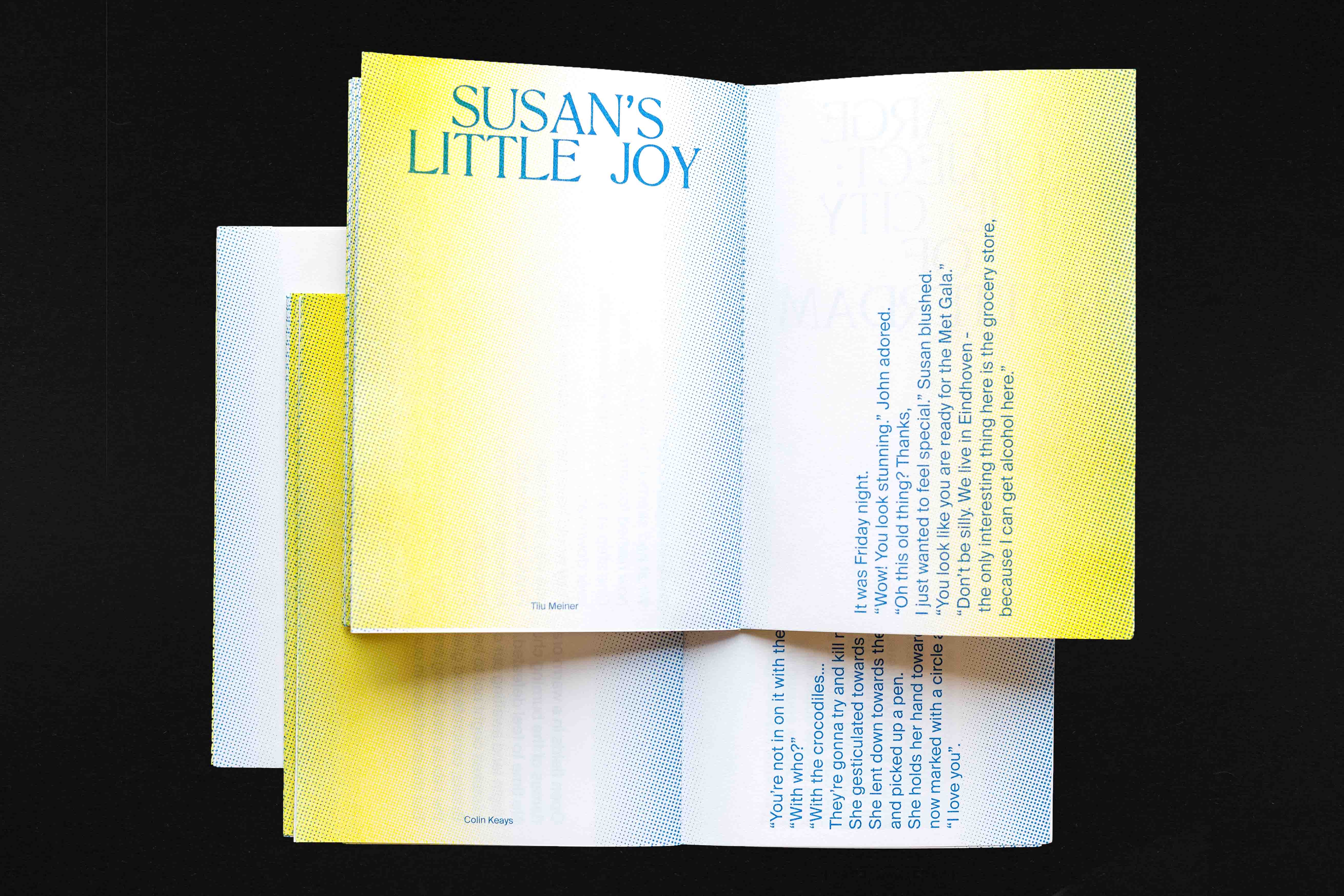
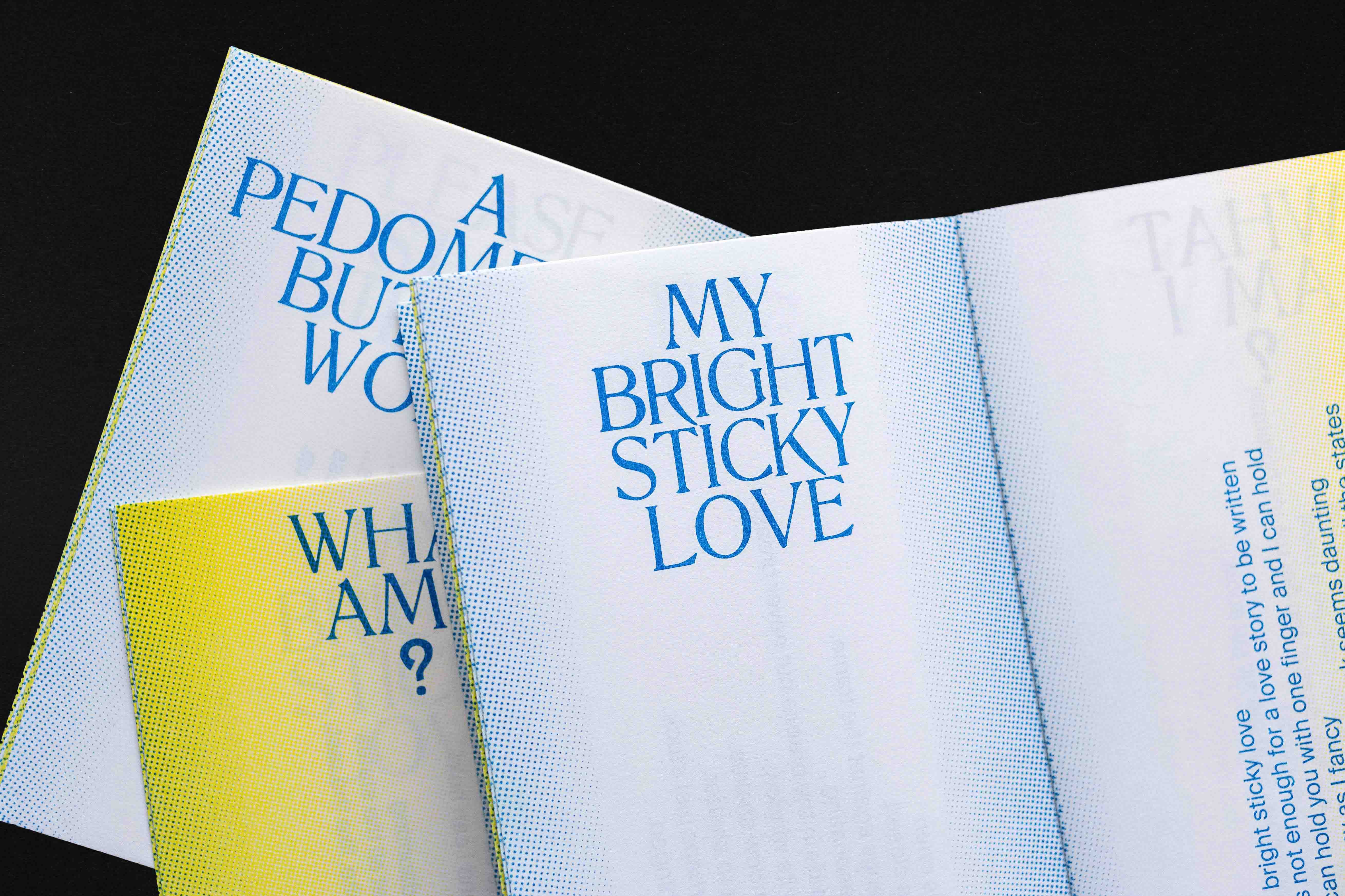
Graphic design for a small publication that is an ode to ordinary objects. Containing 55 word stories that are the results of a flash fiction workshop run at Onomatopee by Lara Chapman and Edoardo Tedone of the Master Department Design Curating and Writing at Design Academy Eindhoven. The booklet was written, designed and risoprinted during the Super Book Saturday, 30 March 2019 at Onomatopee, Eindhoven.
Cover drawing: Kirsten Spruit.
Special thanks: Josh Plough, Nadine Botha.


")


")


")


")


1 Comment on “Ordinary Muses”
It looks like Tancred works OK for the rough Riso aesthetic you were aiming for, and that’s cool.
However, for others who are looking into using this font, I want to point out that Tancred is really poorly drawn and spaced, and should be avoided. It was made by Scriptorium in the early 1990s, probably by autotracing, and is further hampered by a severly limited character set: just Aa–Zz and numerals, no accented characters, no nothing. Selling it in 2019 is irresponsible.
Tancred is a digitization of Lateinisch, a metal typeface first cast by the Berthold foundry in 1899. Latinish by Intellecta is another interpretation that I can’t recommend either. Luckily, there’s a better digitization under the original name by Gerhard Helzel. It’s available from Romana. (The website might look weird, but the fonts are sound.)
Here’s a visual comparison. In Tancred (top), some missing glyphs like $ or & were added from ITC Benguiat. Latinish (middle) isn’t much better. Just look at the uneven outlines. The ampersand slot is filled with a floral dingbat. And what’s up with that R? Helzel’s Lateinisch (bottom) appears to be a faithful digitization of the original metal face, with smooth curves and consistent spacing. It comes in two weights.
For similar options, see also Literaturnaya and Quant Antiqua, which are derived from a Cyrillic version of Lateinisch.