

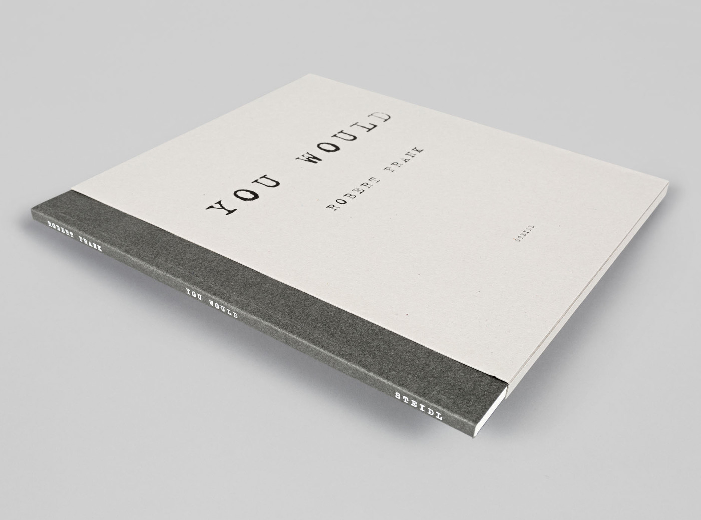
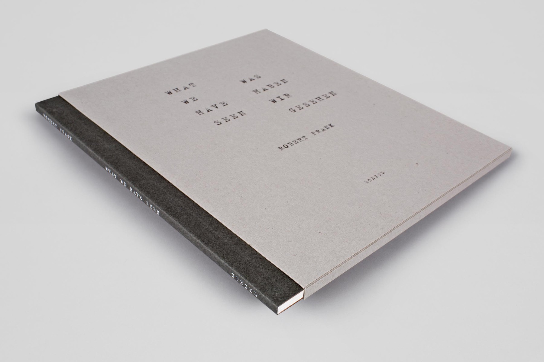
You Would (2012) and Was haben wir gesehen / What we have seen (2016) by Robert Frank
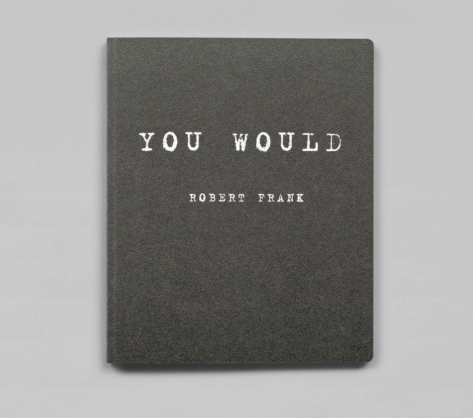
Two volumes from Robert Frank’s series of visual diaries, published by Steidl in 2012 and 2016, respectively. Both booklets use Erik van Blokland’s FF Trixie on the cover.
The lines are printed in white, in multiple and big sizes, with moderate tracking. None of these aspects is really coherent with what a typewriter can do, revealing that this – of course – is a multi-processed emulation of typewritten text, using a digital font. And yet Trixie works it magic, lending an aura of authenticity and immediacy to the books. With its smudged, irregular shapes, the typeface manages to suggest that these letters come right from the fingertips of Robert Frank – intimate and unfiltered.
You Would contains recent images, some shot on 35 mm, others Polaroids, of Frank’s friends, acquaintances and surroundings in New York and Mabou, Nova Scotia. In the book are also iconic images from earlier in Frank’s career such as a photo of Delphine Seyrig and Larry Rivers on the set of Frank’s 1959 film Pull My Daisy. This careful edit of new and old suggests that past experience tempers Frank’s present, and shows that his life is not only recorded by book-making but shaped by it.
Was haben wir gesehen / What we have seen is all about people and places in the long and very convivial life of Robert Frank. […] Frank’s visual diaries constitute an important part of both his later work and the ongoing art of the photobook.
Robert Frank passed away this week at the age of 94. See the obituaries in the New York Times and the Guardian.
The slipcase shows a reversed, positive version of the cover design.

The textured cover in warm grey is followed by blue endpapers.

Spread from You Would.

While You Would features a center-aligned title – another thing that is difficult to achieve with an actual typewriter – the arrangement of Was haben wir gesehen / What we have seen doubles down on the pretended mechanical manufacture by aligning the lines imperfectly.
Spine and slip case. The visual diaries each have 48 pages and measure 20.5×25 cm.

Spread from Was haben wir gesehen / What we have seen.


")


")

")
