La prodigieuse aventure des plantes (1981), L’Aventure des plantes (1982)
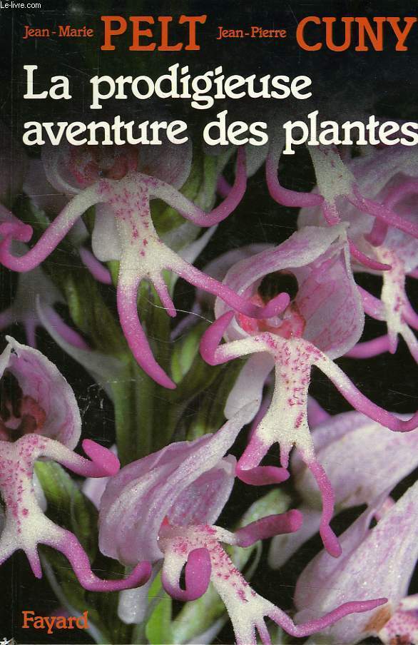
Book cover featuring Italia.
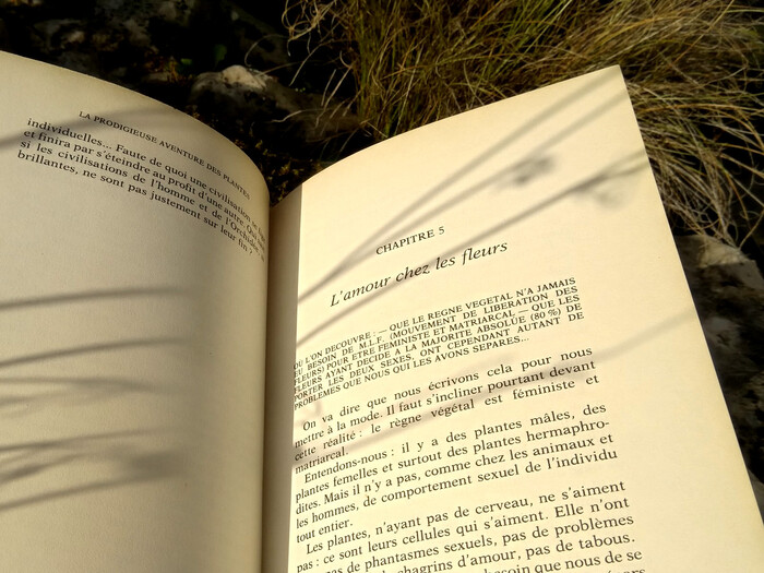
La prodigieuse aventure des plantes is a book written by scientist Jean-Marie Pelt together with author and filmmaker Jean-Pierre Cuny in 1981. It has the aim of making botany and biology accessible to a wide public by using simple words and astonishing examples. Italia Medium is used as the titling typeface on the cover. Made in the 1970s, Italia is inspired by an Arts & Crafts typeface named Golden Type, designed by William Morris himself. Both the protagonists of the Art & Crafts movement and designers in the 1970s were very much interested in gracile, organic shapes as found in plants. Therefore the chosen typeface is empathic with the subject. Inside the book, Aster – a typeface bearing the name of a plant – is used for the body text and titles.
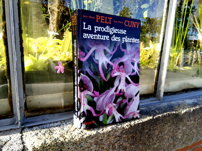
“The amazing adventure of plants”, in front of some plants.
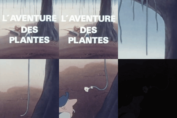
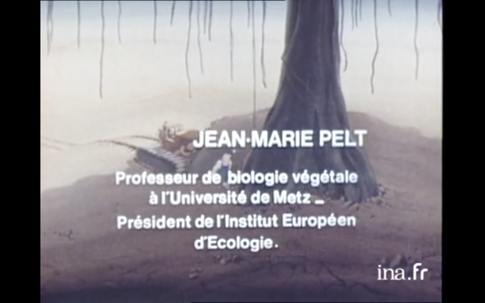
The book’s success spawned the creation of a TV series about the invention of life and the evolution of plants. L’Aventure des plantes was first aired in 1982 on French TV channel TF1. It consists of two seasons with a total of 26 episodes. The same simplicity is applied to make botany accessible to everyone. The first season follows the chapters of the book from the beginning of life to the most advanced flowers. The series is characterized by a certain sense of humor. Some examples are astonishing and bizarre, making each episode a kind of cabinet of botanical curiosities. Typographically speaking, it’s nothing special: Univers is used for the title, and Helvetica for the credits.
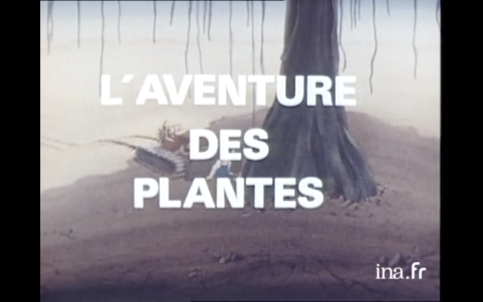
The opening titles of the TV series are in Univers 75 (Black). Unfortunately, an acute accent (´) was used instead of a proper apostrophe (’).
The music of the series was composed by Joël Fajerman. An album with the complete soundtrack was released by Carrere. The titling font is ITC Bookman with its specific swashes.
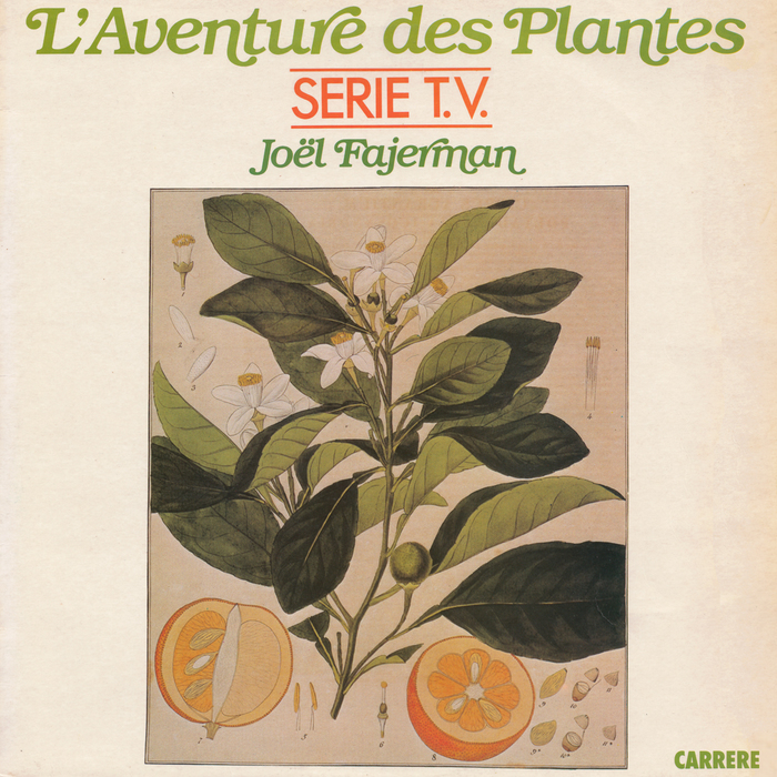
Album cover of the soundtrack as released by Carrere in 1982. The green lines are in ITC Bookman Italic with swashes. “Serie T.V.” is in Futura.
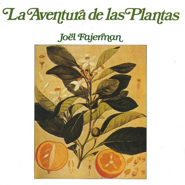
The Spanish version on RCA Records features an adaptation of the original French cover shown above. On this re-release from 1990, the line in Futura was removed. While the artist’s name in ITC Bookman was maintained, the title uses a different version of Bookman, with slanted letterforms. The differences are most striking in the letters a or e.

Two tracks from the soundtrack, “Flowers Love” and “Holiday Village”, were released as 7″ single (Carrere, 1982). The cover features a drawing by Jacques Leroux. The flowery title typeface is Daisyland. Filmotype Jefferson is used for the artist’s name. The bold italic sans is unidentified.
Formats
- Books (3975)
- Film/Video (643)
- Album Art (2593)
Topics
- Science/Nature (613)
- Education/Academia (1358)
- Music (3871)
- Film/TV (1219)
Designers/Agencies
- unknown (2140)
- Jacques Leroux (1)
Tagged with
- botany (21)
- biology (14)
- plants (54)
- popular science (18)
- book covers (3467)
- Fayard (2)
- flowers (187)
- Jean-Marie Pelt (1)
- Jean-Pierre Cuny (1)
- book interiors (1897)
- chapter openings (409)
- French (language) (1241)
- TV series (103)
- title sequences (234)
- TF1 (1)
- 1980s (429)
- album records (1553)
- soundtracks / film scores (51)
- single records (653)
- Carrere Records (1)
- Joël Fajerman (5)
- electronic music (327)
- keyboards/keypads (15)
- ambient music (31)
- swashes (428)
- RCA Records (74)
- Spanish (language) (418)
- vinyl records (2228)
In Sets
- vintage (isabel) (76)


